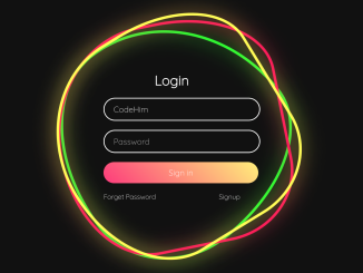
This code creates an animated login form using HTML and CSS3. The form includes username, password fields, and a sign-in button. It features animated rings that change color and rotate on hover, enhancing user interaction. The design is responsive and visually appealing.
You can use this code to create engaging login forms for websites or applications. One major benefit is enhancing user interaction with animated elements, improving the overall user experience.
How to Create Animated Login Form Using HTML and CSS3
1. Start by creating the HTML structure for the login form. Use <div> elements for the form components, including inputs and buttons. Here’s a sample structure:
<!--ring div starts here-->
<div class="ring">
  <i style="--clr:#00ff0a;"></i>
  <i style="--clr:#ff0057;"></i>
  <i style="--clr:#fffd44;"></i>
  <div class="login">
    <h2>Login</h2>
    <div class="inputBx">
      <input type="text" placeholder="Username">
    </div>
    <div class="inputBx">
      <input type="password" placeholder="Password">
    </div>
    <div class="inputBx">
      <input type="submit" value="Sign in">
    </div>
    <div class="links">
      <a href="#">Forget Password</a>
      <a href="#">Signup</a>
    </div>
  </div>
</div>
<!--ring div ends here-->
Within the .login div, add the necessary form elements – a heading, input fields for username and password, and a submit button.
2. Utilize the following CSS styles to design and animate the login form. The CSS code defines the appearance, positioning, and animations of the form elements.
@import url("https://fonts.googleapis.com/css2?family=Quicksand:wght@300&display=swap");
* {
  margin: 0;
  padding: 0;
  box-sizing: border-box;
  font-family: "Quicksand", sans-serif;
}

body {
  display: flex;
  justify-content: center;
  align-items: center;
  min-height: 100vh;
  background: #111;
  width: 100%;
  overflow: hidden;
}
.ring {
  position: relative;
  width: 500px;
  height: 500px;
  display: flex;
  justify-content: center;
  align-items: center;
}
.ring i {
  position: absolute;
  inset: 0;
  border: 2px solid #fff;
  transition: 0.5s;
}
.ring i:nth-child(1) {
  border-radius: 38% 62% 63% 37% / 41% 44% 56% 59%;
  animation: animate 6s linear infinite;
}
.ring i:nth-child(2) {
  border-radius: 41% 44% 56% 59%/38% 62% 63% 37%;
  animation: animate 4s linear infinite;
}
.ring i:nth-child(3) {
  border-radius: 41% 44% 56% 59%/38% 62% 63% 37%;
  animation: animate2 10s linear infinite;
}
.ring:hover i {
  border: 6px solid var(--clr);
  filter: drop-shadow(0 0 20px var(--clr));
}
@keyframes animate {
  0% {
    transform: rotate(0deg);
  }
  100% {
    transform: rotate(360deg);
  }
}
@keyframes animate2 {
  0% {
    transform: rotate(360deg);
  }
  100% {
    transform: rotate(0deg);
  }
}
.login {
  position: absolute;
  width: 300px;
  height: 100%;
  display: flex;
  justify-content: center;
  align-items: center;
  flex-direction: column;
  gap: 20px;
}
.login h2 {
  font-size: 2em;
  color: #fff;
}
.login .inputBx {
  position: relative;
  width: 100%;
}
.login .inputBx input {
  position: relative;
  width: 100%;
  padding: 12px 20px;
  background: transparent;
  border: 2px solid #fff;
  border-radius: 40px;
  font-size: 1.2em;
  color: #fff;
  box-shadow: none;
  outline: none;
}
.login .inputBx input[type="submit"] {
  width: 100%;
  background: #0078ff;
  background: linear-gradient(45deg, #ff357a, #fff172);
  border: none;
  cursor: pointer;
}
.login .inputBx input::placeholder {
  color: rgba(255, 255, 255, 0.75);
}
.login .links {
  position: relative;
  width: 100%;
  display: flex;
  align-items: center;
  justify-content: space-between;
  padding: 0 20px;
}
.login .links a {
  color: #fff;
  text-decoration: none;
}
Feel free to customize the colors, fonts, sizes, and positioning to align with your website or application’s theme. Modify the styles within the CSS code as needed.
That’s all! hopefully, you have successfully created an animated login form for your website/app project. If you have any questions or suggestions, feel free to comment below.
Similar Code Snippets:

I code and create web elements for amazing people around the world. I like work with new people. New people new Experiences.
I truly enjoy what I’m doing, which makes me more passionate about web development and coding. I am always ready to do challenging tasks whether it is about creating a custom CMS from scratch or customizing an existing system.

