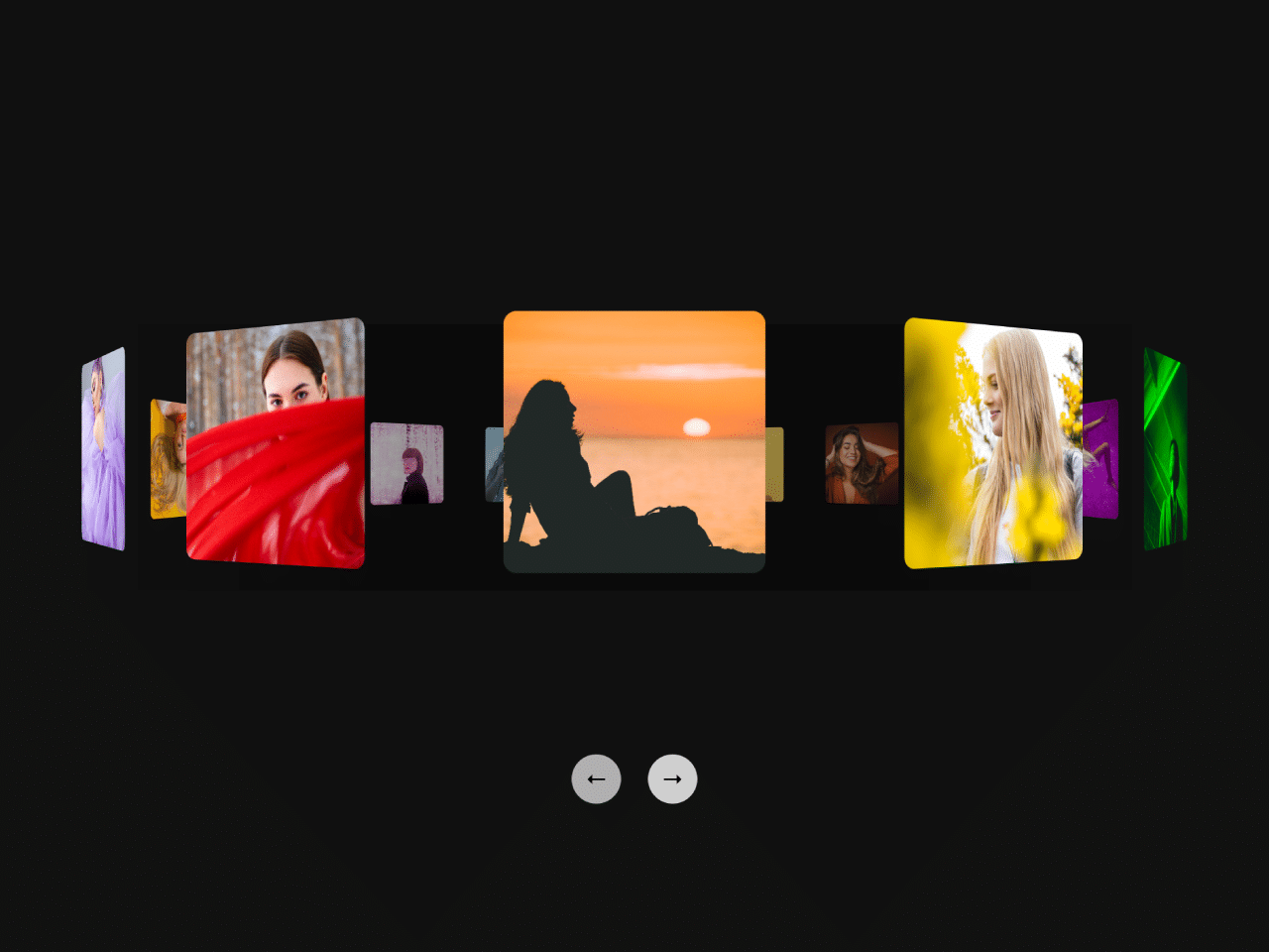

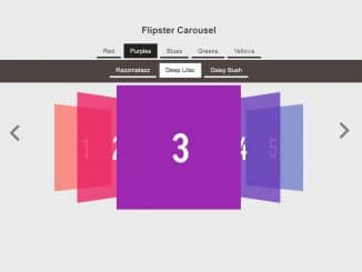
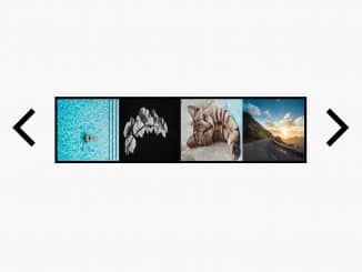
This code creates a simple rotating image carousel using HTML, CSS, and jQuery. It displays a set of images in a circular arrangement, allowing you to navigate through them using navigation buttons. The main functionality involves smoothly rotating the carousel when you click the “Previous” and “Next” buttons. This code is helpful for adding an interactive and visually appealing image carousel to your web projects.
Whether you’re building a portfolio website, e-commerce platform, event site, or any other web project, this carousel can engage users and effectively present images or content in an engaging and dynamic way.
How to Create a Simple Rotating Image Carousel
1. Copy and paste the following HTML code for the carousel. This code includes the carousel container and navigation buttons. You can customize the number of image panels by duplicating the <div class="panel"> elements and assigning different background images to them.
<div class="holder">
<div class="spinner">
<div class="panel a"></div>
<div class="panel b"></div>
<div class="panel c"></div>
<div class="panel d"></div>
<div class="panel e"></div>
<div class="panel f"></div>
<div class="panel g"></div>
<div class="panel h"></div>
<div class="panel i"></div>
<div class="panel j"></div>
<div class="panel k"></div>
<div class="panel l"></div>
<div class="panel m"></div>
<div class="panel n"></div>
<div class="panel o"></div>
<div class="panel p"></div>
<div class="fade"></div>
</div>
</div>
<div class="pagination">
<button type="button" id="prev">←</button>
<button type="button" id="next">→</button>
</div>
2. Now, add the following CSS code to your project. Replace the background image URLs in the CSS code (.a, .b, .c, …) with your own image URLs.
@import url("https://fonts.googleapis.com/css2?family=Roboto:wght@900&display=swap");
* {
  --ang: 0;
}
.cd__main{
   background: #111 !important;
  display: block !important;
   min-height: 720px;
}
html, body {
  height: 100%;
}


.spinner {
  transform-style: preserve-3d;
  position: relative;
  display: flex;
  align-items: center;
  justify-content: center;
  transform: rotateY(calc(var(--ang) * 1deg)) translateY(-12px);
  transition: all 0.5s ease-in-out;
}

.holder {
  width: 600px;
  height: 200px;
  display: flex;
  justify-content: center;
  align-items: center;
  perspective: 700px;
  perspective-origin: center;
  margin: 150px auto;
}

.panel {
  border-radius: 5px;
  width: 100px;
  height: 100px;
  position: absolute;
  background-size: cover;
  background-position: 50% 50%;
}

.panel:nth-child(1) {
  transform: rotateY(0deg) translateZ(400px);
}

.panel:nth-child(2) {
  transform: rotateY(22.5deg) translateZ(400px);
}

.panel:nth-child(3) {
  transform: rotateY(45deg) translateZ(400px);
}

.panel:nth-child(4) {
  transform: rotateY(67.5deg) translateZ(400px);
}

.panel:nth-child(5) {
  transform: rotateY(90deg) translateZ(400px);
}

.panel:nth-child(6) {
  transform: rotateY(112.5deg) translateZ(400px);
}

.panel:nth-child(7) {
  transform: rotateY(135deg) translateZ(400px);
}

.panel:nth-child(8) {
  transform: rotateY(157.5deg) translateZ(400px);
}

.panel:nth-child(9) {
  transform: rotateY(180deg) translateZ(400px);
}

.panel:nth-child(10) {
  transform: rotateY(202.5deg) translateZ(400px);
}

.panel:nth-child(11) {
  transform: rotateY(225deg) translateZ(400px);
}

.panel:nth-child(12) {
  transform: rotateY(247.5deg) translateZ(400px);
}

.panel:nth-child(13) {
  transform: rotateY(270deg) translateZ(400px);
}

.panel:nth-child(14) {
  transform: rotateY(292.5deg) translateZ(400px);
}

.panel:nth-child(15) {
  transform: rotateY(315deg) translateZ(400px);
}

.panel:nth-child(16) {
  transform: rotateY(337.5deg) translateZ(400px);
}

.pagination {
  width: 600px;
  height: 44px;
  margin-top: 10px;
  text-align: center;
  margin: 10px auto;
}

.pagination button {
  padding: 0;
  border: none;
  cursor: pointer;
  width: 44px;
  color: black;
  background: #fffa;
  height: 44px;
  margin: 0 10px;
  font-family: "Roboto", sans-serif;
  font-size: 20px;
  border-radius: 100%;
  transition: all 0.2s ease-in-out;
}

.pagination button:hover {
  background: #fffc;
}

.pagination button:active {
  background: #ffff;
}

@keyframes spin {
  0% {
    transform: rotateY(0deg);
  }
  100% {
    transform: rotateY(360deg);
  }
}
.fade {
  background: #0006;
  background: linear-gradient(90deg, rgba(0, 0, 0, 0) 0%, rgba(0, 0, 0, 0.4) 30%, rgba(0, 0, 0, 0.4) 70%, rgba(0, 0, 0, 0) 100%);
  width: 860px;
  height: 200px;
  position: absolute;
  transform: rotateY(calc(var(--ang) * -1deg)) translateZ(110px);
  transition: all 0.5s ease-in-out;
}

.a {
  background-image: url(https://images.unsplash.com/photo-1516727003284-a96541e51e9c?crop=entropy&cs=srgb&fm=jpg&ixid=M3wzMjM4NDZ8MHwxfHJhbmRvbXx8fHx8fHx8fDE2OTM5MjczNzB8&ixlib=rb-4.0.3&q=85);
}

.b {
  background-image: url(https://images.unsplash.com/photo-1691389694412-266f872999c6?crop=entropy&cs=srgb&fm=jpg&ixid=M3wzMjM4NDZ8MHwxfHJhbmRvbXx8fHx8fHx8fDE2OTM5MjY5NTh8&ixlib=rb-4.0.3&q=85);
}

.c {
  background-image: url(https://images.unsplash.com/photo-1606391901318-07003db08d63?crop=entropy&cs=srgb&fm=jpg&ixid=M3wzMjM4NDZ8MHwxfHJhbmRvbXx8fHx8fHx8fDE2OTM5MjY5OTJ8&ixlib=rb-4.0.3&q=85);
}

.d {
  background-image: url(https://images.unsplash.com/photo-1610785396756-24bd1889ddae?crop=entropy&cs=srgb&fm=jpg&ixid=M3wzMjM4NDZ8MHwxfHJhbmRvbXx8fHx8fHx8fDE2OTM5MjcwMjl8&ixlib=rb-4.0.3&q=85);
}

.e {
  background-image: url(https://images.unsplash.com/photo-1505849871170-7f94cf84f4d2?crop=entropy&cs=srgb&fm=jpg&ixid=M3wzMjM4NDZ8MHwxfHJhbmRvbXx8fHx8fHx8fDE2OTM5MjcwODJ8&ixlib=rb-4.0.3&q=85);
}

.f {
  background-image: url(https://images.unsplash.com/photo-1518087456308-c3976320f908?crop=entropy&cs=srgb&fm=jpg&ixid=M3wzMjM4NDZ8MHwxfHJhbmRvbXx8fHx8fHx8fDE2OTM5MjcxMTB8&ixlib=rb-4.0.3&q=85);
}

.g {
  background-image: url(https://images.unsplash.com/photo-1558724040-9de64afade55?crop=entropy&cs=srgb&fm=jpg&ixid=M3wzMjM4NDZ8MHwxfHJhbmRvbXx8fHx8fHx8fDE2OTM5MjcxNDV8&ixlib=rb-4.0.3&q=85);
}

.h {
  background-image: url(https://images.unsplash.com/photo-1604877098440-b7b440241686?crop=entropy&cs=srgb&fm=jpg&ixid=M3wzMjM4NDZ8MHwxfHJhbmRvbXx8fHx8fHx8fDE2OTM5MjcxOTR8&ixlib=rb-4.0.3&q=85);
}

.i {
  background-image: url(https://images.unsplash.com/photo-1518573484273-eb277fe4b036?crop=entropy&cs=srgb&fm=jpg&ixid=M3wzMjM4NDZ8MHwxfHJhbmRvbXx8fHx8fHx8fDE2OTM5MjcyMTl8&ixlib=rb-4.0.3&q=85);
}

.j {
  background-image: url(https://images.unsplash.com/photo-1485230895905-ec40ba36b9bc?crop=entropy&cs=srgb&fm=jpg&ixid=M3wzMjM4NDZ8MHwxfHJhbmRvbXx8fHx8fHx8fDE2OTM5MjcyMzZ8&ixlib=rb-4.0.3&q=85);
}

.k {
  background-image: url(https://images.unsplash.com/photo-1546877625-cb8c71916608?crop=entropy&cs=srgb&fm=jpg&ixid=M3wzMjM4NDZ8MHwxfHJhbmRvbXx8fHx8fHx8fDE2OTM5MjcyNTl8&ixlib=rb-4.0.3&q=85);
}

.l {
  background-image: url(https://images.unsplash.com/photo-1551727974-8af20a3322f1?crop=entropy&cs=srgb&fm=jpg&ixid=M3wzMjM4NDZ8MHwxfHJhbmRvbXx8fHx8fHx8fDE2OTM5MjcyNzR8&ixlib=rb-4.0.3&q=85);
}

.m {
  background-image: url(https://images.unsplash.com/photo-1436759644647-e274ee931eaa?crop=entropy&cs=srgb&fm=jpg&ixid=M3wzMjM4NDZ8MHwxfHJhbmRvbXx8fHx8fHx8fDE2OTM5OTU1Mjl8&ixlib=rb-4.0.3&q=85);
}

.n {
  background-image: url(https://images.unsplash.com/photo-1533779671378-06561cdaacb5?crop=entropy&cs=srgb&fm=jpg&ixid=M3wzMjM4NDZ8MHwxfHJhbmRvbXx8fHx8fHx8fDE2OTM5MjczMDd8&ixlib=rb-4.0.3&q=85);
}

.o {
  background-image: url(https://images.unsplash.com/photo-1544377570-a774bea2355c?crop=entropy&cs=srgb&fm=jpg&ixid=M3wzMjM4NDZ8MHwxfHJhbmRvbXx8fHx8fHx8fDE2OTM5MjczMzN8&ixlib=rb-4.0.3&q=85);
}

.p {
  background-image: url(https://images.unsplash.com/photo-1586693231040-e89840e7d805?crop=entropy&cs=srgb&fm=jpg&ixid=M3wzMjM4NDZ8MHwxfHJhbmRvbXx8fHx8fHx8fDE2OTM5MjczNDV8&ixlib=rb-4.0.3&q=85);
}
3. Load the jQuery by adding the following CDN link just before closing the body element.
<script src='https://cdnjs.cloudflare.com/ajax/libs/jquery/3.7.1/jquery.min.js'></script>
4. Finally, add the following JavaScript function between <script> tag to activate the next/previous functionality.
var ang = 0;

$("#prev").click(function(){
	ang = ang + 22.5;
  $("*").css("--ang", ang);
});

$("#next").click(function(){
	ang = ang - 22.5;
  $("*").css("--ang", ang);
});
That’s it! You’ve successfully integrated the “Simple Rotating Image Carousel” into your web project. Feel free to further customize the styles and content to match your website’s design and requirements.
Similar Code Snippets:

- Vertical Image Slider in JavaScript
- Slideshow HTML Code For Website
- Crossfading Image Slideshow Using Pure CSS


I code and create web elements for amazing people around the world. I like work with new people. New people new Experiences.
I truly enjoy what I’m doing, which makes me more passionate about web development and coding. I am always ready to do challenging tasks whether it is about creating a custom CMS from scratch or customizing an existing system.