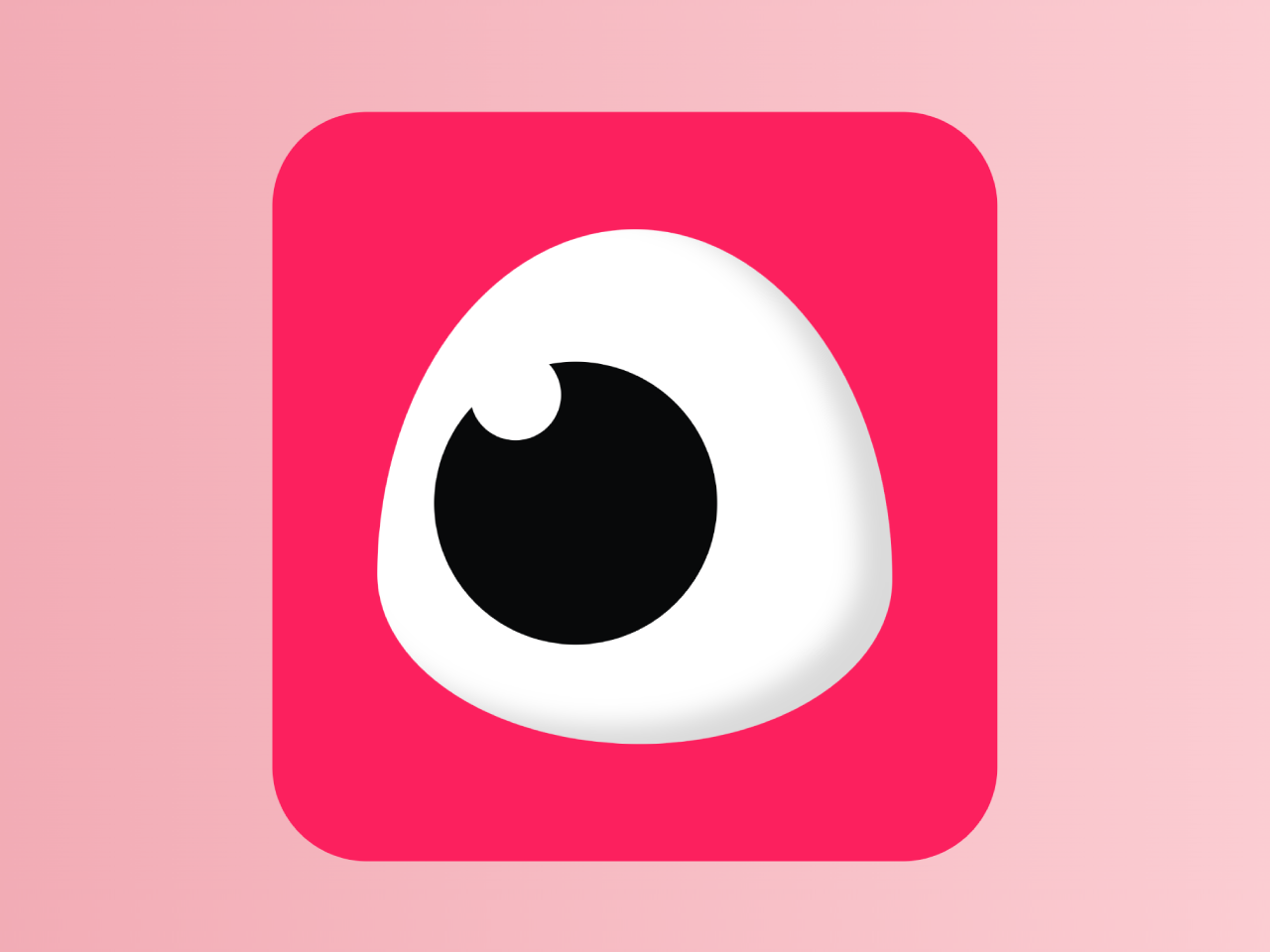

This code creates an eye blink animation using CSS. It forms a blinking eye effect. The CSS animations manipulate eye and eyelid elements to mimic blinking. It’s helpful for adding a fun visual element to a website.
This code is useful for adding a dynamic and eye-catching visual element to a website. Moreover, you can customize the animation with additional CSS according to your needs.
How to Create Eye Blink Animation Using CSS
1. Ensure you have a smooth starting point by adding the Normalize CSS library to your project. Copy and paste the following CDN link in the head section of your HTML file.
<link rel="stylesheet" href="https://cdnjs.cloudflare.com/ajax/libs/normalize/5.0.0/normalize.min.css">
2. Create a container for the animated eye using the following HTML structure:
<div class="box">
	<div class="eyeContainer">
		<div class="eyeLid">
			<div class="eyes">
				<div class="eye"></div>
			</div>
		</div>
	</div>
</div>
3. Now, copy the following CSS code into your stylesheet. This code defines the appearance and behavior of the eye blink animation. Feel free to customize the colors and dimensions according to your website’s theme.
body {
  background-color: #f7f2f2;
}

.box {
  display: flex;
  align-items: center;
  justify-content: center;
  transition: box-shadow 0.2s ease-in-out;
  display: flex;
  flex-direction: column;
  justify-content: center;
  transition: opacity 0.15s ease-in;
  background-color: #fc205e;
  height: 100%;
  width: 100%;
  margin: auto;
  margin-top: 2rem;
  width: 287px;
  height: 300px;
  padding: 3rem;
  border-radius: 50px;
}
.box .eyeContainer {
  display: flex;
  width: 80%;
  /* margin-top: 6rem; */
  justify-content: center;
}
.box .eyeContainer .eyeLid {
  text-align: center;
  display: flex;
  background-color: white;
  border-radius: 50% 50% 49% 51%/67% 68% 32% 33%;
  box-shadow: inset -17px -10px 12.5px rgba(0, 0, 0, 0.144);
  -webkit-animation-name: blink;
  -webkit-animation-duration: 15s;
  -webkit-animation-iteration-count: infinite;
  -webkit-transform-origin: 50%;
  animation-play-state: running;
}
.box:hover {
  cursor: help;
}

.eyeLid,
.eyes {
  text-align: center;
  display: flex;
  /* font-size: 0.65em; */
  width: 17rem;
  height: 17rem;
  /* background-color: black; */
}

.eye {
  position: relative;
  display: inline-block;
  border-radius: 50%;
  width: 55%;
  height: 55%;
  background-color: #08090a;
  border-radius: 50%;
  z-index: 8976;
  margin: auto;
  margin-left: 30px;
  margin-top: 70px;
  -webkit-animation-name: eyeball;
  -webkit-animation-duration: 15s;
  -webkit-animation-iteration-count: infinite;
  -webkit-transform-origin: 30%;
  animation-play-state: running;
}
.eye:after {
  /*pupil*/
  --pupil-size: 2rem;
  position: absolute;
  top: -0.4rem;
  left: 1.2rem;
  width: 3rem;
  height: 3rem;
  background: white;
  border-radius: 50%;
  content: " ";
}

@keyframes blink {
  0% {
    -webkit-transform: scaleX(1) scaleY(1);
  }
  10% {
    -webkit-transform: scaleX(1) scaleY(1);
  }
  10.5% {
    -webkit-transform: scaleX(1.3) scaleY(0.1);
  }
  11% {
    -webkit-transform: scaleX(1) scaleY(1);
  }
  40% {
    -webkit-transform: scaleX(1) scaleY(1);
  }
  40.5% {
    -webkit-transform: scaleX(1.3) scaleY(0.1);
  }
  41% {
    -webkit-transform: scaleX(1) scaleY(1);
  }
  70% {
    -webkit-transform: scaleX(1) scaleY(1);
  }
  70.5% {
    -webkit-transform: scaleX(1.3) scaleY(0.1);
  }
  71% {
    -webkit-transform: scaleX(1) scaleY(1);
  }
  100% {
    -webkit-transform: scaleX(1) scaleY(1);
  }
}
@keyframes eyeball {
  0% {
    -webkit-transform: scaleX(1) scaleY(1);
    margin-left: 30px;
    margin-top: 70px;
  }
  10% {
    -webkit-transform: scaleX(1) scaleY(1);
    margin-left: 30px;
    margin-top: 70px;
  }
  10.5% {
    -webkit-transform: scaleX(1.3) scaleY(0.1);
    margin-left: 30px;
    margin-top: 64px;
  }
  11% {
    -webkit-transform: scaleX(1) scaleY(1);
    margin-left: 30px;
    margin-top: 70px;
  }
  40% {
    -webkit-transform: scaleX(1) scaleY(1);
    margin-left: 30px;
    margin-top: 70px;
  }
  40.5% {
    -webkit-transform: scaleX(1.3) scaleY(0.1);
    margin-left: 78px;
    margin-top: 58px;
  }
  41% {
    -webkit-transform: scaleX(1) scaleY(1);
    margin-left: 78px;
    margin-top: 62px;
  }
  70% {
    -webkit-transform: scaleX(1) scaleY(1);
    margin-left: 78px;
    margin-top: 62px;
  }
  70.5% {
    -webkit-transform: scaleX(1.3) scaleY(0.1);
    margin-left: 30px;
    margin-top: 68px;
  }
  71% {
    -webkit-transform: scaleX(1) scaleY(1);
    margin-left: 30px;
    margin-top: 70px;
  }
  100% {
    -webkit-transform: scaleX(1) scaleY(1);
    margin-left: 30px;
    margin-top: 70px;
  }
}
The keyframes for both eye blinking and eyeball movement are defined in the CSS. These animations add a lifelike quality to the eye. Adjust the duration and iteration count as needed.
That’s all! hopefully, you have successfully created Eye Blink Animation Using CSS. If you have any questions or suggestions, feel free to comment below.
Similar Code Snippets:
 45+ CSS3 Image Hover Effects
- Change Text Automatically in JavaScript
- CSS Background Blur Effect


I code and create web elements for amazing people around the world. I like work with new people. New people new Experiences.
I truly enjoy what I’m doing, which makes me more passionate about web development and coding. I am always ready to do challenging tasks whether it is about creating a custom CMS from scratch or customizing an existing system.