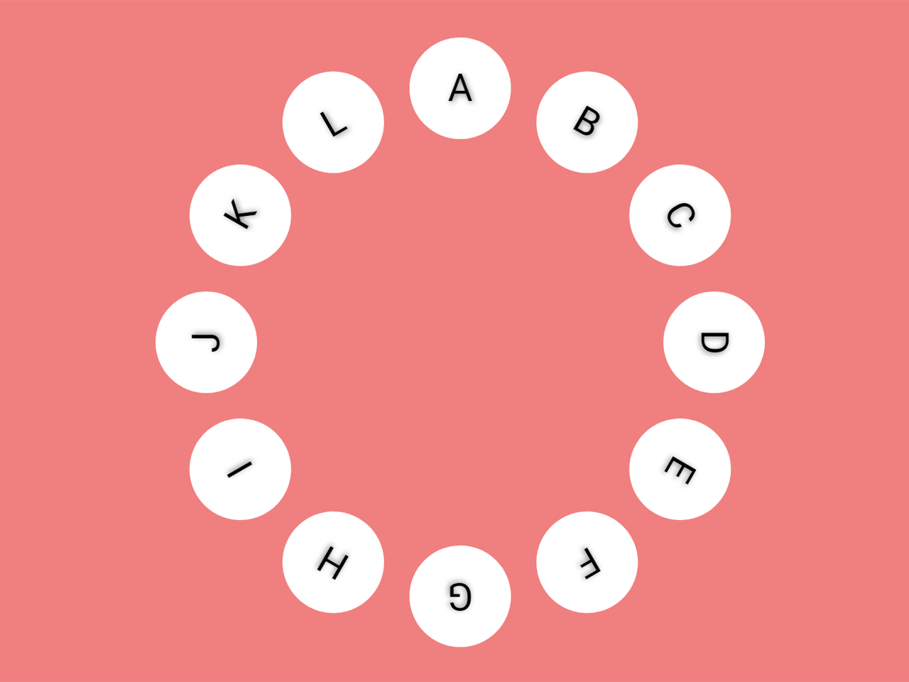

This JavaScript code snippet helps you to create rotatable circular text. Users can spin the circle with a mouse to navigate the circular text. You can use this code snippet to make rotatable menu navigation or spinable navigation.
How to Create Rotatable Circular Text using JavaScript
1. First of all, create the HTML structure as follows:
<div class="ring-wrapper">
  <div id="layer-1" class="ring layer-1">
    <div class="ring-display">
      <div class="label"><span>A</span></div>
      <div class="label"><span>B</span></div>
      <div class="label"><span>C</span></div>
      <div class="label"><span>D</span></div>
      <div class="label"><span>E</span></div>
      <div class="label"><span>F</span></div>
      <div class="label"><span>G</span></div>
      <div class="label"><span>H</span></div>
      <div class="label"><span>I</span></div>
      <div class="label"><span>J</span></div>
      <div class="label"><span>K</span></div>
      <div class="label"><span>L</span></div>
    </div>
    <div class="interaction"></div>
  </div>
</div>
2. After that, add the following CSS styles to your project:
@import url(https://fonts.googleapis.com/css?family=Lato:100,200,300,400,500,600);
html {
  width: 100%;
}

body {

  padding: 50px;
  font-family: "Lato";
  font-weight: 300;
}

.ring-wrapper {
  position: relative;
  display: block;
  width: 500px;
  height: 500px;
  margin: 0 auto;
  overflow: hidden;
}

.ring {
  display: block;
  width: 100px;
  height: 100px;
  position: absolute;
  top: 0;
  transition: transform 0.25s, box-shadow 0.25s;
  overflow: hidden;
  border-radius: 100%;
}

.ring-display {
  width: 100%;
  height: 100%;
  display: block;
  border-radius: 100%;
  overflow: hidden;
  position: absolute;
}

.interaction {
  width: 100%;
  height: 100%;
  display: block;
  border-radius: 100%;
  position: absolute;
  cursor: pointer;
}

.ring:hover + .ring {
  transition: box-shadow 0.25s;
}

.layer-1 {
  width: 500px;
  height: 500px;
  border-radius: 100%;
}

.label {
  top: 50%;
  width: 100%;
  height: 100%;
  text-align: center;
  transform-origin: 50% 0;
  position: absolute;
  //transform:rotate(0deg) translate(0, -50%);
  pointer-events: none;
  color: #000;
  text-shadow: 1px 1px 4px rgba(0, 0, 0, 0.5);
  line-height: 100px;
  font-size: 2em;
  transition: color 1s;
  -webkit-touch-callout: none;
  -webkit-user-select: none;
  -khtml-user-select: none;
  -moz-user-select: none;
  -ms-user-select: none;
  user-select: none;
}

.label span {
  display: inline-block;
  margin: 0 auto;
  width: 80px;
  height: 80px;
  line-height: 80px;
  background: #fff;
  border-radius: 50%;
}

.label:nth-child(1) {
  transform: rotate(0deg) translate(0, -50%);
  //transform: rotate(360deg) translate(0, -50%);
}

.label:nth-child(2) {
  transform: rotate(30deg) translate(0, -50%);
}

.label:nth-child(3) {
  transform: rotate(60deg) translate(0, -50%);
}

.label:nth-child(4) {
  transform: rotate(90deg) translate(0, -50%);
}

.label:nth-child(5) {
  transform: rotate(120deg) translate(0, -50%);
}

.label:nth-child(6) {
  transform: rotate(150deg) translate(0, -50%);
}

.label:nth-child(7) {
  transform: rotate(180deg) translate(0, -50%);
}

.label:nth-child(8) {
  transform: rotate(210deg) translate(0, -50%);
}

.label:nth-child(9) {
  transform: rotate(240deg) translate(0, -50%);
}

.label:nth-child(10) {
  transform: rotate(270deg) translate(0, -50%);
}

.label:nth-child(11) {
  transform: rotate(300deg) translate(0, -50%);
}

.label:nth-child(12) {
  transform: rotate(330deg) translate(0, -50%);
}
3. Finally, add the following JavaScript code and done.
circle('layer-1');

            function circle(id) {

                var el = document.getElementById(id);

                var elDisplay = el.children[0];
                var elInteraction = el.children[1];

                var offsetRad = null;
                var targetRad = 0;
                var previousRad;


                try {
                    elInteraction.addEventListener('mousedown', down);
                }
                catch (err) {
                    console.log("Interaction not found");
                }

                function down(event) {
                    offsetRad = getRotation(event);
                    previousRad = offsetRad;
                    window.addEventListener('mousemove', move);
                    window.addEventListener('mouseup', up);
                }

                function move(event) {

                    var newRad = getRotation(event);
                    targetRad += (newRad - previousRad);
                    previousRad = newRad;
                    elDisplay.style.transform = 'rotate(' + (targetRad / Math.PI * 180) + 'deg)';
                }

                function up() {
                    window.removeEventListener('mousemove', move);
                    window.removeEventListener('mouseup', up);
                }

                function getRotation(event) {
                    var pos = mousePos(event, elInteraction);
                    var x = pos.x - elInteraction.clientWidth * .5;
                    var y = pos.y - elInteraction.clientHeight * .5;
                    return Math.atan2(y, x);
                }

                function mousePos(event, currentElement) {
                    var totalOffsetX = 0;
                    var totalOffsetY = 0;
                    var canvasX = 0;
                    var canvasY = 0;

                    do {
                        totalOffsetX += currentElement.offsetLeft - currentElement.scrollLeft;
                        totalOffsetY += currentElement.offsetTop - currentElement.scrollTop;
                    }
                    while (currentElement = currentElement.offsetParent)

                    canvasX = event.pageX - totalOffsetX;
                    canvasY = event.pageY - totalOffsetY;

                    return {
                        x: canvasX,
                        y: canvasY
                    };
                }
            }
That’s all! hopefully, you have successfully integrated this rotatable circular text code snippet into your project. If you have any questions or facing any issues, feel free to comment below.
Similar Code Snippets:

- Squishy Toggle Buttons Using Pure CSS
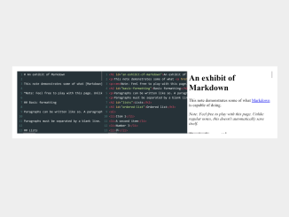
- Live Markdown Editor With Preview Using Codemirror JS
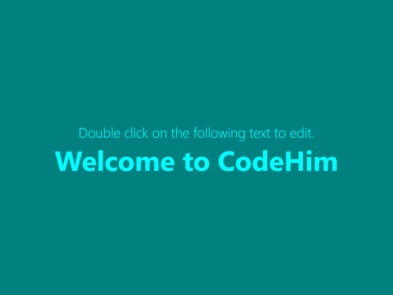
- Contenteditable on Double Click in JavaScript
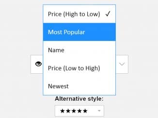
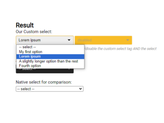
- Custom Select Dropdown CSS Only
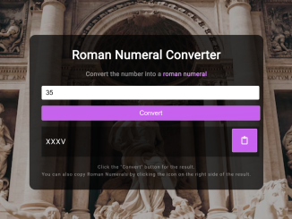
- Roman Numeral Converter Using JavaScript

I code and create web elements for amazing people around the world. I like work with new people. New people new Experiences.
I truly enjoy what I’m doing, which makes me more passionate about web development and coding. I am always ready to do challenging tasks whether it is about creating a custom CMS from scratch or customizing an existing system.