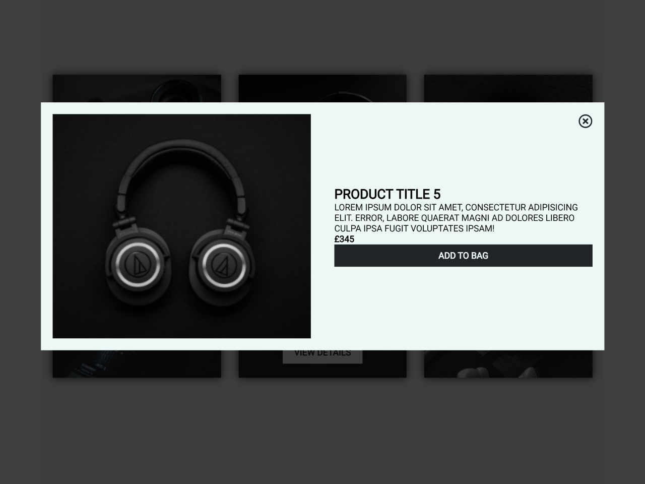

This code snippet helps you to create a responsive product card with a quick view product preview popup effect. It uses CSS to create a grid layout for the product cards and to display the product preview popup. It also uses JavaScript to handle the events that trigger the popup and to close the popup.
The product preview popup is hidden by default. It is displayed when the user clicks on the product view button and it is hidden when the user clicks on the close button or clicks anywhere outside of the popup.
Moreover, you can use this code to create a visually appealing and engaging way to display products on a website. The quick-view product preview popup allows users to view more information about a product without having to leave the current page.
How to Create Responsive Product Card With Quick View Product Preview Popup Effect
1. First of all, load the Font Awesome CSS (for icons) by adding the following CDN link into the head tag of your HTML document.
<link rel='stylesheet' href='https://cdnjs.cloudflare.com/ajax/libs/font-awesome/5.13.1/css/all.min.css'>
2. Create a container for your product grid. Inside the container, define individual product elements using the provided HTML code. Each product element includes an image and a “View Details” button.
<div class="container">

  <div class="product">

    <div class="product__list">
      <img class="product__img" src="https://i.ibb.co/Nsn88qm/img1.jpg" alt="">
      <span class="product__viewBtn">view details</span>
    </div>

    <div class="product__list">
      <img class="product__img" src="https://i.ibb.co/68H9LJb/img2.jpg" alt="">
      <span class="product__viewBtn">view details</span>
    </div>

    <div class="product__list">
      <img class="product__img" src="https://i.ibb.co/xD92MfK/img3.jpg" alt="">
      <span class="product__viewBtn">view details</span>
    </div>

    <div class="product__list">
      <img class="product__img" src="https://i.ibb.co/XkkwpZ9/img4.jpg" alt="">
      <span class="product__viewBtn">view details</span>
    </div>

    <div class="product__list">
      <img class="product__img" src="https://i.ibb.co/Yk3mk8H/img5.jpg" alt="">
      <span class="product__viewBtn">view details</span>
    </div>

    <div class="product__list">
      <img class="product__img" src="https://i.ibb.co/tmPwKS7/img6.jpg" alt="">
      <span class="product__viewBtn">view details</span>
    </div>

  </div>

  <div class="modal"></div>

  <div class="modal__content">

    <i class="modal__close far fa-times-circle"></i>

    <div class="modal__left">
      <img class="modal__img" src="" alt="">
    </div>

    <div class="modal__right">
      <div class="detail">
        <h2 class="detail__title"></h2>
        <p class="detail__description">Lorem ipsum dolor sit amet, consectetur adipisicing elit. Error, labore quaerat
          magni ad dolores libero culpa ipsa fugit voluptates ipsam!</p>
        <p class="detail__price"></p>
        <p class="detail__bagBtn">add to bag</p>
      </div>
    </div>

  </div>


</div>
Adjust the product information according to your needs. Modify the product images, titles, descriptions, and prices in the HTML and JavaScript sections to match your specific product details.
3. Now, add the following CSS code to style the product grid, cards, and modal. This includes responsive design considerations for different screen sizes.
html {
  box-sizing: border-box;
  font-family: "Nunito Sans", sans-serif;
  font-weight: lighter;
}

body {
  margin: 0;
}

*,
*:before,
*:after {
  box-sizing: inherit;
}

.container {
  display: flex;
  justify-content: center;
  align-items: center;
  height: 100vh;
  background: #edf7f6;
}

.product {
  display: grid;
  grid-template-columns: repeat(3, 1fr);
  grid-template-rows: repeat(2, 1fr);
  gap: 20px 30px;
  padding: 20px;
  max-width: 960px;
}
.product__list {
  position: relative;
  display: flex;
  justify-content: center;
  align-items: center;
  box-shadow: 0 0 15px 0 #212527;
  transition: all 250ms ease-in-out;
}
.product__list:after {
  content: "";
  position: absolute;
  top: 0;
  display: block;
  height: 100%;
  width: 100%;
  background-color: #3e363f;
  opacity: 0;
  transition: all 500ms ease-in-out;
}
.product__list:hover:after {
  opacity: 0.5;
}
.product__list:hover > .product__viewBtn {
  visibility: visible;
  opacity: 1;
  z-index: 1;
}
.product__img {
  width: 100%;
}
.product__viewBtn {
  cursor: pointer;
  position: absolute;
  bottom: 10%;
  background: #212527;
  color: #edf7f6;
  padding: 10px 20px;
  font-weight: bold;
  text-align: center;
  text-transform: uppercase;
  opacity: 0;
  visibility: hidden;
  transition: all 250ms ease-in-out;
}
.product__viewBtn:hover {
  color: #212527;
  background: #edf7f6;
}

.modal {
  display: flex;
  justify-content: center;
  align-items: center;
  position: fixed;
  top: 0;
  height: 100%;
  width: 100%;
  background: rgba(0, 0, 0, 0.75);
  transition: all 250ms ease-in-out;
  opacity: 0;
  visibility: hidden;
}
.modal--bg {
  visibility: visible;
  opacity: 1;
  z-index: 1;
}
.modal__content {
  position: absolute;
  display: flex;
  justify-content: center;
  align-items: center;
  display: grid;
  grid-template-columns: repeat(2, 1fr);
  max-height: 540px;
  max-width: 960px;
  background-color: #edf7f6;
  visibility: hidden;
  opacity: 0;
  transform: translateY(-100px);
  transition: all 250ms ease-in-out;
}
.modal__content--show {
  transform: translateY(0);
  visibility: visible;
  opacity: 1;
  z-index: 2;
}
.modal__img {
  width: 100%;
}
.modal__close {
  position: absolute;
  top: 20px;
  right: 20px;
  font-size: 24px;
  color: #212527;
  cursor: pointer;
  transition: all 250ms ease-in-out;
  z-index: 3;
}
.modal__close:hover {
  color: #df4747;
}
.modal__left, .modal__right {
  display: flex;
  justify-content: center;
  align-items: center;
  padding: 20px;
}

.detail__title, .detail__description {
  text-transform: uppercase;
}
.detail__price {
  font-weight: bold;
}
.detail__bagBtn {
  cursor: pointer;
  background: #212527;
  color: #edf7f6;
  text-align: center;
  padding: 10px 20px;
  font-weight: bold;
  text-transform: uppercase;
  transition: all 250ms ease-in-out;
}
.detail__bagBtn:hover {
  color: #47df5b;
}

@media (max-width: 600px) {
  .product {
    display: grid;
    grid-template-columns: repeat(2, 1fr);
    grid-template-rows: repeat(3, 1fr);
    min-width: 400px;
  }

  .modal__content {
    display: flex;
    justify-content: center;
    align-items: center;
    flex-direction: column;
    text-align: center;
  }
  .modal__content--show {
    max-height: 100%;
    min-width: 400px;
  }
  .modal__left {
    margin-top: 40px;
  }
}
.social {
  position: absolute;
  left: 20px;
  display: grid;
  grid-template-columns: repeat(3, 1fr);
  justify-items: center;
  align-items: center;
  height: 50px;
  width: 200px;
}
.social__icon {
  font-size: 50px;
  color: #212527;
  padding: 0 10px;
  transition: all 250ms ease-in-out;
}
.social__icon:hover {
  cursor: pointer;
  color: #df4747;
}
4. Finally, copy the JavaScript code into your project. This code handles the logic for displaying and hiding the modal, updating the modal content with product details, and responding to user interactions.
const modal = document.querySelector('.modal');
const modalContent = document.querySelector('.modal__content');
const close = document.querySelector('.modal__close');
const modalImg = document.querySelector('.modal__img');
const productList = document.querySelectorAll('.product__list');
const title = document.querySelector('.detail__title');
const cost = document.querySelector('.detail__price');

const productCost = ['£395', '£245', '£195', '£295', '£345', '£455'];

productList.forEach((list, index) => {
  const view = list.querySelector('.product__viewBtn');
  const productImg = list.querySelector('.product__img').getAttribute('src');

  view.addEventListener('click', () => {
    modal.classList.add('modal--bg');
    modalContent.classList.add('modal__content--show');
    modalImg.setAttribute('src', productImg);
    title.innerText = `product title ${index + 1}`;
    cost.innerText = productCost[index];
  });
});

close.addEventListener('click', () => {
  modal.classList.remove('modal--bg');
  modalContent.classList.remove('modal__content--show');
});

modal.addEventListener('click', () => {
  modal.classList.remove('modal--bg');
  modalContent.classList.remove('modal__content--show');
});
That’s all! hopefully, you have successfully created a product grid layout with a quick view modal on your website. If you have any questions or suggestions, feel free to comment below.
Similar Code Snippets:

- JavaScript Modal Popup Code with Example
- Modal Window Using JavaScript


I code and create web elements for amazing people around the world. I like work with new people. New people new Experiences.
I truly enjoy what I’m doing, which makes me more passionate about web development and coding. I am always ready to do challenging tasks whether it is about creating a custom CMS from scratch or customizing an existing system.