
This code creates animated server error modals using CSS. Each modal represents a different HTTP error code. It uses CSS animations to display dynamic visuals for each error, making error handling more engaging and intuitive.
You can use this code on your website to enhance user experience during server errors. It provides visually appealing error modals, improving user engagement and retention. With CSS animations, it simplifies error handling and adds a touch of interactivity to your website.
How to Create Animated Server Error Modals Using CSS
1. Begin by creating the HTML structure for your error modals. Each modal will contain elements representing different HTTP error codes (e.g., 400, 401, 403, 404, 500).
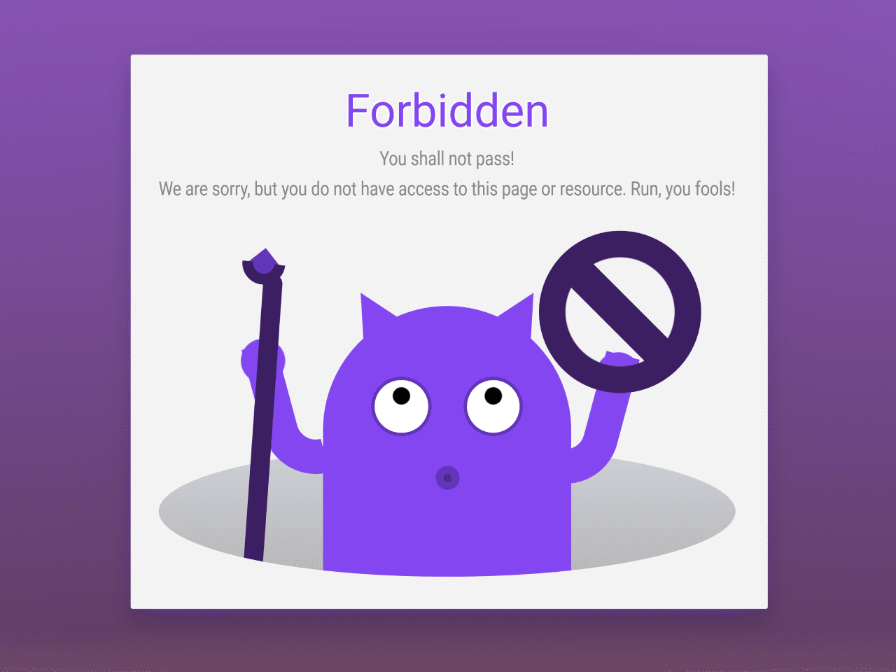
<div class="content">
	<div class="modal-links">
		<div class="modal-link e-400">
			<span class="modal-button">400</span>
			<input type="checkbox" class="modal-launcher">
			<div class="modal-window">
				<h2>Bad Request</h2>
				<p>The request is malformed.</p>
				<p>The client’s HTTP request does not conform to the HTTP protocol’s standards. Please, check it.</p>
				<div class="demon">
					<div class="hole"></div>
					<div class="cartel">
						https://www.domain.com/%%%400_bad_request_error/
					</div>
					<div class="body"></div>
					<div class="arms"></div>
					<div class="eyes"></div>
					<div class="mouth"></div>
					<div class="horns"></div>
				</div>
			</div>
			<div class="modal-overlay"></div>
		</div>
		<div class="modal-link e-401">
			<span class="modal-button">401</span>
			<input type="checkbox" class="modal-launcher">
			<div class="modal-window">
				<h2>Unauthorized</h2>
				<p>This page isn't working.</p>
				<p>Sorry, but you are not authorized. Access is allowed only for registerd users.</p>
				<div class="demon">
					<div class="hole"></div>
					<div class="key"></div>
					<div class="login"></div>
					<div class="body"></div>
					<div class="arms"></div>
					<div class="eyes"></div>
					<div class="mouth"></div>
					<div class="horns"></div>
				</div>
			</div>
			<div class="modal-overlay"></div>
		</div>
		<div class="modal-link e-403">
			<span class="modal-button">403</span>
			<input type="checkbox" class="modal-launcher">
			<div class="modal-window">
				<h2>Forbidden</h2>
				<p>You shall not pass!</p>
				<p>We are sorry, but you do not have access to this page or resource. Run, you fools!</p>
				<div class="demon">
					<div class="hole"></div>
					<div class="prohibited"></div>
					<div class="body"></div>
					<div class="arms"></div>
					<div class="eyes"></div>
					<div class="mouth"></div>
					<div class="horns"></div>
				</div>
			</div>
			<div class="modal-overlay"></div>
		</div>
		<div class="modal-link e-404">
			<span class="modal-button">404</span>
			<input type="checkbox" class="modal-launcher">
			<div class="modal-window">
				<h2>Not Found</h2>
				<p>Sorry, nothing found.</p>
				<p>The requested resource has been deleted or moved to a different location.</p>
				<div class="demon">
					<div class="hole"></div>
					<div class="loupe"></div>
					<div class="body"></div>
					<div class="arms"></div>
					<div class="eyes"></div>
					<div class="mouth"></div>
					<div class="horns"></div>
				</div>
			</div>
			<div class="modal-overlay"></div>
		</div>
		<div class="modal-link e-500">
			<span class="modal-button">500</span>
			<input type="checkbox" class="modal-launcher">
			<div class="modal-window">
				<h2>Internal Server Error</h2>
				<p>Something were wrong at our end.</p>
				<p>Don't worry, it's not you - it's us.</p>
				<p>Sorry about that.</p>
				<div class="demon">
					<div class="hole"></div>
					<div class="cable left">
						<div class="hand"></div>
					</div>
					<div class="cable right">
						<div class="hand"></div>
					</div>
					<div class="body"></div>
					<div class="arms"></div>
					<div class="eyes"></div>
					<div class="mouth"></div>
					<div class="horns"></div>
				</div>
			</div>
			<div class="modal-overlay"></div>
		</div>
	</div>
</div>
2. Apply CSS styles to customize the appearance of error modals and their components, such as buttons, text, and animations. Utilize CSS animations to create dynamic effects for each error code.
@import url('https://fonts.googleapis.com/css2?family=Varela+Round&display=swap');

:root {
	--dm1: #f0464d;
	--dm2: #b8343a;
	--dm3: #631e24;
	--ellastic: linear(0 0%, 0 2.27%, 0.02 4.53%, 0.04 6.8%, 0.06 9.07%, 0.1 11.33%, 0.14 13.6%, 0.25 18.15%, 0.39 22.7%, 0.56 27.25%, 0.77 31.8%, 1 36.35%, 0.89 40.9%, 0.85 43.18%, 0.81 45.45%, 0.79 47.72%, 0.77 50%, 0.75 52.27%, 0.75 54.55%, 0.75 56.82%, 0.77 59.1%, 0.79 61.38%, 0.81 63.65%, 0.85 65.93%, 0.89 68.2%, 1 72.7%, 0.97 74.98%, 0.95 77.25%, 0.94 79.53%, 0.94 81.8%, 0.94 84.08%, 0.95 86.35%, 0.97 88.63%, 1 90.9%, 0.99 93.18%, 0.98 95.45%, 0.99 97.73%, 1 100%);
}

body {
	font-family: "Varela Round", sans-serif;
	font-size: 1em;
	margin: 0;

}
.content {
	text-align: center;
	position: relative;
	height: 100vh;
	display: flex;
	align-items: center;
	justify-content: center;
	flex-direction: column;
}

.content:before,
.content:after {
	content: "YOUR ERROR";
	position: absolute;
	margin-top: -6em;
	width: 100vw;
	left: 0;
	font-size: 1.85em;
	color: var(--dm3);
	transition: all 0.5s ease 0s;
	text-shadow: 0 0px 0px #f1f1f185, 0 -1px 1px #0008, 0 1px 1px #fff8;
}

.content:after {
	content: "RIGHT HERE";
	margin-top: 6.5em;
}

.content:has(.modal-link:hover):before,
.content:has(.modal-link:hover):after {
	color: #fffe;
}

.content:has(.modal-link.e-400:hover):before,
.content:has(.modal-link.e-400:hover):after {
	color: #b87b34;
}
.content:has(.modal-link.e-401:hover):before,
.content:has(.modal-link.e-401:hover):after {
	color: #29b473;
}
.content:has(.modal-link.e-403:hover):before,
.content:has(.modal-link.e-403:hover):after {
	color: #6234b8;
}
.content:has(.modal-link.e-404:hover):before,
.content:has(.modal-link.e-404:hover):after {
	color: #3457b8
}
.content:has(.modal-link.e-500:hover):before,
.content:has(.modal-link.e-500:hover):after {
	color: #b8343a
}

.modal-link {
	position: relative;
	display: inline-block;
}

.modal-button {
	position: relative;
	text-decoration: none;
	margin: 0.15em;
	display: inline-block;
	padding: 0.25em 0.65em;
	border-radius: 10px;
	transition: all 0.2s ease 0s;
	background: var(--dm1);
	outline: none;
	cursor: pointer;
	color: #fffe;
	font-size: 2em;
	border-bottom: 5px solid var(--dm2);
	box-shadow: 0px 6px 6px -3px var(--dm1);
	text-shadow: 0 -1px 1px var(--dm3), 0 1px 1px var(--dm2);
}

.modal-link:hover .modal-button {
	box-shadow: 0px 0px 2px var(--dm3), 0px 1px 2px var(--dm3), 0px 0px 35px 0px var(--dm1);
	border-bottom: 1px solid var(--dm3);
	text-shadow: 0px 0px 2px var(--dm1), 0px 0px 1px var(--dm1);
	transform: translateY(4px);
	transition: all 0.2s ease 0s;
	/*margin: 4px auto 0 auto;*/
	background: var(--dm2);
	transition: all 0.2s ease 0s;
	color: #fff;
	text-shadow: 0 2px 2px var(--dm3), 0 -2px 2px var(--dm1);
}

.modal-link:active .modal-button {
	color: #fff;
	text-shadow: 0 0 1px #fff, 0 0 3px #fff, 0 0 5px #fff;
	box-shadow: 2px 2px 2px #ffffff4a, 0px 0px 35px 0px #ffffff;
}

input.modal-launcher {
	position: absolute;
	width: 100%;
	height: 100%;
	left: 0;
	top: 0;
	margin: 0;
	opacity: 0;
	cursor: pointer;
}

input.modal-launcher:checked {
	position: fixed;
	width: 30px;
	height: 30px;
	width: 100%;
	height: 100%;
	right: 0;
	top: 0;
	z-index: 3;
	left: inherit;
}

.modal-window {
	cursor: default;
	background: #F3F3F3;
	box-shadow: 0px 5px 20px -10px var(--dm1), 0 1vmin 2vmin 0 #0004;
	position: fixed;
	z-index: 333;
	padding: 1.75em 2em 2em 1.75em;
	border-radius: 2px;
	box-sizing: border-box;
	margin-top: 150vh;
	text-align: justify;
	left: 50%;
	top: 50%;
	transform: translate(-50%, -50%);
	color: #353535;
	transition: all 1s var(--ellastic) 0s;
	min-width: 51vmin;
}

.modal-window h2 {
	color: var(--dm1);
	margin-top: 0;
	margin-bottom: 1vmin;
	text-align: center;
	font-size: 4.25vmin;
	font-weight: normal;
	text-shadow: -1px -1px 1px #fff, 1px 1px 1px #fff, 1px 1px 2px #fff;
}

.modal-window p {
	margin: 1vmin 0 0 0;
	text-align: center;
	color: #858585;
	transform: scaleY(1.2);
}

.modal-overlay {
	background: linear-gradient(180deg, var(--dm1), var(--dm2), var(--dm3), #fff0);
	position: fixed;
	left: 0;
	top: 0;
	z-index: 1;
	width: 100%;
	height: 150vh;
	cursor: default;
	margin-top: -200vh;
	opacity: 0.8;
	transition: all 1s var(--ellastic) 0s;
}

.modal-overlay:before, .modal-overlay:after {
	background: var(--dm3);
	position: fixed;
	width: 1em;
	height: 1em;
	right: 0.375em;
	top: 0.375em;
	content: "";
	line-height: 1.5em;
	font-weight: bold;
	color: var(--dm1);
	font-size: 2em;
	line-height: 1em;
	border-radius: 2px;
	margin-top: -100vh;
	transition: all 0.5s ease 0s;
}

.modal-overlay:after {
	content: "x";
	transform: rotate(45deg);
	border-radius: 100%;
	background: transparent;
}

input.modal-launcher:checked + .modal-window,
input.modal-launcher:checked + .modal-window + .modal-overlay,
input.modal-launcher:checked + .modal-window + .modal-overlay:before,
input.modal-launcher:checked + .modal-window + .modal-overlay:after  {
	margin-top: 0;
}

input.modal-launcher:checked:hover + .modal-window + .modal-overlay:before {
	background: #fff;
}


@media (max-width:767px){
	.modal-window {
		width: 70%;
	}
}

@media (max-width:480px){
	.modal-window {
		width: 90%;
	}
}


.demon {
	background: #f0f0;
	width: 100%;
	height: 32vmin;
	position: relative;
	overflow: hidden;
	border-radius: 0 0 50% 50% / 0 0 19% 19%;
	display: flex;
	align-items: flex-end;
	justify-content: center;
	margin-top: 3vmin;
}

.demon * {
	position: absolute;
}

.hole {
	background: linear-gradient(180deg, #cdd0d9, #b7b7b7);
	width: 100%;
	height: 12vmin;
	border-radius: 100%;
	bottom: 0;
}

.body {
	background: var(--dm1);
	width: 23vmin;
	height: 25vmin;
	z-index: 1;
	border-radius: 13vmin 13vmin 0 0;

}

/*input:checked + .modal-window h2,*/
/*input:checked + .modal-window p,*/
input:checked + .modal-window .demon * {
	animation: jump 1s var(--ellastic) 0.75s 1;
	animation-fill-mode: forwards;
}

input:checked + .modal-window .demon .hole {
	animation: none;
}

input:checked + .modal-window h2 {
	animation-delay: 0.85s;
}
/*
input:checked + .modal-window p {
animation-delay: 0.7s;
}
*/


.eyes {
	width: 14vmin;
	height: 5.5vmin;
	bottom: 13vmin;
	z-index: 2;
}

.eyes:before, .eyes:after {
	content: "";
	position: absolute;
	width: 5.5vmin;
	height: 5.5vmin;
	background: radial-gradient(circle at 50% 30%, #000 0.75vmin, #fff calc(0.75vmin + 1px));
	border: 0.35vmin solid var(--dm2);
	border-radius: 100%;
	box-sizing: border-box;
}

.eyes:after {
	right: 0;;
}


.arms {
	background: radial-gradient(circle at 2.65vmin 2.1vmin, var(--dm1) 2vmin, #fff0 calc(2vmin + 1px) 100%), radial-gradient(circle at calc(100% - 2.65vmin) 2.1vmin, var(--dm1) 2vmin, #fff0 calc(2vmin + 1px) 100%);
	width: 34vmin;
	height: 22vmin;
	z-index: 0;
}

.arms:before, .arms:after {
	content: "";
	position: absolute;
	width: 5vmin;
	height: 13vmin;
	background: #f3f0;
	border: 3.25vmin solid var(--dm1);
	border-top-width: 0;
	border-top-color: #fff0;
	border-right-width: 0;
	border-radius: 0 0 0 10vmin;
	top: 1vmin;
	left: 1vmin;
}

.arms:after {
	right: 1vmin;
	left: inherit;
	border-right-width: 3.25vmin;
	border-left: 0;
	border-radius: 0 0 10vmin 0;
}


.mouth {
	width: 2.2vmin;
	height: 2.2vmin;
	background: radial-gradient(circle at 50% 4.25vmin, pink 2.5vmin, #0006 calc(2.5vmin + 1px));
	border-radius: 100%;
	border: 0.75vmin solid var(--dm2);
	bottom: 8vmin;
	z-index: 1;
}


.horns {
	background: #fff0;
	width: 18vmin;
	height: 4vmin;
	bottom: 22.5vmin;
}

.horns:before, .horns:after {
	content: "";
	position: absolute;
	border: 2vmin solid #f3f2;
	border-color: #fff0 #fff0 var(--dm1) #fff0;
	border-width: 0 2vmin 4vmin 2vmin;
	transform: rotate(-30deg);
}

.horns:after {
	transform: rotate(30deg);
	right: 0;
}


.cable {
	background: #0ff0;
	width: 6vmin;
	height: 14.5vmin;
	margin-left: -29.8vmin;
	border-left: 1vmin solid var(--dm3);
	border-top: 1vmin solid var(--dm3);
	z-index: 1;
	border-radius: 3vmin 0 0 0;
}

.cable:before {
	content: "";
	position: absolute;
	width: 8vmin;
	height: 4vmin;
	left: -0.5vmin;
	top: calc(-6vmin + 1px);
	border: 1vmin solid var(--dm3);
	border-left: 0 solid #fff0;
	z-index: 1;
	border-radius: 1px 3vmin 3vmin 1px;
	clip-path: polygon(0 0, 100% 0, 100% 100%, 70% 100%, 70% 70%, 0 20%);
}

.cable:after {
	content: "";
	position: absolute;
	width: 3.75vmin;
	height: 4vmin;
	left: -3vmin;
	top: -7.4vmin;
	background:
		linear-gradient(90deg, #fff0 1.35vmin, var(--dm3) calc(1.35vmin + 1px)),
		linear-gradient(180deg, #fff0 1vmin, var(--dm3) calc(1vmin + 1px) 1.5vmin, #fff0 0 100%),
		linear-gradient(0deg, #fff0 1vmin, var(--dm3) calc(1vmin + 1px) 1.5vmin, #fff0 0 100%);
	border-radius: 0 1vmin 1vmin 0;
	background-repeat: no-repeat;
	background-size: 100% 100%, 90% 100%, 90% 100%;
	background-position: 0 0, 100% 0, 100% 0;
}

.cable.right {
	margin-right: -29.8vmin;
	margin-left: inherit;
	transform: rotateY(180deg);
}

.cable.right:after {
	width: 4vmin;
	border-radius: 100%;
	right: 5vmin;
	left: inherit;
	transform: rotateY(180deg);
	background: radial-gradient(circle at 50% 68%, #fff 0 0.3vmin, #fff0 calc(0.3vmin + 1px) 100%), radial-gradient(circle at 50% 32%, #fff 0 0.35vmin, #fff0 calc(0.35vmin + 1px) 100%), var(--dm3);
}


.hand {
	width: 4vmin;
	height: 4vmin;
	background: var(--dm1);
	border-radius: 100%;
	top: -7.5vmin;
	z-index: 2;
	left: 1.1vmin;
}

.cable.left .hand:before {
	width: 2vmin;
	height: 0.5vmin;
	background: var(--dm3);
	content: "";
	position: absolute;
	border-radius: 0.5vmin 0 0 0.5vmin;
	left: -4vmin;
	top: 1.25vmin;
	box-shadow: 0 1.4vmin 0 var(--dm3);
}


@keyframes jump {
	0% { margin-bottom: -3vmin; }
	100% { margin-bottom: 0; }
}


.modal-links {
	display: flex;
	flex-wrap: wrap;
	justify-content: center;
}

.cartel {
	background: var(--dm2);
	color: #fff;
	bottom: 18.5vmin;
	z-index: 3;
	transform: rotate(-10deg);
	padding: 0.5vmin 0.6vmin;
	border-radius: 1vmin;
	font-size: 2.25vmin;
}

.cartel:before {
	content: "%%";
	background: var(--dm3);
	color: var(--dm1);
	position: absolute;
	left: calc(50% - 3vmin);
	padding: 0 1.1vmin;
}

.modal-link.e-400 {
	--dm1: #f08a46;
	--dm2: #b87b34;
	--dm3: #633a1e;
}

.modal-link.e-404 {
	--dm1: #4682f0;
	--dm2: #3457b8;
	--dm3: #1e2b63;
}

.modal-link.e-403 {
	--dm1: #8246f0;
	--dm2: #6234b8;
	--dm3: #3c1e63;
}

.modal-link.e-401 {
	--dm1: #24d683;
	--dm2: #29b473;
	--dm3: #1e634c;
}


.loupe {
	background: radial-gradient(circle at 50% 50%, #fff0 3.5vmin, var(--dm3) calc(3.5vmin + 1px));
	width: 11vmin;
	height: 11vmin;
	margin-left: -8.5vmin;
	bottom: 10.3vmin;
	z-index: 3;
	border-radius: 100%;
}

.loupe:before {
	content: "";
	position: absolute;
	background: var(--dm3);
	width: 2vmin;
	height: 12vmin;
	border-radius: 1vmin;
	transform: rotate(-64deg);
	left: -5vmin;
	top: -5vmin;
}


.e-404 .arms {
	background: radial-gradient(circle at 2.65vmin 2.1vmin, var(--dm1) 2vmin, #fff0 calc(2vmin + 1px) 100%);
}
.e-404 .arms:after {
	transform: rotatex(180deg) rotate(35deg);
	transform-origin: 50% 80%;
}

.e-404 .eyes:before {
	transform: scale(1.25);
}


.prohibited {
	width: 15vmin;
	height: 15vmin;
	background: linear-gradient(45deg, #fff0 0 9vmin, var(--dm3) 0 12vmin, #fff0 11vmin 100%), radial-gradient(#fff0 5vmin, var(--dm3) calc(5vmin + 1px));
	z-index: 3;
	border-radius: 100%;
	margin-left: 32vmin;
	bottom: 17vmin;
}

.prohibited:before {
	content: "";
	position: absolute;
	width: 1.75vmin;
	height: 28vmin;
	background: var(--dm3);
	border-radius: 1vmin;
	left: -26.5vmin;
	top: 4vmin;
	transform: rotate(4deg);
}

.prohibited:after {
	content: "";
	position: absolute;
	width: 4vmin;
	height: 4vmin;
	background: radial-gradient(ellipse at 48% 51%, var(--dm2) 1.5vmin, #fff0 calc(1.5vmin + 1px));
	background-repeat: no-repeat;
	border-radius: 3vmin 3vmin;
	left: -27.5vmin;
	top: 1vmin;
	transform: rotate(-38deg);
	border: 1vmin solid #fff0;
	border-bottom-color: var(--dm3);
	border-left-color: var(--dm3);
}


.e-403 .arms {
	background: radial-gradient(circle at 3vmin 2vmin, var(--dm1) 2vmin, #fff0 calc(2vmin + 1px) 100%), radial-gradient(circle at calc(100% - 4.2vmin) 3.25vmin, var(--dm1) 2vmin, #fff0 calc(2vmin + 1px) 100%);
	width: 40vmin;
}

.e-403 .arms:before {
	transform: rotate(-15deg);
	transform-origin: 0% 0%
}

.e-403 .arms:after {
	transform: rotate(15deg);
	transform-origin: 30% 0%;
	right: 2vmin;
}


.login {
	background: repeating-linear-gradient(180deg, var(--dm1) 0 0.5vmin, #fff0 calc(0.5vmin + 1px) 2vmin, #fff0 calc(2vmin + 1px) calc(2vmin + 2px)), var(--dm2);
	width: 18vmin;
	height: 11vmin;
	z-index: 2;
	margin-left: 26vmin;
  bottom: 19.5vmin;
	transform: rotate(10deg);
	border-radius: 1vmin;
	background-size: 40% 70%;
	background-repeat: no-repeat;
	background-position: 85% 70%;
}

.login:before {
	content: "";
	position: absolute;
	background: var(--dm1);
	width: 4vmin;
	height: 4vmin;
	left: 3vmin;
	top: 1.5vmin;
	border-radius: 100%;
}


.login:after {
	content: "";
	position: absolute;
	background: var(--dm1);
	width: 6vmin;
	height: 4vmin;
	left: 2vmin;
	top: 5.5vmin;
	border-radius: 100% 100% 10% 10%;
}

.key {
	background: radial-gradient(circle at 77% 50%, #fff0 0.5vmin, var(--dm3) calc(0.5vmin + 1px) 2.5vmin, #fff0 calc(2.5vmin + 1px) 100%);
	width: 12vmin;
	height: 6vmin;
	z-index: 3;
	margin-left: -35vmin;
	bottom: 21vmin;
	transform: rotate(45deg);
}

.key:before {
	content: "";
	position: absolute;
	width: 65%;
	height: 50%;
	background: conic-gradient(from -45deg at 38% 90%, var(--dm3) 0 25%, #fff0 0 100%), conic-gradient(from -45deg at 62% 75%, var(--dm3) 0 25%, #fff0 0 100%), conic-gradient(from -45deg at 80% 85%, var(--dm3) 0 25%, #fff0 0 100%), conic-gradient(from -45deg at 20% 80%, var(--dm3) 0 25%, #fff0 0 100%);
	top: 1vmin;
	background-repeat: no-repeat;
	border-radius: 0.5vmin 0 0;
}
Add JavaScript functionality if desired to enhance interactivity, such as closing the modals or providing additional error information.
Test your error modals across different browsers and devices to ensure compatibility and responsiveness. Make any necessary adjustments to improve user experience.
That’s all! hopefully, you have successfully created Animated Server Error Modals on your website. If you have any questions or suggestions, feel free to comment below.
Similar Code Snippets:

- Responsive Product Card with Quick View Product Preview Popup Effect
- Modal Window Using JavaScript


I code and create web elements for amazing people around the world. I like work with new people. New people new Experiences.
I truly enjoy what I’m doing, which makes me more passionate about web development and coding. I am always ready to do challenging tasks whether it is about creating a custom CMS from scratch or customizing an existing system.