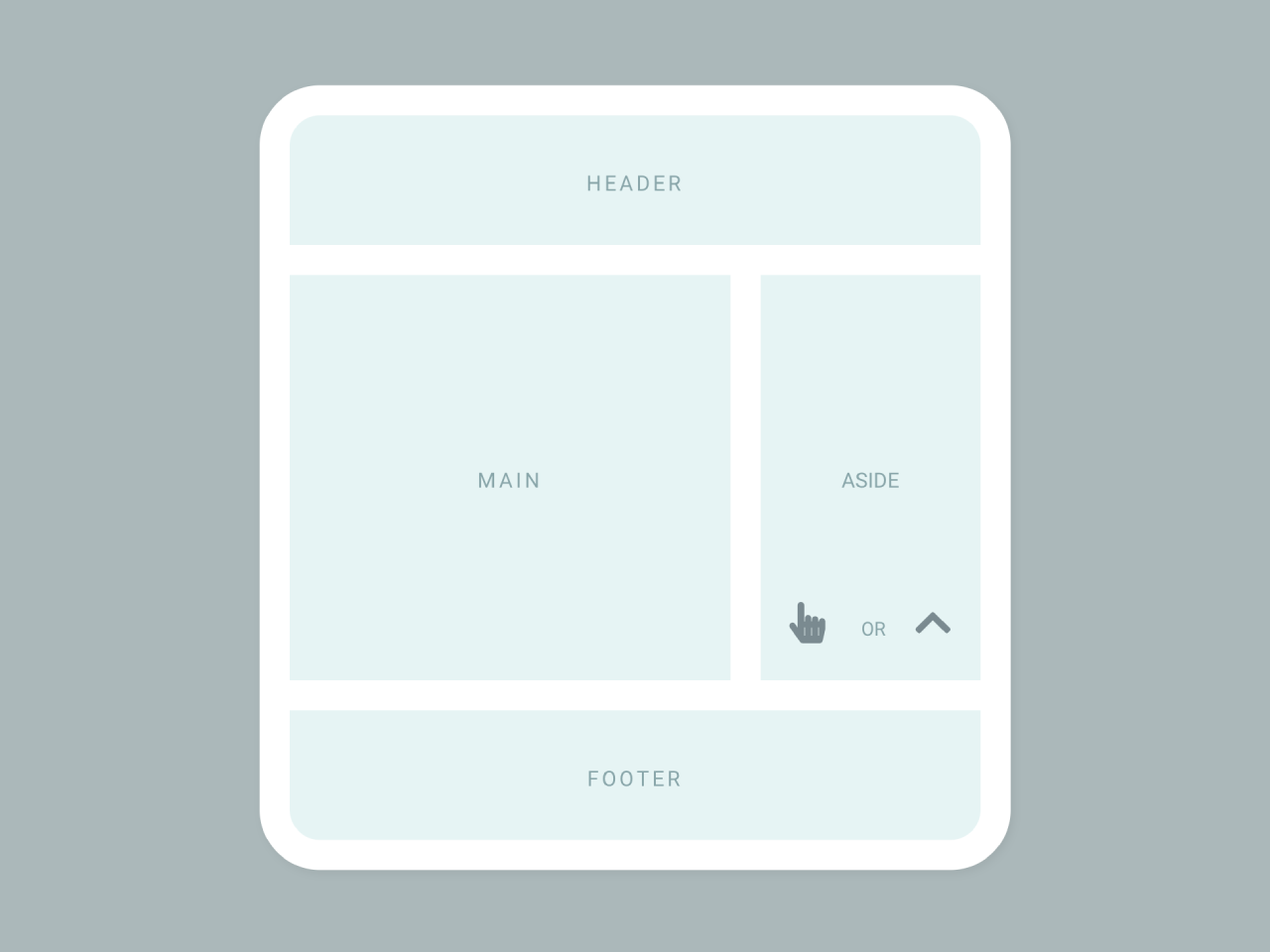

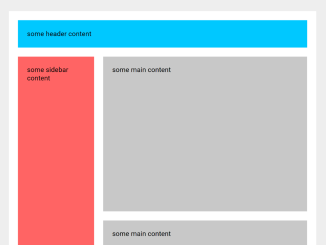
This HTML & CSS code snippet helps you to create an expandable aside in a mini-grid layout. The JavaScript functionality allows expanding the aside with a button click or the “ArrowUp” key. Helpful for enhancing user interaction and optimizing space in a web application.
How to Create an Expandable Aside in a Mini-Grid Layout Using CSS
1. Copy the following HTML code into your project. The layout consists of a container with a header, main content, an expandable aside, and a footer. Customize the content within each region to suit your application’s needs.
Include the SVG symbols for the click and chevron icons in your HTML. These icons add a visually appealing touch to the expandable aside. Ensure the <svg> elements are placed within your document, as shown in the code.
<div class="container">
  <header class="region header">
    <span class="header-label">
      header
    </span>
  </header>

  <main class="region main">
    main
  </main>
 <aside class="region aside">
    <button aria-label="click here or use ArrowUp key to toggle expansion">
      <span class="aside-label">
        aside
      </span>

      <span class="aside-instructions" aria-hidden="true">
        <span class="click-icon-container">
          <svg class="icon click-icon">
            <use xlink_href="#click-icon"></use>
          </svg>
        </span>
        <span class="icon-separator">or</span>
        <span class="chevron-icon-container">
          <svg class="icon chevron-contour-icon">
            <use xlink_href="#chevron-icon"></use>
          </svg>
          <svg class="icon chevron-icon">
            <use xlink_href="#chevron-icon"></use>
          </svg>
        </span>
      </span>

    </button>
  </aside>

  <footer class="region footer">
    footer
  </footer>
</div>

<svg style="display: none;">
  <symbol id="click-icon" viewBox="0 0 448 512">
    <path fill="currentColor" d="M448 240v96c0 3.084-.356 6.159-1.063 9.162l-32 136C410.686 499.23 394.562 512 376 512H168a40.004 40.004 0 0 1-32.35-16.473l-127.997-176c-12.993-17.866-9.043-42.883 8.822-55.876 17.867-12.994 42.884-9.043 55.877 8.823L104 315.992V40c0-22.091 17.908-40 40-40s40 17.909 40 40v200h8v-40c0-22.091 17.908-40 40-40s40 17.909 40 40v40h8v-24c0-22.091 17.908-40 40-40s40 17.909 40 40v24h8c0-22.091 17.908-40 40-40s40 17.909 40 40zm-256 80h-8v96h8v-96zm88 0h-8v96h8v-96zm88 0h-8v96h8v-96z" />
  </symbol>
  <symbol id="chevron-icon" viewBox="0 0 448 512">
    <path fill="currentColor" d="M240.971 130.524l194.343 194.343c9.373 9.373 9.373 24.569 0 33.941l-22.667 22.667c-9.357 9.357-24.522 9.375-33.901.04L224 227.495 69.255 381.516c-9.379 9.335-24.544 9.317-33.901-.04l-22.667-22.667c-9.373-9.373-9.373-24.569 0-33.941L207.03 130.525c9.372-9.373 24.568-9.373 33.941-.001z" />
  </symbol>
</svg>
2. Copy the following CSS code into your project. This code provides the styling for the entire layout, including the grid structure, animations, and the expandable aside’s appearance. Adjust the colors, fonts, and other styles according to your project’s design.
:root {
  --move-duration: 0.3s;
}

body {
  height: 100vh;
  margin: 0;
  display: grid;
  place-items: center;
  background: linear-gradient(
    135deg,
    #FFF,
    #DAEEEE
  );
  font-family: monospace;
}

button {
  -webkit-appearance: none;
     -moz-appearance: none;
          appearance: none;
  border: none;
  font: inherit;
  color: inherit;
  background: transparent;
}

.icon {
  color: #7a8a90;
  transition: all .3s;
}

.container {
  --gutter: 1em;
  display: grid;
  grid-template-columns: 2fr 1fr;
  width: clamp(180px, 50vmin, 360px);
  padding: var(--gutter);
  gap: var(--gutter);
  background: #fff;
  border-radius: 2em;
  box-shadow: .1em .1em .3em #0001;
}

.region {
  --region-bg: #DAEEEEAA;
  display: flex;
  justify-content: center;
  align-items: center;
  padding: 1em;
  text-align: center;
  background: var(--region-bg);
  font-variant: small-caps;
  letter-spacing: .1em;
  color: #88a5a9;
}

.header {
  min-height: 5vh;
  grid-column: span 2;
  border-top-left-radius: 1em;
  border-top-right-radius: 1em;
}

.with-long-aside .header {
  grid-row: 1;
  grid-column: 1;
  border-top-right-radius: 0;
  -webkit-animation: pulse linear forwards 0.5s;
          animation: pulse linear forwards 0.5s;
}

@-webkit-keyframes pulse {
  20% {
    background: lemonchiffon;
  }
  to {
    background: var(--region-bg);
  }
}

@keyframes pulse {
  20% {
    background: lemonchiffon;
  }
  to {
    background: var(--region-bg);
  }
}

.header-label {
  display: flex;
  justify-content: flex-end;
  min-width: 1%;
  transition: all .5s;
}

.with-long-aside .header-label {
  -webkit-animation:
    move-left-header-label
    var(--move-duration)
    forwards;
          animation:
    move-left-header-label
    var(--move-duration)
    forwards;
}

.without-long-aside .header-label {
  justify-content: flex-start;
  -webkit-animation:
    move-right-header-label
    var(--move-duration)
    forwards;
          animation:
    move-right-header-label
    var(--move-duration)
    forwards;
}

@-webkit-keyframes move-left-header-label {
  from {
    min-width: 85%;
  }
  to {
    min-width: 1%;
  }
}

@keyframes move-left-header-label {
  from {
    min-width: 85%;
  }
  to {
    min-width: 1%;
  }
}

@-webkit-keyframes move-right-header-label {
  from {
    min-width: 52%;
  }
  to {
    min-width: 1%;
  }
}

@keyframes move-right-header-label {
  from {
    min-width: 52%;
  }
  to {
    min-width: 1%;
  }
}

.main {
  min-height: 25vh;
}

.aside {
  position: relative;
  padding: 0;
}

.aside:hover {
  box-shadow: inset 0 0 5em .1em #0351;
}

.with-long-aside .aside {
  grid-row: 1 / 3;
  border-top-right-radius: 1em;
  -webkit-animation: pulse linear forwards 0.5s;
          animation: pulse linear forwards 0.5s;
}

.aside button {
  display: flex;
  justify-content: center;
  align-items: center;
  padding: 1em;
  text-align: center;
  width: 100%;
  height: 100%;
  cursor: pointer;
}

.aside-label {
  display: flex;
  align-items: flex-end;
  min-height: 1%;
  transition: all .5s;
}

.with-long-aside .aside-label {
  -webkit-animation:
    move-up-aside-label
    var(--move-duration)
    forwards;
          animation:
    move-up-aside-label
    var(--move-duration)
    forwards;
}

.without-long-aside .aside-label {
  align-items: flex-start;
  -webkit-animation:
    move-down-aside-label
    var(--move-duration)
    forwards;
          animation:
    move-down-aside-label
    var(--move-duration)
    forwards;
}

@-webkit-keyframes move-up-aside-label {
  from {
    min-height: 32%;
  }
  to {
    min-height: 1%;
  }
}

@keyframes move-up-aside-label {
  from {
    min-height: 32%;
  }
  to {
    min-height: 1%;
  }
}

@-webkit-keyframes move-down-aside-label {
  from {
    min-height: 44%;
  }
  to {
    min-height: 1%;
  }
}

@keyframes move-down-aside-label {
  from {
    min-height: 44%;
  }
  to {
    min-height: 1%;
  }
}

.aside-instructions {
  position: absolute;
  bottom: 1em;
  width: 100%;
  display: flex;
  justify-content: space-evenly;
  align-items: center;
  transition: all .3s;
}

@media (max-height: 400px) {
  .aside-instructions {
    display: none;
  }
}

.click-icon,
.chevron-icon,
.chevron-contour-icon {
  width: max(3vmin, 14px);
  height: max(3vmin, 14px);
  transition: all .2s;
}

.click-icon-container {
  position: relative;
}

:active .click-icon-container::after {
  content: "";
  position: absolute;
  top: -8px;
  left: 1.5px;
  display: block;
  width: 16px;
  height: 16px;
  border-radius: 50%;
  background: #a8c5c9;
  opacity: 0;
  transform: scale(0);
  -webkit-animation: icon-click .5s forwards;
          animation: icon-click .5s forwards;
}

@-webkit-keyframes icon-click {
  40% {
    opacity: 1;
  }
  to {
    transform: scale(1);
    opacity: 0;
  }
}

@keyframes icon-click {
  40% {
    opacity: 1;
  }
  to {
    transform: scale(1);
    opacity: 0;
  }
}

.click-icon {
  position: relative;
  z-index: 1;
}

.icon-separator {
  padding-left: 3px;
  font-size: .9em;
}

.chevron-icon-container {
  position: relative;
}

.with-long-aside .chevron-icon {
  transform: translateY(-10%)
}

.chevron-contour-icon {
  position: absolute;
  top: 0;
  left: 0;
  opacity: 0;
  filter:
    contrast(2)
    brightness(1.25)
    hue-rotate(30deg);
}

.with-long-aside .chevron-contour-icon {
  transform: scale(.9) translateY(5%);
  opacity: 0.6;
}

.footer {
  min-height: 5vh;
  grid-column: span 2;
  border-bottom-left-radius: 1em;
  border-bottom-right-radius: 1em;
}
3. Finally, incorporate the JavaScript code to enable the expandable aside functionality. This code utilizes event listeners to respond to button clicks and the “ArrowUp” key, toggling the class of the container to expand or shrink the aside. Ensure that the script is placed after the HTML content in your document.
const container = document.querySelector('.container')
const target = document.querySelector('.aside button')

const modifiers = {
  expanded: 'with-long-aside',
  shrunk: 'without-long-aside'
}
let initial = true

const toggle = () => {
  container.classList.toggle(modifiers.expanded)
  if (!initial) {
    container.classList.toggle(modifiers.shrunk)
  }
  initial = false
}

const onKeyUp = (e) => {
  if (e.key === 'ArrowUp') {
    toggle()
  }
}

target.addEventListener('click', toggle)
window.addEventListener('keydown', onKeyUp)
That’s all! hopefully, you have successfully integrated this expandable aside layout on your website. If you have any questions or suggestions, feel free to comment below.
Similar Code Snippets:

- Fixed Sidebar With Scrolling Content
- Modern Blog Layout Using CSS Grid
- Sticky Sidebar on Scroll JavaScript


I code and create web elements for amazing people around the world. I like work with new people. New people new Experiences.
I truly enjoy what I’m doing, which makes me more passionate about web development and coding. I am always ready to do challenging tasks whether it is about creating a custom CMS from scratch or customizing an existing system.