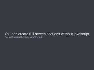
This CSS code snippet helps you to create full screen width and height sections on a webpage. It sets each section’s height to 100% of the viewport. The “intro” section is 90% in height, emphasizing its distinction. Sections adapt responsively to browser resizing.
It utilizes CSS properties like `vh` for height. The code enhances visual appeal without JavaScript’s involvement. Moreover, you can customize the sections using additional CSS according to your website’s layout.
How to Create Full-Screen Width and Height Sections Using CSS
1. First of all, create the HTML structure of your sections within <section> tags. Each section will represent a full-screen segment of your page content. The content within each section is contained in a <div> with the class “content.” Adjust the content within the <h1> and <p> tags to suit your needs.
<section class="intro">
  <div class="content">
    <h1>You can create full screen sections without javascript.</h1>
    <p>The height is set to 90vh, that means 90% height.</p>
 </div>
</section>

<section>
  <div class="content">
    <h1>Resize your browser and see how they adapt.</h1>
 </div>
</section>

<section>
  <div class="content">
    <h1>It's amazing and fast.</h1>
 </div>
</section>

<section>
  <div class="content">
    <h1>See the <a href="http://caniuse.com/#feat=viewport-units">browser support.</a></h1>
 </div>
</section>

<footer>
  Made by <a href="https://www.twitter.com/ckor">@ckor</a>
</footer>
2. The CSS code is where the magic happens. Key properties like height: 100vh; ensure each section takes up the full height of the viewport. The “intro” section, with the class “intro,” has a specified height of 90% (height: 90vh;). The background colors and styling details are easily customizable.
* {
  box-sizing: border-box;
}

body {
  margin: 0;
  font-weight: 500;
  font-family: "HelveticaNeue";
}

section {
  width: 100%;
  padding: 0 7%;
  display: table;
  margin: 0;
  max-width: none;
  background-color: #373B44;
  height: 100vh;
}
section:nth-of-type(2n) {
  background-color: #FE4B74;
}

.intro {
  height: 90vh;
}

.content {
  display: table-cell;
  vertical-align: middle;
}

h1 {
  font-size: 3em;
  display: block;
  color: white;
  font-weight: 300;
}

p {
  font-size: 1.5em;
  font-weight: 500;
  color: #C3CAD9;
}

a {
  font-weight: 700;
  color: #373B44;
  position: relative;
}
a:hover {
  opacity: 0.8;
}
a:active {
  top: 1px;
}

footer {
  padding: 1% 5%;
  text-align: center;
  background-color: #373B44;
  color: white;
}
footer a {
  color: #FE4B74;
  font-weight: 500;
  text-decoration: none;
}
The CSS for content (h1, p, and a tags) ensures a clean and visually appealing display. Adjust font sizes, colors, and styles to match your website’s theme.
That’s all! hopefully, you have successfully created Full-Screen sections on your website. If you have any questions or suggestions, feel free to comment below.
Similar Code Snippets:

I code and create web elements for amazing people around the world. I like work with new people. New people new Experiences.
I truly enjoy what I’m doing, which makes me more passionate about web development and coding. I am always ready to do challenging tasks whether it is about creating a custom CMS from scratch or customizing an existing system.

