
This JavaScript code snippet helps you to create a responsive coverflow carousel. It comes with mobile friendly design to slide the images with coverflow animation.
How to Create Responsive Coverflow Carousel in JavaScript
1. First of all, create the HTML structure for coverflow carousel as follows:
<div class="mouse"></div>
<div id="app">
<section>
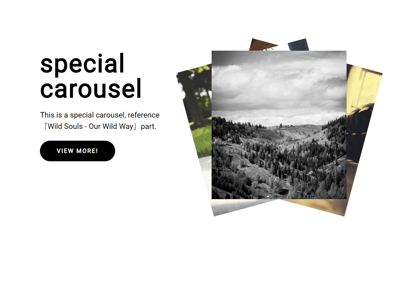
<div class="text">
<h2>
special <br />
carousel
</h2>
<p>
This is a special carousel, reference「Wild Souls - Our
Wild Way」part.
</p>
<a href="https://www.wildsouls.gr/en/" target="_blank">
<span>VIEW MORE!</span>
</a>
</div>
<div class="carousel">
<div class="card c1">
<img src="https://picsum.photos/500/550?random=113" alt="" />
</div>
<div class="card c2">
<img src="https://picsum.photos/500/550?random=114" alt="" />
</div>
<div class="card c3">
<img src="https://picsum.photos/500/550?random=115" alt="" />
</div>
</div>
</section>
2. After that, add the following CSS styles into your project:
@import url("https://fonts.googleapis.com/css2?family=PT+Sans:ital,wght@0,400;0,700;1,400;1,700&display=swap");
@-webkit-keyframes buttonHover {
  100% {
    transform: translateX(145%);
  }
}
@keyframes buttonHover {
  100% {
    transform: translateX(145%);
  }
}
@-webkit-keyframes moveCard {
  95% {
    left: 0;
  }
  100% {
    left: 100%;
  }
}
@keyframes moveCard {
  95% {
    left: 0;
  }
  100% {
    left: 100%;
  }
}
*,
*::before,
*::after {
  box-sizing: border-box;
  color: inherit;
  list-style: none;
}

html,
body {
  margin: 0;
  padding: 0;
}

main {
  display: block;
}

img {
  width: 100%;
  vertical-align: middle;
}

a {
  text-decoration: none;
}

h1,
h2,
h3,
h4,
h5,
h6,
p {
  margin: 0;
  line-height: 1.5;
}

html {
  font-size: 10px;
  font-family: "PT Sans", sans-serif;
}

body {
  background-color: beige;

}
@media (max-width: 768px) {
  body {
    overflow-x: hidden;
    overflow-y: auto;
  }
}

#app {
  width: 100%;
  max-width: 1920px;
  min-width: 320px;
  margin: 0 auto;
  overflow: hidden;
}

.mouse {
  width: 60px;
  height: 60px;
  background-color: #000;
  border-radius: 50%;
  position: absolute;
  top: 0;
  right: 0;
  transform: translate(-50%, -50%) scale(0.5);
  pointer-events: none;
  opacity: 0;
  transition: opacity 0.5s, transform 0.5s;
  z-index: 99;
}
.mouse::before {
  content: ">";
  display: block;
  color: #fff;
  position: absolute;
  top: 50%;
  left: 50%;
  transform: translate(-50%, -50%);
  font-size: 2rem;
  font-weight: 700;
}
.mouse.hover {
  opacity: 1;
  transform: translate(-50%, -50%) scale(1);
}

section {
  display: flex;
  width: 80%;
  padding: 100px 0;
  margin: 0 auto;
}
@media (max-width: 768px) {
  section {
    flex-wrap: wrap;
    width: 84%;
  }
}
section .text {
  flex-basis: 50%;
  margin-right: 12%;
  position: relative;
  z-index: 2;
}
@media (max-width: 768px) {
  section .text {
    flex-basis: 100%;
    margin-right: 0;
    margin-bottom: 16%;
  }
}
section .text h2 {
  font-size: 6rem;
  font-weight: 700;
  letter-spacing: 2px;
  line-height: 1;
  margin-bottom: 20px;
}
@media (max-width: 940px) {
  section .text h2 {
    font-size: 5rem;
  }
}
section .text p {
  font-size: 1.8rem;
  margin-bottom: 20px;
}
@media (max-width: 940px) {
  section .text p {
    font-size: 1.6rem;
  }
}
section .text a {
  display: inline-block;
  background-color: #000;
  padding: 16px 40px;
  border-radius: 40px;
  overflow: hidden;
}
section .text a span {
  display: block;
  color: #fff;
  font-size: 1.4rem;
  font-weight: 700;
  letter-spacing: 2px;
  position: relative;
  width: 100%;
  transform: translateX(0);
  -webkit-user-select: none;
     -moz-user-select: none;
      -ms-user-select: none;
          user-select: none;
}
@media (max-width: 940px) {
  section .text a span {
    font-size: 1.3rem;
  }
}
section .text a span::before {
  content: "VIEW MORE!";
  display: inline-block;
  position: absolute;
  top: 0;
  left: 0;
  width: 100%;
  height: 100%;
  transform: translateX(-145%);
}
section .text a:hover span {
  -webkit-animation: buttonHover linear 2s infinite;
          animation: buttonHover linear 2s infinite;
}
section .carousel {
  flex-basis: 50%;
  height: 500px;
  position: relative;
}
@media (max-width: 768px) {
  section .carousel {
    flex-basis: 100%;
    height: 400px;
  }
}
section .carousel .card {
  width: 100%;
  max-width: 450px;
  position: absolute;
  top: 0;
  left: 200%;
  opacity: 0;
  -webkit-user-select: none;
     -moz-user-select: none;
      -ms-user-select: none;
          user-select: none;
  transform-origin: bottom center;
  transition: left 0.5s, opacity 0.5s, transform 0.5s;
}
@media (max-width: 768px) {
  section .carousel .card {
    max-width: 350px;
  }
}
section .carousel .card.c1 {
  transform: translateX(-50%) rotate(15deg);
}
section .carousel .card.c2 {
  transform: translateX(-50%) rotate(-15deg);
  transition-delay: 0.2s;
}
section .carousel .card.c3 {
  transform: translateX(-50%) rotate(0deg);
  transition-delay: 0.4s;
}
section .carousel .card.active {
  left: 50%;
  opacity: 1;
}
section .carousel .card.move {
  left: 0;
  opacity: 0;
  transition-delay: 0s;
}
section .carousel .card.stage {
  transform: translateX(-50%) rotate(0deg);
  transition-delay: 0s;
}
3. Finally, add the following JavaScript code before closing of the body tag to activate the coverflow carousel.
'use strict'
;(function () {
    let isMobile =
        navigator.userAgent.match(
            /Line|J2ME|Opera Mini|SonyEricsson|Nokia|iPhone|iPod|BB10|PlayBook|android|webOS|BlackBerry|Windows Phone|Windows CE|Android/i
        ) != null
    let scrollTop =
        window.pageYOffset ||
        document.documentElement.scrollTop ||
        document.body.scrollTop
    let carousel = document.querySelector('.carousel')
    let cards = document.querySelectorAll('.card')
    let c1 = document.querySelector('.c1')
    let c2 = document.querySelector('.c2')
    let c3 = document.querySelector('.c3')
    let mouse = document.querySelector('.mouse')
    let status = 0
    let moving = false

    function clickCard() {
        if (!moving) {
            moving = true
            status++
            changeCard(status)
        }
    }
    function changeCard(status) {
        if (status % 3 === 0) {
            cards.forEach((card) => {
                card.classList.remove('move')
                card.classList.remove('stage')
                card.classList.add('active')
            })
            hideCard()
        }
        if (status % 3 === 1) {
            c3.classList.add('move')
            c2.classList.add('stage')
            hideCard(c3)
        }
        if (status % 3 === 2) {
            c2.classList.add('move')
            c1.classList.add('stage')
            hideCard(c2)
        }
    }
    function hideCard(el) {
        if (el) {
            setTimeout(() => {
                el.classList.remove('active')
                el.classList.remove('move')
                el.classList.remove('stage')
            }, 500)
        }
        setTimeout(() => {
            moving = false
        }, 700)
    }
    function cardEnter() {
        mouse.classList.add('hover')
    }
    function cardLeave() {
        mouse.classList.remove('hover')
    }
    function init() {
        if (isMobile) mouse.style.display = 'none'
        window.addEventListener('scroll', function () {
            scrollTop =
                window.pageYOffset ||
                document.documentElement.scrollTop ||
                document.body.scrollTop
        })
        window.addEventListener('mousemove', function (e) {
            mouse.style.top = e.y + scrollTop + 'px'
            mouse.style.left = e.x + 'px'
        })
        carousel.addEventListener('click', clickCard)
        carousel.addEventListener('mouseenter', cardEnter)
        carousel.addEventListener('mouseleave', cardLeave)
        setTimeout(() => {
            cards.forEach((card) => card.classList.add('active'))
        }, 500)
    }
    init()
})()
That’s all! hopefully, you have successfully integrated this Coverflow Carousel into your project. If you have any questions or facing any issues, feel free to comment below.
Similar Code Snippets:
 JavaScript Autoplay Carousel with Play Pause Controls
- JavaScript Slideshow with Glass Shadow Effect


I code and create web elements for amazing people around the world. I like work with new people. New people new Experiences.
I truly enjoy what I’m doing, which makes me more passionate about web development and coding. I am always ready to do challenging tasks whether it is about creating a custom CMS from scratch or customizing an existing system.
why is it the coverflow isn’t functioning ?