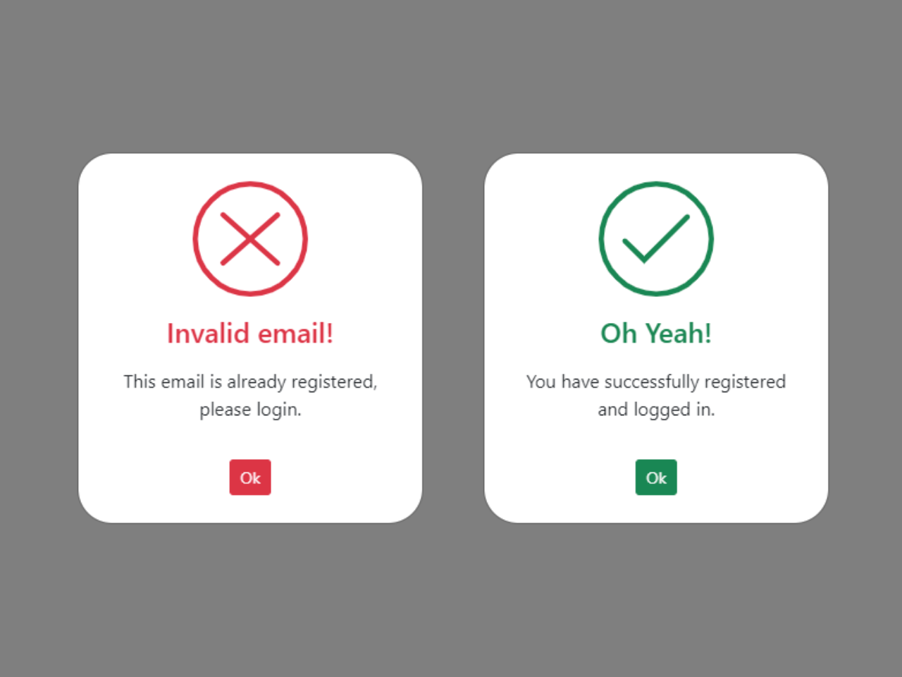

This Bootstrap 5 code snippet helps you to create stylish custom success and error modal popup messages. It utilizes SVG animations to create dynamic visual effects. You can easily notify users of successful actions or prompt them about errors with these eye-catching modal pop-ups, providing a polished user experience.
How to Create Bootstrap 5 Success & Error Modal Popup
1. In the <head> section of your HTML document, include the necessary CDN links for Bootstrap 5, jQuery, and Bootstrap JavaScript. These links are essential for the proper functioning of the modals and animations.
<link rel='stylesheet' href='https://cdnjs.cloudflare.com/ajax/libs/bootstrap/5.0.2/css/bootstrap.min.css'>
<script src='https://cdnjs.cloudflare.com/ajax/libs/jquery/3.6.0/jquery.min.js'></script>
<script src='https://cdnjs.cloudflare.com/ajax/libs/twitter-bootstrap/5.2.0/js/bootstrap.min.js'></script>
2. Within your HTML content, add the buttons that will trigger the success and error modals. These buttons are included in the provided code and have the classes btn btn-success and btn btn-danger for styling.
The modals in the code contain placeholders for success and error messages. Customize the modal content by modifying the <h4> and <p> elements within each modal. These elements define the title and message displayed in the modals.
<!--[if lte IE 9]> <style>
.path {stroke-dasharray: 0 !important;}
</style> <![endif]-->
<div class="container  p-5">
	<div class="row">
		<div class="col-12 text-center">
			<button type="button" class="btn btn-success m-1" data-bs-toggle="modal" data-bs-target="#statusSuccessModal">Success Modal</button>
			<button type="button" class="btn btn-danger m-1" data-bs-toggle="modal" data-bs-target="#statusErrorsModal">Error Modal</button>
		</div>


		<div class="modal fade" id="statusErrorsModal" tabindex="-1" role="dialog" data-bs-backdrop="static" data-bs-keyboard="false">
			<div class="modal-dialog modal-dialog-centered modal-sm" role="document">
				<div class="modal-content">
					<div class="modal-body text-center p-lg-4">
						<svg version="1.1" xmlns="http://www.w3.org/2000/svg" viewBox="0 0 130.2 130.2">
							<circle class="path circle" fill="none" stroke="#db3646" stroke-width="6" stroke-miterlimit="10" cx="65.1" cy="65.1" r="62.1" />
							<line class="path line" fill="none" stroke="#db3646" stroke-width="6" stroke-linecap="round" stroke-miterlimit="10" x1="34.4" y1="37.9" x2="95.8" y2="92.3" />
							<line class="path line" fill="none" stroke="#db3646" stroke-width="6" stroke-linecap="round" stroke-miterlimit="10" x1="95.8" y1="38" X2="34.4" y2="92.2" />
						</svg>
						<h4 class="text-danger mt-3">Invalid email!</h4>
						<p class="mt-3">This email is already registered, please login.</p>
						<button type="button" class="btn btn-sm mt-3 btn-danger" data-bs-dismiss="modal">Ok</button>
					</div>
				</div>
			</div>
		</div>
		<div class="modal fade" id="statusSuccessModal" tabindex="-1" role="dialog" data-bs-backdrop="static" data-bs-keyboard="false">
			<div class="modal-dialog modal-dialog-centered modal-sm" role="document">
				<div class="modal-content">
					<div class="modal-body text-center p-lg-4">
						<svg version="1.1" xmlns="http://www.w3.org/2000/svg" viewBox="0 0 130.2 130.2">
							<circle class="path circle" fill="none" stroke="#198754" stroke-width="6" stroke-miterlimit="10" cx="65.1" cy="65.1" r="62.1" />
							<polyline class="path check" fill="none" stroke="#198754" stroke-width="6" stroke-linecap="round" stroke-miterlimit="10" points="100.2,40.2 51.5,88.8 29.8,67.5 " />
						</svg>
						<h4 class="text-success mt-3">Oh Yeah!</h4>
						<p class="mt-3">You have successfully registered and logged in.</p>
						<button type="button" class="btn btn-sm mt-3 btn-success" data-bs-dismiss="modal">Ok</button>
					</div>
				</div>
			</div>
		</div>
	</div>
</div>
3. If you want to customize the modal styles further, you can do so by modifying the following CSS code. This code is responsible for the appearance and animations of the modals. Adjust properties like border-radius, width, and stroke to match your design preferences.
.modal#statusSuccessModal .modal-content,
.modal#statusErrorsModal .modal-content {
	border-radius: 30px;
}
.modal#statusSuccessModal .modal-content svg,
.modal#statusErrorsModal .modal-content svg {
	width: 100px;
	display: block;
	margin: 0 auto;
}
.modal#statusSuccessModal .modal-content .path,
.modal#statusErrorsModal .modal-content .path {
	stroke-dasharray: 1000;
	stroke-dashoffset: 0;
}
.modal#statusSuccessModal .modal-content .path.circle,
.modal#statusErrorsModal .modal-content .path.circle {
	-webkit-animation: dash 0.9s ease-in-out;
	animation: dash 0.9s ease-in-out;
}
.modal#statusSuccessModal .modal-content .path.line,
.modal#statusErrorsModal .modal-content .path.line {
	stroke-dashoffset: 1000;
	-webkit-animation: dash 0.95s 0.35s ease-in-out forwards;
	animation: dash 0.95s 0.35s ease-in-out forwards;
}
.modal#statusSuccessModal .modal-content .path.check,
.modal#statusErrorsModal .modal-content .path.check {
	stroke-dashoffset: -100;
	-webkit-animation: dash-check 0.95s 0.35s ease-in-out forwards;
	animation: dash-check 0.95s 0.35s ease-in-out forwards;
}

@-webkit-keyframes dash {
	0% {
		stroke-dashoffset: 1000;
	}
	100% {
		stroke-dashoffset: 0;
	}
}
@keyframes dash {
	0% {
		stroke-dashoffset: 1000;
	}
	100%{
		stroke-dashoffset: 0;
	}
}
@-webkit-keyframes dash {
	0% {
		stroke-dashoffset: 1000;
	}
	100% {
		stroke-dashoffset: 0;
	}
}
@keyframes dash {
	0% {
		stroke-dashoffset: 1000;}
	100% {
		stroke-dashoffset: 0;
	}
}
@-webkit-keyframes dash-check {
	0% {
		stroke-dashoffset: -100;
	}
	100% {
		stroke-dashoffset: 900;
	}
}
@keyframes dash-check {
	0% {
		stroke-dashoffset: -100;
	}
	100% {
		stroke-dashoffset: 900;
	}
}
.box00{
	width: 100px;
	height: 100px;
	border-radius: 50%;
}
That’s all! hopefully, you have successfully created a custom success & error modals. If you have any questions or suggestions, feel free to comment below.
Similar Code Snippets:
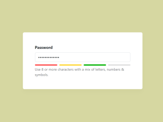
 Bootstrap 5 Password Strength Meter
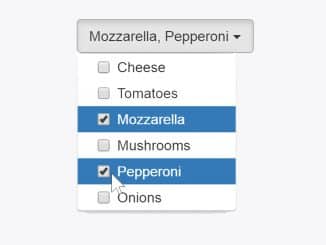
- Dynamic Cascading Dropdown Bootstrap
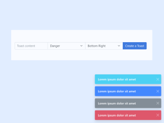
- Bootstrap 5 Toast Dynamic Message
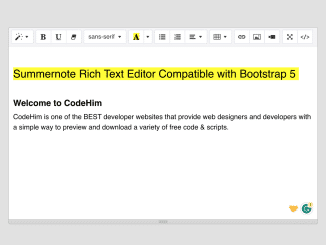
- Summernote Editor Compatible With Bootstrap 5
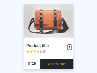
- Product Card Using Bootstrap 5

I code and create web elements for amazing people around the world. I like work with new people. New people new Experiences.
I truly enjoy what I’m doing, which makes me more passionate about web development and coding. I am always ready to do challenging tasks whether it is about creating a custom CMS from scratch or customizing an existing system.