

This code creates a reflection shadow effect on an image using CSS. It duplicates the image and flips it vertically to simulate a reflection. This effect adds depth and style to images displayed on a webpage.
You can use this reflection effect for gallery images or image cards. It adds a stylish reflection shadow effect to images, giving them a more dynamic and appealing look.
How to Create Image Reflection Shadow Effect Using CSS
1. Start by setting up your HTML structure. Place the image within a container element.
  <section id="main">
    <div class="image"></div>
  </section>
2. Now, add the necessary CSS styles to create the reflection shadow effect. Replace the url() values in the CSS code with your desired image URLs. Adjust the dimensions (width and height) of the .image class to fit your image size.
body {
  margin: 0px;
  padding: 0px;
  font-family: "Poppins", sans-serif;
  background: #22232e !important;
}
* {
  box-sizing: border-box;
  scroll-behavior: smooth;
}
#main {
  width: 100%;
  min-height: 100vh;
  background: #22232e;
  display: flex;
  align-items: center;
  justify-content: center;
}
.image{
  background-image: url(https://omjsblog.files.wordpress.com/2023/11/1.jpg);
  background-size: cover;
  background-position: center;
  background-repeat: no-repeat;
  width: 350px;
  height: 200px;
  position: relative;
}
.image::before{
  content: '';
  position: absolute;
  top: 102%;
  left: 0;
  width: 350px;
  height: 200px;
  background-image: url(https://omjsblog.files.wordpress.com/2023/11/1.jpg);
  background-size: cover;
  background-position: center;
  background-repeat: no-repeat;
  transform: scaleY(-1);
  opacity: 0.2;
}
.image::after{
  content: '';
  position: absolute;
  top: 102%;
  left: 0;
  width: 350px;
  height: 200px;
  background-image: linear-gradient(transparent, #22232e 50%);
}
The reflection shadow effect is achieved through the use of ::before and ::after pseudo-elements. These elements create a mirrored image below the original, simulating a reflection with a shadow.
Feel free to experiment with the code to achieve the desired visual effect. Adjust the opacity, colors, and dimensions to match your website’s aesthetic. Test different images to see how the reflection shadow effect enhances your overall design.
That’s all! hopefully, you have successfully created an image reflection shadow effect on your webpage. If you have any questions or suggestions, feel free to comment below.
Similar Code Snippets:
 Falling Snow Effect HTML Code
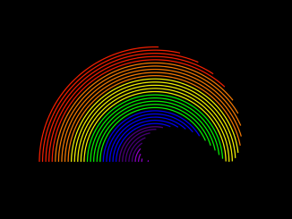
- CSS Rainbow Effect Animation
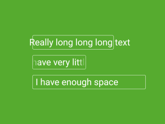
- CSS Text Overflow Scroll Animation
- CSS Text Color Change Animation
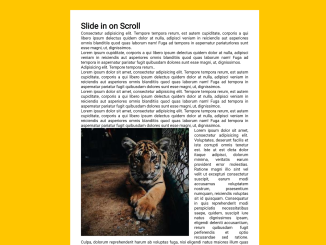
- Animate when Scrolled into View JavaScript


I code and create web elements for amazing people around the world. I like work with new people. New people new Experiences.
I truly enjoy what I’m doing, which makes me more passionate about web development and coding. I am always ready to do challenging tasks whether it is about creating a custom CMS from scratch or customizing an existing system.