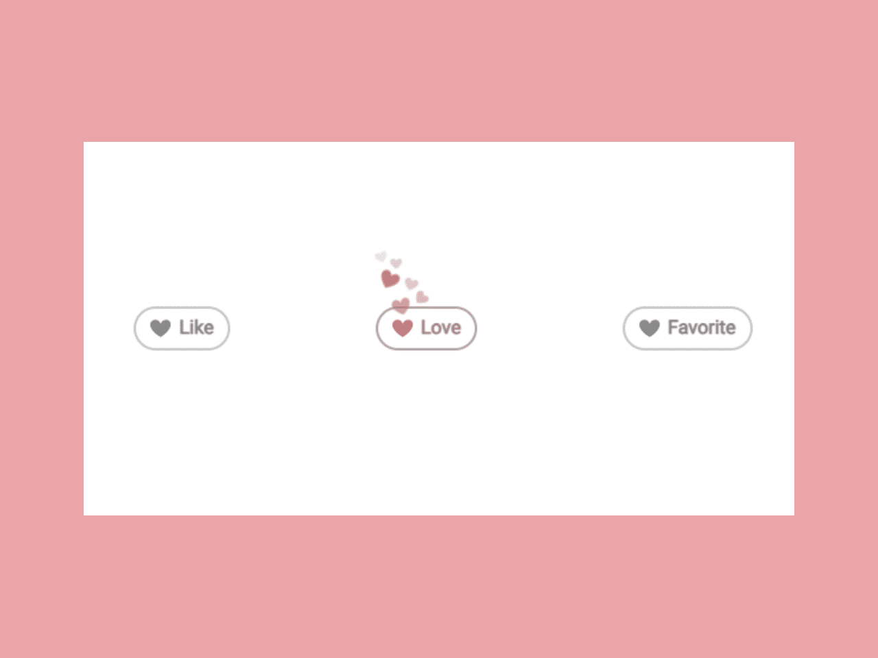

This code snippet helps you to create an interactive hear like button in CSS. It allows users to click on buttons labeled “Like,” “Love,” or “Favorite” to interact with animated heart icons. When clicked, the buttons change their appearance to indicate that the user has “liked” the content. The core functionality is the animation of heart icons when the buttons are clicked, providing a visual feedback mechanism for user interaction.
It adds visually appealing heart-shaped like buttons that provide instant feedback when users interact with your content. This can improve user satisfaction and encourage user interactions.
How to Create an Interactive Heart Like Button in CSS
1. First of all, load the Font Awesome CSS (for icons) and jQuery by adding the following CDN links into the head tag of your HTML document.
<link rel="stylesheet" href="https://cdnjs.cloudflare.com/ajax/libs/normalize/5.0.0/normalize.min.css">
<script src='//cdnjs.cloudflare.com/ajax/libs/jquery/2.1.3/jquery.min.js'></script>
2. After that, create the basic HTML structure. Define a container for your buttons and create individual buttons inside it. Add labels like “Like,” “Love,” or “Favorite” to each button. Here’s a simplified HTML snippet:
<div class='middle-wrapper'>
  <div class='like-wrapper'>
    <a class='like-button'>
      <span class='like-icon'>
        <div class='heart-animation-1'></div>
        <div class='heart-animation-2'></div>
      </span>
      Like
    </a>
    <a class='like-button'>
      <span class='like-icon'>
        <div class='heart-animation-1'></div>
        <div class='heart-animation-2'></div>
      </span>
      Love
    </a>
    <a class='like-button'>
      <span class='like-icon'>
        <div class='heart-animation-1'></div>
        <div class='heart-animation-2'></div>
      </span>
      Favorite
    </a>
  </div>
</div>
3. Now, it’s time to style your buttons using CSS. You can use the following CSS code, which includes animations and styles for your buttons. This CSS code will create the visual effects and animations for the heart icons and button interactions. Remember to include the CSS file in your HTML:
body {
  font-size: 16px;
}

a {
  cursor: pointer;
}

.middle-wrapper {
  display: flex;
  justify-content: center;
  align-items: center;
  width: 100%;
  height: 95vh;
}

.like-wrapper {
  display: flex;
  justify-content: space-around;
  flex-flow: row wrap;
  width: 50%;
}

.like-button {
  border: 2px solid #c7c7c7;
  border-radius: 40px;
  padding: 0.45rem 0.75rem;
  color: #878787;
  font-weight: bold;
  display: flex;
  align-items: center;
  justify-content: center;
  font-size: 1rem;
  transition: all 0.25s cubic-bezier(0.175, 0.885, 0.32, 1.275);
  filter: grayscale(100%);
  -webkit-user-select: none;
     -moz-user-select: none;
      -ms-user-select: none;
          user-select: none;
}
.like-button.liked {
  color: #ff6e6f;
  border-color: currentColor;
  filter: grayscale(0);
}
.like-button:hover {
  border-color: currentColor;
}

.like-icon {
  width: 18px;
  height: 16px;
  display: inline-block;
  position: relative;
  margin-right: 0.25em;
  font-size: 1.5rem;
  background: url("data:image/svg+xml;base64,PHN2ZyB3aWR0aD0iMjEiIGhlaWdodD0iMTgiIHZpZXdCb3g9IjAgMCAyMSAxOCIgeG1sbnM9Imh0dHA6Ly93d3cudzMub3JnLzIwMDAvc3ZnIj48cGF0aCBkPSJNMTAuMTAxIDQuNDE3UzguODk1LjIwNyA1LjExMS4yMDdjLTQuNDY1IDAtMTAuOTY3IDYuODQ2IDUuMDgyIDE3LjU5MkMyNS4yMzcgNy4wMyAxOS42NjUuMjAyIDE1LjUwMS4yMDJjLTQuMTYyIDAtNS40IDQuMjE1LTUuNCA0LjIxNXoiIGZpbGw9IiNGRjZFNkYiIGZpbGwtcnVsZT0iZXZlbm9kZCIvPjwvc3ZnPg==") no-repeat center;
  background-size: 100%;
  -webkit-animation: heartUnlike 0.25s cubic-bezier(0.175, 0.885, 0.32, 1.275) both;
          animation: heartUnlike 0.25s cubic-bezier(0.175, 0.885, 0.32, 1.275) both;
}

.liked .like-icon {
  -webkit-animation: heartPulse 0.25s cubic-bezier(0.175, 0.885, 0.32, 1.275) both;
          animation: heartPulse 0.25s cubic-bezier(0.175, 0.885, 0.32, 1.275) both;
}
.liked .like-icon [class^=heart-animation-] {
  background: url("data:image/svg+xml;base64,PHN2ZyB3aWR0aD0iMjEiIGhlaWdodD0iMTgiIHZpZXdCb3g9IjAgMCAyMSAxOCIgeG1sbnM9Imh0dHA6Ly93d3cudzMub3JnLzIwMDAvc3ZnIj48cGF0aCBkPSJNMTAuMTAxIDQuNDE3UzguODk1LjIwNyA1LjExMS4yMDdjLTQuNDY1IDAtMTAuOTY3IDYuODQ2IDUuMDgyIDE3LjU5MkMyNS4yMzcgNy4wMyAxOS42NjUuMjAyIDE1LjUwMS4yMDJjLTQuMTYyIDAtNS40IDQuMjE1LTUuNCA0LjIxNXoiIGZpbGw9IiNGRjZFNkYiIGZpbGwtcnVsZT0iZXZlbm9kZCIvPjwvc3ZnPg==") no-repeat center;
  background-size: 100%;
  display: block;
  position: absolute;
  top: 0;
  left: 0;
  width: 16px;
  height: 14px;
  opacity: 0;
}
.liked .like-icon [class^=heart-animation-]::before, .liked .like-icon [class^=heart-animation-]::after {
  content: "";
  background: inherit;
  background-size: 100%;
  width: inherit;
  height: inherit;
  display: inherit;
  position: relative;
  top: inherit;
  left: inherit;
  opacity: 0;
}
.liked .like-icon .heart-animation-1 {
  -webkit-animation: heartFloatMain-1 1s cubic-bezier(0.175, 0.885, 0.32, 1.275) both;
          animation: heartFloatMain-1 1s cubic-bezier(0.175, 0.885, 0.32, 1.275) both;
}
.liked .like-icon .heart-animation-1::before, .liked .like-icon .heart-animation-1::after {
  width: 12px;
  height: 10px;
  visibility: hidden;
}
.liked .like-icon .heart-animation-1::before {
  opacity: 0.6;
  -webkit-animation: heartFloatSub-1 1s 0.25s cubic-bezier(0.175, 0.885, 0.32, 1.275) both;
          animation: heartFloatSub-1 1s 0.25s cubic-bezier(0.175, 0.885, 0.32, 1.275) both;
}
.liked .like-icon .heart-animation-1::after {
  -webkit-animation: heartFloatSub-2 1s 0.15s cubic-bezier(0.175, 0.885, 0.32, 1.275) both;
          animation: heartFloatSub-2 1s 0.15s cubic-bezier(0.175, 0.885, 0.32, 1.275) both;
  opacity: 0.75;
}
.liked .like-icon .heart-animation-2 {
  -webkit-animation: heartFloatMain-2 1s 0.1s cubic-bezier(0.175, 0.885, 0.32, 1.275) both;
          animation: heartFloatMain-2 1s 0.1s cubic-bezier(0.175, 0.885, 0.32, 1.275) both;
}
.liked .like-icon .heart-animation-2::before, .liked .like-icon .heart-animation-2::after {
  width: 10px;
  height: 8px;
  visibility: hidden;
}
.liked .like-icon .heart-animation-2::before {
  -webkit-animation: heartFloatSub-3 1s 0.25s cubic-bezier(0.175, 0.885, 0.32, 1.275) both;
          animation: heartFloatSub-3 1s 0.25s cubic-bezier(0.175, 0.885, 0.32, 1.275) both;
  opacity: 0.25;
}
.liked .like-icon .heart-animation-2::after {
  -webkit-animation: heartFloatSub-4 1s 0.15s cubic-bezier(0.175, 0.885, 0.32, 1.275) both;
          animation: heartFloatSub-4 1s 0.15s cubic-bezier(0.175, 0.885, 0.32, 1.275) both;
  opacity: 0.4;
}

@-webkit-keyframes heartPulse {
  0% {
    transform: scale(1);
  }
  50% {
    transform: scale(1.5);
  }
}

@keyframes heartPulse {
  0% {
    transform: scale(1);
  }
  50% {
    transform: scale(1.5);
  }
}
@-webkit-keyframes heartUnlike {
  50% {
    transform: scale(0.75);
  }
}
@keyframes heartUnlike {
  50% {
    transform: scale(0.75);
  }
}
@-webkit-keyframes heartFloatMain-1 {
  0% {
    opacity: 0;
    transform: translate(0) rotate(0);
  }
  50% {
    opacity: 1;
    transform: translate(0, -25px) rotate(-20deg);
  }
}
@keyframes heartFloatMain-1 {
  0% {
    opacity: 0;
    transform: translate(0) rotate(0);
  }
  50% {
    opacity: 1;
    transform: translate(0, -25px) rotate(-20deg);
  }
}
@-webkit-keyframes heartFloatMain-2 {
  0% {
    opacity: 0;
    transform: translate(0) rotate(0) scale(0);
  }
  50% {
    opacity: 0.9;
    transform: translate(-10px, -38px) rotate(25deg) scale(1);
  }
}
@keyframes heartFloatMain-2 {
  0% {
    opacity: 0;
    transform: translate(0) rotate(0) scale(0);
  }
  50% {
    opacity: 0.9;
    transform: translate(-10px, -38px) rotate(25deg) scale(1);
  }
}
@-webkit-keyframes heartFloatSub-1 {
  0% {
    visibility: hidden;
    transform: translate(0) rotate(0);
  }
  50% {
    visibility: visible;
    transform: translate(13px, -13px) rotate(30deg);
  }
}
@keyframes heartFloatSub-1 {
  0% {
    visibility: hidden;
    transform: translate(0) rotate(0);
  }
  50% {
    visibility: visible;
    transform: translate(13px, -13px) rotate(30deg);
  }
}
@-webkit-keyframes heartFloatSub-2 {
  0% {
    visibility: hidden;
    transform: translate(0) rotate(0);
  }
  50% {
    visibility: visible;
    transform: translate(18px, -10px) rotate(55deg);
  }
}
@keyframes heartFloatSub-2 {
  0% {
    visibility: hidden;
    transform: translate(0) rotate(0);
  }
  50% {
    visibility: visible;
    transform: translate(18px, -10px) rotate(55deg);
  }
}
@-webkit-keyframes heartFloatSub-3 {
  0% {
    visibility: hidden;
    transform: translate(0) rotate(0);
  }
  50% {
    visibility: visible;
    transform: translate(-10px, -10px) rotate(-40deg);
  }
  100% {
    transform: translate(-50px, 0);
  }
}
@keyframes heartFloatSub-3 {
  0% {
    visibility: hidden;
    transform: translate(0) rotate(0);
  }
  50% {
    visibility: visible;
    transform: translate(-10px, -10px) rotate(-40deg);
  }
  100% {
    transform: translate(-50px, 0);
  }
}
@-webkit-keyframes heartFloatSub-4 {
  0% {
    visibility: hidden;
    transform: translate(0) rotate(0);
  }
  50% {
    visibility: visible;
    transform: translate(2px, -18px) rotate(-25deg);
  }
}
@keyframes heartFloatSub-4 {
  0% {
    visibility: hidden;
    transform: translate(0) rotate(0);
  }
  50% {
    visibility: visible;
    transform: translate(2px, -18px) rotate(-25deg);
  }
}
4. To handle user interactions, such as clicking the buttons and triggering animations, you’ll need JavaScript. Include the following JavaScript code in your HTML or in a separate JS file:
$('a.like-button').on('click', function(e) {
  $(this).toggleClass('liked');

  setTimeout(() => {
    $(e.target).removeClass('liked')
  }, 1000)
});
That’s all! hopefully, you have successfully created an interactive Heart Like Button using HTML, CSS and JS. If you have any questions or suggestions, feel free to comment below.
Similar Code Snippets:


I code and create web elements for amazing people around the world. I like work with new people. New people new Experiences.
I truly enjoy what I’m doing, which makes me more passionate about web development and coding. I am always ready to do challenging tasks whether it is about creating a custom CMS from scratch or customizing an existing system.