
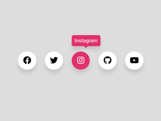
This code creates Circular Social Media Icons in CSS. It uses FontAwesome icons and CSS transitions for rotation. This code helps you display social media icons in a circular fashion on your website.
You can use this code on your website or blog to link your social profiles. It encourages user engagement and provides easy access to your social media profiles. Similarly, you can use these icons in your social sharing project.
How to Create Circular Social Media Icons In Css
1. First of all, load the Font Awesome CSS by adding the following CDN links into the head tag of your HTML document.
<link href="//netdna.bootstrapcdn.com/font-awesome/4.0.3/css/font-awesome.css" rel="stylesheet" >
2. In your HTML file, set up an unordered list (<ul>) to contain the social media icons. Inside each list item (<li>), create a <span> element with a FontAwesome icon for each social media platform you want to display.
<ul>
  <li>
    <span class="fa-stack fa-lg">
      <i class="fa fa-circle-o fa-stack-2x"></i>
      <i class="fa fa-github fa-stack-1x"></i>
    </span>
  </li>
  <li>
    <span class="fa-stack fa-lg">
      <i class="fa fa-circle-o fa-stack-2x"></i>
      <i class="fa fa-dribbble fa-stack-1x"></i>
    </span>
  </li>
  <li>
    <span class="fa-stack fa-lg">
      <i class="fa fa-circle-o fa-stack-2x"></i>
      <i class="fa fa-google-plus fa-stack-1x"></i>
    </span>
  </li>
  <li>
    <span class="fa-stack fa-lg">
      <i class="fa fa-circle-o fa-stack-2x"></i>
      <i class="fa fa-facebook fa-stack-1x"></i>
    </span>
  </li>
  <li>
    <span class="fa-stack fa-lg">
      <i class="fa fa-circle-o fa-stack-2x"></i>
      <i class="fa fa-twitter fa-stack-1x"></i>
    </span>
  </li>
  <li>
    <span class="fa-stack fa-lg">
      <i class="fa fa-circle-o fa-stack-2x"></i>
      <i class="fa fa-share fa-stack-1x"></i>
    </span>
  </li>
</ul>
3. Add the following CSS code to your stylesheet. This code will handle the positioning, transitions, and rotations of the circular icons. You can also customize the appearance by modifying the CSS properties.
ul { padding:0; position:fixed; height:125px; width:0px; margin: 0 50% }
li {
  color:white;
  width:40px; height:35px;
  position:absolute; bottom:25px;
  list-style:none; text-align:center;
  transform-origin:150% top;
  transition:all 0.5s linear;
}
li:nth-of-type(1) { transition:transform 0.5s linear; opacity:0 }
li:nth-of-type(2) { transition:transform 0.4s linear; opacity:0 }
li:nth-of-type(3) { transition:transform 0.3s linear; opacity:0 }
li:nth-of-type(4) { transition:transform 0.2s linear; opacity:0 }
li:nth-of-type(5) { transition:transform 0.1s linear; opacity:0 }
li:nth-of-type(6) { z-index:1; background:none; }

li span { transition:transform 0.2s linear; }

ul:hover { width:115px; }
ul:hover li:nth-of-type(1) { transform:rotate(300deg); opacity:1 }
ul:hover li:nth-of-type(2) { transform:rotate(240deg); opacity:1 }
ul:hover li:nth-of-type(3) { transform:rotate(180deg); opacity:1 }
ul:hover li:nth-of-type(4) { transform:rotate(120deg); opacity:1 }
ul:hover li:nth-of-type(5) { transform:rotate(60deg); opacity:1 }
ul:hover li:nth-of-type(1) span { transform:rotate(-300deg); }
ul:hover li:nth-of-type(2) span { transform:rotate(-240deg); }
ul:hover li:nth-of-type(3) span { transform:rotate(-180deg); }
ul:hover li:nth-of-type(4) span { transform:rotate(-120deg); }
ul:hover li:nth-of-type(5) span { transform:rotate(-60deg); }

*:not(body){ -webkit-backface-visibility: hidden; backface-visibility: hidden; } /* Fix white screens on animation */

i.fa.fa-stack-1x {font-size: 12px;}
To change the social media icons, replace the fa-github, fa-dribbble, fa-google-plus, fa-facebook, fa-twitter, and fa-share classes with the appropriate FontAwesome classes for your desired platforms.
That’s all! hopefully, you have successfully created Circular Social Media Icons. If you have any questions or suggestions, feel free to comment below.
Similar Code Snippets:


I code and create web elements for amazing people around the world. I like work with new people. New people new Experiences.
I truly enjoy what I’m doing, which makes me more passionate about web development and coding. I am always ready to do challenging tasks whether it is about creating a custom CMS from scratch or customizing an existing system.