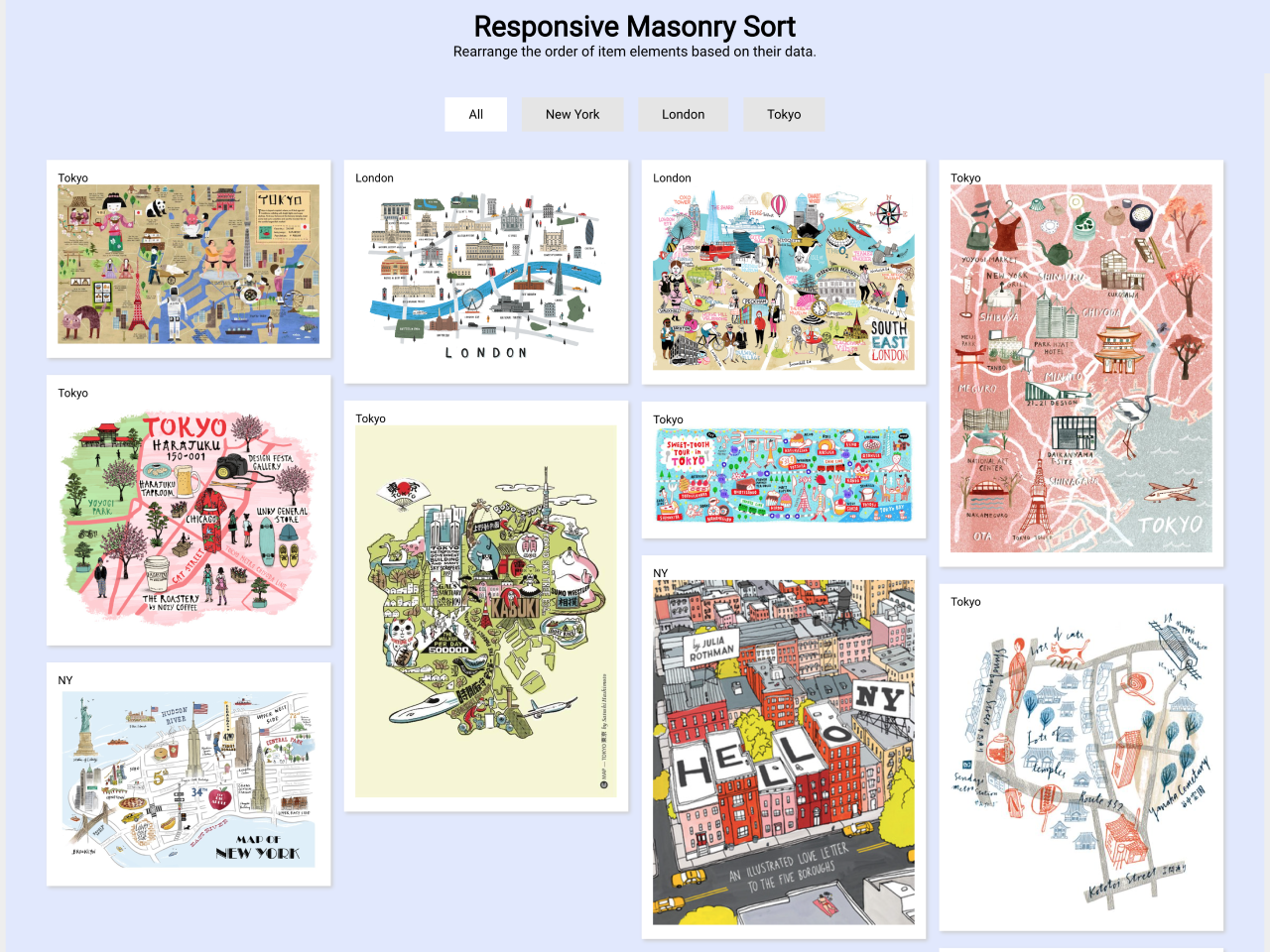

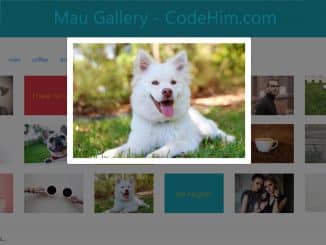
This code creates a visually appealing layout where items can be sorted based on their data. By clicking on category buttons, like “New York” or “Tokyo,” you can focus on specific content. The layout adjusts responsively, offering a seamless experience on various screen sizes. Perfect for showcasing diverse content with an organized and dynamic presentation.
How to Create Responsive Masonry Layout With Sortable Items
1. Include the necessary jQuery library by adding the provided CDN link in the <head> section of your HTML file. Make sure to include the CSS and JavaScript code as well.
<script src='//cdnjs.cloudflare.com/ajax/libs/jquery/2.1.3/jquery.min.js'></script>
2. Copy the following HTML structure, maintaining the hierarchy of elements. Customize the content within the .item elements to suit your needs. Modify the category buttons inside the #btn_area div to match the content categories you want to showcase.
<h1>Responsive Masonry Sort</h1>
<p>Rearrange the order of item elements based on their data.</p>
<div id="btn_area">
  <div class="active btn" id="all">All</div>
  <div class="btn" id="newyork">New York</div>
  <div class="btn" id="london">London</div>
  <div class="btn" id="tokyo">Tokyo</div>
</div>
<div id="parent">
  <div class="item tokyo">
    Tokyo
    <img src="https://s-media-cache-ak0.pinimg.com/736x/25/1e/54/251e545adfb3b55af6a5dc3e20f0b985.jpg">
  </div>
  <div class="item tokyo">
    Tokyo
    <img src="http://payload383.cargocollective.com/1/2/90203/9960185/Tokyo_670.jpg">
  </div>
  <div class="item newyork">
    NY
    <img src="http://shannoneileenblog.typepad.com/.a/6a0120a5c8d9a9970c0134899b8697970c-pi">
  </div>
  <div class="item london">
    London
    <img src="http://static1.squarespace.com/static/54345469e4b06f9169880040/t/54dcd02fe4b08f6ad5d7cb24/1423757364030/illustratedlondonmap">
  </div>
  <div class="item tokyo">
    Tokyo
    <img src="https://s-media-cache-ak0.pinimg.com/736x/21/c2/bc/21c2bc8df881b98802e1eca25bf4532b.jpg">
  </div>
  <div class="item london">
    London
    <img src="http://www.wanderarti.com/wp-content/uploads/2014/02/Tilly-at-Running-for-Crayons.jpg">
  </div>
  <div class="item tokyo">
    Tokyo
    <img src="https://s-media-cache-ak0.pinimg.com/736x/ea/44/e5/ea44e538de2f98a7ac3ab85003a203a1.jpg">
  </div>
  <div class="item newyork">
    NY
    <img src="http://d.gr-assets.com/books/1404704785l/18296046.jpg">
  </div>
  <div class="item tokyo">
    Tokyo
    <img src="https://s-media-cache-ak0.pinimg.com/736x/56/fd/6a/56fd6aec313cd544300c211b6245c5e2.jpg">
  </div>
  <div class="item tokyo">
    Tokyo
    <img src="https://s-media-cache-ak0.pinimg.com/736x/ee/e8/e0/eee8e0894002535c6cfa76b9bf92dab4.jpg">
  </div>
  <div class="item london">
    London
    <img src="http://payload216.cargocollective.com/1/2/64089/6639775/GimMick_London-Antoine-Corbineau-Illustrated-Credit_Mutuel.jpg">
  </div>
  <div class="item newyork">
    NY
    <img src="https://www.evermade.com/wp-content/uploads/2012/11/NYC-Hand-Drawn-Map-of-New-York-Williamsburg.jpg">
  </div>
</div>
<h4>Photo from <a href="https://www.google.com.tw/search?espv=2&tbm=isch&q=hand+drawn+map&spell=1&sa=X&ved=0ahUKEwiP1N2Ls9HLAhVl4qYKHSIzAxEQBQgYKAA&dpr=1&biw=1920&bih=971"> google</a>.</h4>
3. Now, style the user interface using the following CSS code. Adjust the CSS styles to match your website’s design preferences. You can customize colors, fonts, and spacing according to your branding.
body {
  font-family: sans-serif;
  margin: 0;
  background: #f2f2f2;
}

h1 {
  text-align: center;
  margin-top: 50px;
}

p {
  text-align: center;
  margin-bottom: 35px;
}

#btn_area {
  text-align: center;
  margin: 40px 0 30px 0;
}

.btn {
  padding: 10px 25px;
  margin: 0 6px;
  background: #e5e5e5;
  display: inline-block;
  font-size: 0.9em;
  transition: 0.3s ease all;
}

.btn:hover {
  background: #e1e1e1;
  cursor: pointer;
}

.active {
  background: #ffffff;
}

#parent {
  -webkit-column-count: 4;
  -moz-column-count: 4;
  column-count: 4;
  -webkit-column-gap: 1.2em;
  -moz-column-gap: 1.2em;
  column-gap: 1.2em;
  margin: 1.5%;
  padding: 0;
  font-size: .8em;
}

.item {
  display: inline-block;
  background: #fff;
  padding: 1em;
  margin: 0 0 1.5em;
  width: 100%;
  -webkit-transition: 1s ease all;
  box-sizing: border-box;
  -moz-box-sizing: border-box;
  -webkit-box-sizing: border-box;
  box-shadow: 2px 2px 4px 0 #ccc;
}

.item img {
  max-width: 100%;
}

h4 {
  text-align: center;
  line-height: 80px;
  font-weight: normal;
}

@media only screen and (min-width: 300px) {
  #parent {
    -moz-column-count: 1;
    -webkit-column-count: 1;
    column-count: 1;
  }
}

@media only screen and (min-width: 600px) {
  #parent {
    -moz-column-count: 2;
    -webkit-column-count: 2;
    column-count: 2;
  }
}

@media only screen and (min-width: 900px) {
  #parent {
    -moz-column-count: 3;
    -webkit-column-count: 3;
    column-count: 3;
  }
}

@media only screen and (min-width: 1200px) {
  #parent {
    -moz-column-count: 4;
    -webkit-column-count: 4;
    column-count: 4;
  }
}
4. Finally, ensure the following JavaScript code is included at the end of your HTML file, just before the closing </body> tag. This code handles the sorting functionality when you click on the category buttons.
var $btns = $('.btn').click(function() {
  if (this.id == 'all') {
    $('#parent > div').fadeIn(450);
  } else {
    var $el = $('.' + this.id).fadeIn(450);
    $('#parent > div').not($el).hide();
  }
  $btns.removeClass('active');
  $(this).addClass('active');
})
That’s all! hopefully, you have successfully created a Responsive Masonry Layout with sortable items. If you have any questions or suggestions, feel free to comment below.
Similar Code Snippets:


I code and create web elements for amazing people around the world. I like work with new people. New people new Experiences.
I truly enjoy what I’m doing, which makes me more passionate about web development and coding. I am always ready to do challenging tasks whether it is about creating a custom CMS from scratch or customizing an existing system.