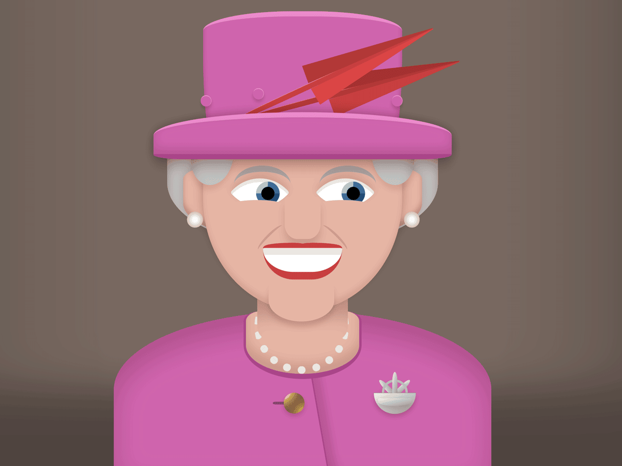

This CSS snippet creates a sketch of Queen Elizabeth. It uses HTML elements to draw different parts of face and CSS properties to style them.
How to Create Queen Elizabeth Sketch in CSS
1. Create the HTML structure as follows:
<queen-liz id="queen">
  <queen-head>
    <div class="hair"></div>
    <div class="earrings"></div>

    <ul class="hat">
      <li class="top"><i></i></li>
      <li class="feather"></li>
      <li class="feather"></li>
      <li class="brim"></li>
    </ul>

    <ul class="face">
      <li class="eye"><i></i></li>
      <li class="eye"><i></i></li>
      <li class="nose"></li>
      <li class="mouth"></li>
    </ul>
  </queen-head>

  <queen-body>
    <div class="neck"></div>
    <div class="button"></div>
    <div class="crest"><i></i></div>
  </queen-body>

</queen-liz>

<details class="ref">
  <summary>View Reference Image</summary>
  <div class="ref-bg">
<img src="https://upload.wikimedia.org/wikipedia/commons/thumb/b/b6/Queen_Elizabeth_II_in_March_2015.jpg/1200px-Queen_Elizabeth_II_in_March_2015.jpg" />
  </div>
</details>
2. Style the queen Elizabeth’s sketch using the following CSS styles:
:root {
  --pink: #cf64ad;
  --skin: #e5b5a4;
  --hair: #c4c1bf;
  --red: #c73f3f;
  --pearl: #ede5d5;
}

* {
  box-sizing: border-box;
}

html,
body {
  background: #111;
  color: white;
  margin: 0;
  padding: 0;
  font-family: monospace;
}

html {
  width: 100%;
  min-height: 100vh;
  display: grid;
  align-content: center;
}

ul,
ul li {
  list-style: none;
  margin: 0;
  padding: 0;
}

queen-liz {
  position: relative;
  display: grid;
  align-content: end;
  width: 90vmin;
  height: 90vmin;
  background: #796961;
  margin: 0 auto;
  border-radius: 5px;
  z-index: 2;
  box-shadow: 0 -15vmin 15vmin rgba(0,0,0,0.35) inset;
  overflow: hidden;
  cursor: pointer;
}

queen-liz:hover {
  background: #665952;
}

queen-liz,
queen-liz *,
queen-liz *::before,
queen-liz *::after {
  transition: all 0.4s ease;
}

queen-body {
  display: grid;
  align-content: top;
  position: relative;
  width: 80%;
  height: 30vmin;
  background: var(--pink);
  margin: 0 auto;
  border-radius: 50% 50% 0 0;
  z-index: 2;
  box-shadow: 0 3vmin 5vmin inset rgba(50,0,0,0.2);
}

queen-body::after {
  content: "";
  position: absolute;
  width: 25%;
  left: 28%;
  height: 110%;
  border-right: 3px solid #a9468a;
  box-shadow: 1.5vmin 1.5vmin 1.5vmin rgba(60, 0, 0, 0.15);
  transform: rotate(-10deg);
}

.neck {
  width: 30%;
  height: 12vmin;
  background: var(--skin);
  margin: 0 auto;
  border-radius: 30% 30% 100% 100%;
  z-index: 1;
  box-shadow: 0 -2vmin 2vmin rgba(60, 0, 0, 0.15) inset;
  position: relative;
  border: 0.5vmin solid #a9468a;
  border-bottom-width: 1vmin;
  border-top-width: 0;
}

.neck::before {
  content: "";
  position: absolute;
  width: 80%;
  left: 10%;
  height: 15vmin;
  background: inherit;
  bottom: 50%;
  border-radius: 0 0 20% 20%;
  box-shadow: 0 12vmin 3vmin -2vmin rgba(30, 0, 0, 0.2) inset;
  z-index: 1;
}

.neck::after {
  content: "";
  position: absolute;
  left: 7.25%;
  top: -6vmin;
  height: 16.5vmin;
  width: 16.5vmin;
  border: 0px dotted var(--pearl);
  border-bottom: 1.5vmin dotted var(--pearl);
  border-left: 1.5vmin dotted var(--pearl);
  border-radius: 100%;
  transform: rotate(-45deg);
}

.button {
  position: absolute;
  width: 4vmin;
  height: 4vmin;
  background: radial-gradient(ellipse farthest-corner at right bottom, #FEDB37 0%, #FDB931 8%, #9f7928 30%, #8A6E2F 40%, transparent 80%),
                radial-gradient(ellipse farthest-corner at left top, #FFFFFF 0%, #FFFFAC 8%, #D1B464 25%, #5d4a1f 62.5%, #5d4a1f 100%);
  border-radius: 100%;
  left: 45%;
  top: 52%;
  box-shadow: 0 0.5vmin 1vmin rgba(60,0,0,0.2);
}

.button::before {
  content: "";
  position: absolute;
  height: 0.6vmin;
  width: 2.5vmin;
  top: calc(50% - 0.3vmin);
  right: 90%;
  background: black;
  border-radius: 30% 0 0 30%;
  z-index: -1;
  opacity: 0.35;
}

.crest {
  width: 8vmin;
  height: 4vmin;
  background-color: #ccc;
  background: linear-gradient(to top left, #999, #eee);
    border-radius: 2px 2px 10vmin 10vmin;
  box-shadow: 0 0.5vmin 1vmin rgba(60,0,0,0.2);
  position: absolute;
  right: 20%;
  top: 52%;
  border-top: 1px solid #999;
}

.crest::before {
  content: "";
  position: absolute;
  top: 1vmin;
  height: 1.5vmin;
  width: 80%;
  left: 10%;
  border-radius: 3px 3px 50% 50%;
  background: inherit;
  box-shadow: inherit;
}

.crest::after {
  content: "";
  position: absolute;
  width: 4vmin;
  height: 4vmin;
  border: 0.5vmin solid #bbb;
  border-radius: 100%;
  bottom: 40%;
  left: calc(50% - 2.5vmin);
  z-index: -1;
  box-shadow: inherit;
}

.crest i {
  position: absolute;
  background: inherit;
  width: 1vmin;
  height: 4vmin;
  bottom: 100%;
  left: calc(50% - 0.5vmin);
  border-radius: 100% 100% 0 0;
}

.crest i::before,
.crest i::after {
  content: "";
  position: absolute;
  display: block;
  background: inherit;
  width: 1vmin;
  height: 4vmin;
  bottom: -1vmin;
  left: -150%;
  border-radius: 100% 100% 0 0;
  transform: rotate(-45deg);
  z-index: -1;
}

.crest i::after {
  transform: rotate(45deg);
  left: 150%;
}

queen-head {
  width: 38vmin;
  height: 43vmin;
  background: ;
  border-radius: 75% 75% 100% 100%;
  margin: 0 auto;
  position: relative;
  z-index: 3;
}

.smile queen-head {
  margin-bottom: -2vmin;
}

queen-head::before {
  content: "";
  position: absolute;
  width: 136%;
  left: -18%;
  height: 25vmin;
  top: 6vmin;
  border-radius: 50% 50% 80% 80%;
  background: var(--hair);
  z-index: -2;
  box-shadow: 0 2vmin 2vmin rgba(0, 0, 0, 0.3) inset;
}

queen-head::after {
  content: "";
  position: absolute;
  width: 120%;
  left: -10%;
  height: 15vmin;
  top: 15vmin;
  border-radius: 30% 30% 80% 80%;
  background: var(--skin);
  z-index: -1;
  box-shadow: 0 -1vmin 1vmin rgba(60, 0, 0, 0.25) inset,
    0 0 2vmin rgba(60, 0, 0, 0.2);
}

.smile queen-head::after {
  top: 15.5vmin;
}

.face {
  background: var(--skin);
  height: 100%;
  border-radius: inherit;
  box-shadow: 0 -1vmin 1vmin rgba(60, 0, 0, 0.1) inset,
    0 -1vmin 2vmin rgba(60, 0, 0, 0.3);
}

.face::after {
  content: "";
  background: var(--skin);
  position: absolute;
  width: 33%;
  height: 8vmin;
  bottom: -2vmin;
  left: 33%;
  border-radius: 40% 40% 90% 90%;
  box-shadow: 0 1vmin 1vmin rgba(70, 0, 0, 0.15);
}

.smile .face::after {
  height: 7vmin;
  bottom: -1vmin;
}

.hair::after,
.hair::before {
  content: "";
  position: absolute;
  width: 8vmin;
  height: 11vmin;
  background: var(--hair);
  top: 8vmin;
  left: -6%;
  border-radius: 50% 50% 100% 100%;
  box-shadow: 1vmin 3vmin 2vmin rgba(0, 0, 0, 0.2) inset,
    0 1vmin 1vmin rgba(50,0,0,0.1);
  transform: rotate(10deg);
}

.hair::after {
  left: unset;
  right: -6%;
  box-shadow: -1vmin 3vmin 2vmin rgba(0, 0, 0, 0.2) inset,
    0 1vmin 1vmin rgba(50,0,0,0.1);
  transform: rotate(-10deg);
}

.earrings::after,
.earrings::before {
  content: "";
  position: absolute;
  width: 3vmin;
  height: 3vmin;
  top: 56%;
  left: -8%;
  border-radius: 100%;
   background: rgb(253,252,244);
background: radial-gradient(circle, rgba(253,252,244,1) 20%, rgba(237,230,214,1) 40%, rgba(184,154,144,1) 100%);
}

.earrings::after {
  left: 101%;
}

.smile .earrings::before,
.smile .earrings::after {
  margin-top: 1vmin;
}


.eye {
  display: grid;
  align-content: center;
  background: white;
  border-radius: 5% 90% 5% 90% / 5% 90% 6% 90%;
  width: 8vmin;
  height: 8vmin;
  transform: rotate(-45deg);
  position: absolute;
  top: 38%;
  left: 18%;
  box-shadow: -0.5vmin 0.5vmin 0 rgba(0,0,0,0.1) inset,
    0.5vmin -0.5vmin 1.5vmin rgba(70,0,0,0.15);
}

.eye + .eye {
  left: unset;
  right: 18%;
}

.smile .eye {
  top: 39%;
}

.eye::before {
  content: "";
  display: block;
  background: black;
  width: 2.5vmin;
  height: 2.5vmin;
  border-radius: 100%;
  margin: 0 auto;
  transform: translate(1vmin, 1.25vmin);
  border: 1vmin solid #406c96;
  border-top-color: #97c2d6;
  border-bottom-color: #244f78;
}

queen-liz:hover .eye::before {
  transform: translate(0, 0);
}

.smile .eye::before {
  transform: translate(-1vmin, -1.25vmin);
}

.eye::after {
  content: "";
  position: absolute;
  bottom: 20%;
  left: -40%;
  width: 130%;
  height: 2vmin;
  background: var(--skin);
  transform: rotate(45deg);
  border-radius: 100%;
}

.smile .eye::after {
  bottom: 25%;
  left: -45%;
  width: 150%;
  height: 2.5vmin;
}

.eye i {
  position: absolute;
  width: 135%;
  height: 6vmin;
  border-radius: 100%;
  border-top: 1.25vmin solid var(--hair);
  transform: rotate(45deg);
  left: 0;
  top: -0.35vmin;
  filter: brightness(0.85);
  overflow: hidden;
  background: transparent;
}

.smile .eye i {
  top: -1.5vmin;
  left: 1vmin;
}

.mouth {
  position: absolute;
  background: white;
  border-radius: 2vmin 2vmin 20vmin 20vmin;
  height: 4.5vmin;
  width: 40%;
  left: 30%;
  bottom: 14%;
  border-top: 0.5vmin solid var(--red);
  z-index: 3;
  border-bottom: 1.5vmin solid var(--red);
  box-shadow: 0 1.3vmin 0 rgba(50,0,0,0.1) inset;
}

.smile .mouth {
  bottom: 13%;
  width: 46%;
  left: 27%;
  height: 5vmin;
  box-shadow: 0 1.6vmin 0 rgba(50,0,0,0.1) inset;
}

.mouth::after,
.mouth::before {
  content: "";
  position: absolute;
  width: 49%;
  height: 1vmin;
  bottom: 100%;
  left: 2%;
  border-radius: 100% 40% 0 30%;
  background: var(--red);
}
.mouth::after {
  right: 2%;
  left: unset;
  border-radius: 40% 100% 30% 0;
}

.smile .mouth::after,
.smile .mouth::before {
  height: 1.25vmin;
}

.nose {
  width: 18%;
  left: 41%;
  height: 8vmin;
  box-shadow: 0 1.5vmin 1.5vmin rgba(50,0,0,0.15);
  background: var(--skin);
  position: absolute;
  bottom: 32%;
  border-radius: 10% 10% 35% 35%;
  z-index: 3;
}

.nose::after,
.nose::before {
  content: "";
  position: absolute;
  height: 6.5vmin;
  width: 1vmin;
  border-radius: 100%;
  border-left: 0.5vmin solid #b98c7f;
  transform: rotate(45deg);
  bottom: -3vmin;
  left: -3.5vmin;
  opacity: 0.6;
  z-index: -1;
}

.nose::after {
  left: unset;
  right: -3.5vmin;
  transform: rotate(135deg);
}

.smile .nose::before {
  transform: rotate(60deg);
  height: 7vmin;
}

.smile .nose::after {
  transform: rotate(120deg);
  height: 7vmin;
}

.hat .brim {
  position: absolute;
  width: 150%;
  height: 7vmin;
  left: -25%;
  background: var(--pink);
  border-top: 1vmin solid #e88bcb;
  border-bottom: 1vmin solid #a9468a;
  top: 5vmin;
  border-radius: 50% 50% 10% 10%;
  box-shadow: 0 0 2vmin rgba(40, 0, 0, 0.35),
    0 -1vmin 2vmin rgba(40, 0, 0, 0.15) inset,
    0 2vmin 2vmin rgba(60,0,0,0.15);
  z-index: 5;
}

.hat .top {
  position: absolute;
  display: block;
  background: var(--pink);
  height: 24vmin;
  border-top: 1vmin solid #e88bcb;
  width: 100%;
  bottom: 75%;
  left: 0;
  border-radius: 45% 45% 5% 5% / 15% 15% 70% 70%;
  z-index: 0;
  box-shadow: 0 -1vmin 1vmin rgba(60, 0, 0, 0.25) inset;
}

.hat .top i::before,
.hat .top i::after,
.hat .top i {
  display: block;
  position: absolute;
  width: 2vmin;
  height: 2vmin;
  background: inherit;
  border-radius: 100%;
  box-shadow: 0 0.5vmin 0.65vmin rgba(60,0,0,0.2);
  top: 57%;
  left: 25%;
  border-right: 1px solid #e88bcb;
  border-top: 2px solid #e88bcb;
}

.hat .top i::after {
  content: "";
  left: -10vmin;
}

.hat .top i::before {
  content: "";
  left: 26.5vmin;
}


.feather {
  width: 40vmin;
  height: 1vmin;
  background: var(--red);
  position: absolute;
  top: -3vmin;
  left: 15%;
  z-index: 4;
  border-radius: 50% 100% 100% 50%;
  transform: rotate(-25deg);
  border-top: 1px solid #f98b8b;
}

.feather + .feather {
  transform: rotate(-15deg);
  top: 0;
  z-index: 2;
  filter: brightness(0.9);
  left: 25%;
}

.feather::after,
.feather::before {
  content: "";
  display: block;
  border: 1.75vmin solid transparent;
  border-left: 26vmin solid var(--red);
  position: absolute;
  right: -2vmin;
  top: -2px;
  transform: rotate(-5deg);
  filter: brightness(1.1);
}

.feather::before {
  filter: brightness(0.9);
  top: unset;
  bottom: -1px;
  transform: rotate(5deg);
}

.ref {
  position: fixed;
  top: 0;
  left: 0;
  padding: 1em;
  border-radius: 5px;
  z-index: 9;
  transition: all 0.3s ease;
}

.ref summary {
  cursor: pointer;
  font-weight: bold;
  position: relative;
  z-index: 10;
  font-size: 13px;
}

.ref[open] summary::after {
  content: "";
  position: fixed;
  top: 0;
  left: 0;
  width: 100%;
  height: 100%;
}

.ref summary:hover {
  color: var(--pink);
}

.ref-bg {
  position: fixed;
  left: 0;
  top: 0;
  display: grid;
  align-content: center;
  height: 100%;
  width: 100%;
  background: rgba(0,0,0,0.5);
}

.ref img {
  border-radius: 5px;
  bottom: 3em;
  left: 2vmin;
  max-height: 80vh;
  max-width: 75vw;
  margin: 0 auto;
  object-fit: contain;
  box-shadow: 0 3vmin 8vmin rgba(0,0,0,0.65);
}
3. Add the following JavaScript function to toggle smile class to animate the queen’s face.
var queen = document.getElementById('queen');

function animateQueen() {
queen.classList.toggle('smile');
}

queen.addEventListener("click", animateQueen);
That’s all! hopefully, you have successfully created Queen Elizabeth sketch in CSS. If you have any questions or suggestions, feel free to comment below.
Similar Code Snippets:

- JavaScript Timesheet Calculator


I code and create web elements for amazing people around the world. I like work with new people. New people new Experiences.
I truly enjoy what I’m doing, which makes me more passionate about web development and coding. I am always ready to do challenging tasks whether it is about creating a custom CMS from scratch or customizing an existing system.