
This JavaScript code helps you to detect media query changes in a webpage. It adjusts the displayed content according to the screen size or device. The core functionality involves using the window.getComputedStyle method to check the content property of a pseudo-element in the CSS. This code is helpful for responsive web design, allowing content to adapt based on the user’s device, such as mobile, tablet, or desktop screens.
You can use this code in your website to create a responsive design that automatically adjusts content for different devices.
How to Detect Media Query Changes Using JavaScript
1. First, set up your HTML structure. Ensure that you have a container element that holds the content you want to adapt. For example:
<div id="slides">
<div class="slide active">
<div class="slide__text"><span><span>getComputedStyle</span></span><span id="css"><span></span></span></div>
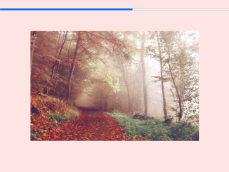
<div class="slide__image" style="background:linear-gradient(90deg,#f5365c,#f56036)"></div>
</div>
<div class="slide">
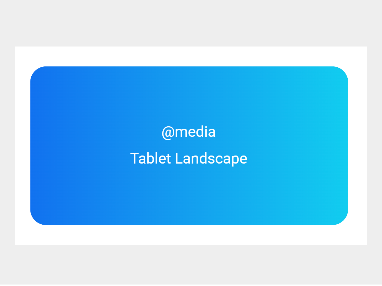
<div class="slide__text"><span><span>@media</span></span><span id="js"><span></span></span></div>
<div class="slide__image" style="background:linear-gradient(90deg,#1171ef,#11cdef)"></div>
</div>
</div>
2. Style your HTML elements with CSS to make them responsive. This code assumes you’re already familiar with CSS. You can use media queries to define styles for different screen sizes. Here’s a snippet from the code:
* {
  margin: 0;
  padding: 0;
}

body {
  display: flex;
  flex-direction: column;
  align-items: center;
  justify-content: center;
  min-height: 100vh;
  font: 28px/1.8 -apple-system, BlinkMacSystemFont, Segoe UI, Helvetica, Arial, sans-serif, Apple Color Emoji, Segoe UI Emoji, Segoe UI Symbol;
  color: white;
}

#slides {
  max-width: 20rem;
  width: 100%;
  height: 10rem;
  margin: auto;
  position: relative;
  border-radius: 1rem;
  overflow: hidden;
}

.slide {
  width: 100%;
  height: 100%;
  z-index: 1;
  padding: 0;
  position: absolute;
  transition: z-index 1s ease;
}
.slide.active {
  z-index: 2;
  transition: z-index 1s ease;
}
.slide__text {
  z-index: 2;
  position: relative;
  height: 100%;
  display: flex;
  flex-direction: column;
  align-items: center;
  justify-content: center;
  overflow-y: hidden;
}
.slide__text > span {
  display: block;
  overflow-y: hidden;
}
.slide__text > span > span {
  display: inline-block;
  transform: translate3d(0, 140%, 0);
  opacity: 0;
  transition: transform 0.5s cubic-bezier(0.82, 0, 0.12, 1), opacity 0.9s cubic-bezier(0.82, 0, 0.12, 1);
}
.slide__text > span > span:nth-child(1) {
  transition-delay: 0.15s;
}
.slide__text > span > span:nth-child(2) {
  transition-delay: 0.3s;
}
.active .slide__text > span > span {
  transform: translate3d(0, 0%, 0);
  opacity: 1;
  transition: transform 0.7s cubic-bezier(0.82, 0, 0.12, 1), opacity 0.2s ease;
}
.slide__text > span:nth-of-type(2n) span {
  transition-delay: 0.2s;
}
.slide__image {
  width: 100%;
  height: 0%;
  position: absolute;
  top: 0;
  left: 0;
  z-index: 1;
  background-size: cover;
  background-position: center;
  transition: height 0.7s 0.7s cubic-bezier(0.82, 0, 0.12, 1);
}
.active .slide__image {
  height: 100%;
  transition: height 0.5s 0.3s cubic-bezier(0.82, 0, 0.12, 1);
}

#css span::after {
  content: "Desktop";
}
@media screen and (max-width: 1024px) {
  #css span::after {
    content: "Tablet Landscape";
  }
}
@media screen and (max-width: 768px) {
  #css span::after {
    content: "Tablet Portrait";
  }
}
@media screen and (max-width: 360px) {
  #css span::after {
    content: "Mobile";
  }
}
3. Now, let’s add the JavaScript code to make it all work. You can include the code in a separate JavaScript file or within a <script> tag in your HTML.
const js = document.querySelector('#js span');
const all = document.querySelectorAll('.slide');
let index = 0;

window.addEventListener('resize', onResize, false);

function onResize() {
    const content = window.getComputedStyle(document.querySelector('#css span'), '::after').getPropertyValue('content');
    if (content.includes('Mobile')) {
        js.innerHTML = 'Mobile';
    } else if (content.includes('Tablet Portrait')) {
        js.innerHTML = 'Tablet Portrait';
    } else if (content.includes('Tablet Landscape')) {
        js.innerHTML = 'Tablet Landscape';
    } else if (content.includes('Desktop')) {
        js.innerHTML = 'Desktop';
    }
}

onResize();

setInterval(function () {
    const activeSlide = document.querySelector('#slides .slide.active');
    if (activeSlide) {
        activeSlide.classList.remove('active');
    }

    if (index === all.length - 1) {
        index = 0;
    } else {
        index++;
    }

    const newActiveSlide = all[index];
    if (newActiveSlide) {
        newActiveSlide.classList.add('active');
    }
}, 2000);
That’s it! hopefully, you have successfully created a functionality to detect media query changes on a webpage. With this code, your website will adapt to different screen sizes, providing a seamless user experience for all visitors. If you have any questions or suggestions, feel free to comment below.
Similar Code Snippets:
 Scroll Progress Bar in JavaScript
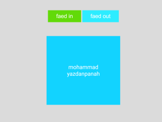
- Fadein And Fadeout in JavaScript
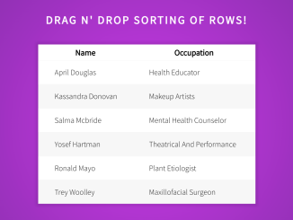
- Draggable Table Rows In JavaScript
- Interactive Notification Center UI in Vanilla JS
- Find Duplicates in Array JavaScript
- Img Comparison Slider using Vanilla JS


I code and create web elements for amazing people around the world. I like work with new people. New people new Experiences.
I truly enjoy what I’m doing, which makes me more passionate about web development and coding. I am always ready to do challenging tasks whether it is about creating a custom CMS from scratch or customizing an existing system.