
This CSS code snippet helps you to create an error shake animation for input elements. When an error occurs in the input field, it triggers a shake animation to visually highlight the issue. Basically, the code provides classes to trigger shaking animation that you can add/remove to enable/disable animation during form validation.
This animation draws attention to the problematic input, making it easier for users to identify and correct errors during form submission.
How to Create Input Error Shake Animation in CSS
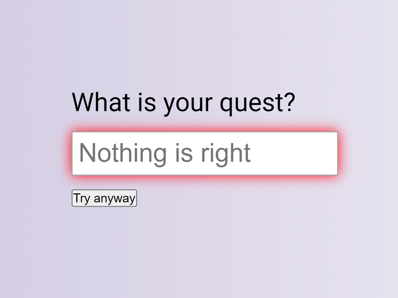
1. Inside the <div> with the class “form,” create a label and an input field with an associated ID. Add a button for demonstration purposes, which triggers the error animation.
<div class="form">
  <label for="name">What is your quest?</label><br>
  <input id="name" type="text" onChange="removeError()" placeholder="Nothing is right" />

  <div>
    <button onclick="addError();">Try anyway</button>
  </div>
</div>
2. Use the following CSS code to style your form. Ensure that the input field has a transition property for smooth animation. The keyframes ‘shake’ in the CSS create the animated effect when the ‘error’ class is added to the input.
* {
  box-sizing: border-box;
}

html {
  font-family: Helvetica, Arial, sans-serif;
  font-size: 28px;
}

header {
  font-size: 14px;
  border-bottom: 1px solid #ccc;
  margin-bottom: 2rem;
}
header h1 {
  margin-bottom: 0;
}
header p {
  margin-top: 0;
}

.form {
  width: 50vw;
  margin: 1rem auto;
}
.form label {
  font-size: 1rem;
  vertical-align: middle;
}
.form input {
  width: 100%;
  font-size: 1rem;
  padding: 0.25rem;
  vertical-align: middle;
  box-shadow: 0 0 0 transparent;
  border: 1px solid #999;
  outline: 0 none;
  transition: box-shadow 0.5s;
}
.form input.error {
  -webkit-animation: shake 0.2s ease-in-out 0s 2;
          animation: shake 0.2s ease-in-out 0s 2;
  box-shadow: 0 0 0.5em red;
}

@-webkit-keyframes shake {
  0% {
    margin-left: 0rem;
  }
  25% {
    margin-left: 0.5rem;
  }
  75% {
    margin-left: -0.5rem;
  }
  100% {
    margin-left: 0rem;
  }
}

@keyframes shake {
  0% {
    margin-left: 0rem;
  }
  25% {
    margin-left: 0.5rem;
  }
  75% {
    margin-left: -0.5rem;
  }
  100% {
    margin-left: 0rem;
  }
}
3. Finally, incorporate the JavaScript code to manipulate the input element. The ‘addError’ and ‘removeError’ functions toggle the ‘error’ class, initiating and halting the shake animation.
var element = document.getElementById('name');
var addError = function() { element.classList.add('error'); };
var removeError = function() { element.classList.remove('error'); };
That’s all! hopefully, you have successfully created a shake animation for inputs on your website. If you have any questions or suggestions, feel free to comment below.
Similar Code Snippets:
 Encrypt and Decrypt In JavaScript with Key
- Generate 4 Digit Random Pin and Validate in JavaScript
- Squishy Toggle Buttons Using Pure CSS


I code and create web elements for amazing people around the world. I like work with new people. New people new Experiences.
I truly enjoy what I’m doing, which makes me more passionate about web development and coding. I am always ready to do challenging tasks whether it is about creating a custom CMS from scratch or customizing an existing system.