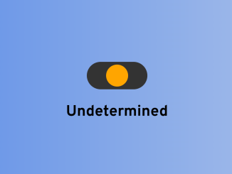
This code creates a responsive toggle 3 option switch in HTML and CSS. It lets you switch between three states: Enabled, Undetermined, and Disabled. The toggle switch visually represents these states with different colors, making it a user-friendly way to control and display options on your web page.
It’s beneficial for creating user-friendly toggles or switches that allow users to easily select from three options.
How to Create 3 Option Toggle Switch in HTML CSS
1. First of all, load the Normalize CSS and Google Fonts by adding the following CDN links into the head tag of your HTML document.
<link rel="stylesheet" href="https://cdnjs.cloudflare.com/ajax/libs/normalize/5.0.0/normalize.min.css">
<link rel='stylesheet' href='https://fonts.googleapis.com/css?family=Overpass:400,400i,700,700i'>
2. Create a container in HTML with an input element and a span for display purposes. The input element has attributes like type, min, max, and onchange for controlling the toggle’s behavior.
<!-- https://stackoverflow.com/questions/23661970/3-state-css-toggle-switch
https://ionicons.com/usage -->

<div class="wrapper">
  <input type="range" name="points" onchange="filterme(this.value);" min="1" step="1" id="custom-toggle" class="tgl-def" max="3" value="2">
</div>
<span>All</span>
3. Now, style your toggle switch and customize its appearance to match your website’s design. Adjust the colors, sizes, and other properties as needed.
body{
   background: linear-gradient(to right, #6190e8, #a7bfe8);
  display: flex;
  flex-direction: column;
  justify-content: center;
  align-items: center;
  min-height: 640px;
  font-family: "Overpass";
  font-size:16px;
  font-weight: bold;
  position: relative;
}

p {
  margin: 0;
  padding: 0;
}

.wrapper {
  width: 200px;
  display: flex;
  justify-content: center;
  padding: 20px 0;
}

#custom-toggle {
  -webkit-appearance: none;
  appearance: none;
  height: 20px;
  width: 40px;
  background-color: #333;
  -webkit-border-radius: 25px;
  border-radius: 25px;
  padding: 0 2px;
  margin: 0;
  cursor: pointer;
}
#custom-toggle.tgl-def::-webkit-slider-thumb {
  background-color: orange;
}
#custom-toggle.tgl-on::-webkit-slider-thumb {
  background-color: green;
}
#custom-toggle.tgl-off::-webkit-slider-thumb {
  background-color: red;
}
#custom-toggle::-webkit-slider-thumb {
  -webkit-appearance: none;
  appearance: none;
  width: 16px;
  height: 16px;
  -webkit-border-radius: 25px;
  border-radius: 25px;
}
#custom-toggle:focus {
  outline: none;
}

.rangeActive {
  background-color: green;
}
4. Finally, add the following JavaScript code to your project. It handles the toggle’s functionality. It updates the toggle’s appearance and changes the text to represent three different states (Enabled, Undetermined, Disabled) based on the selected option.
function filterme(value) {
  value = parseInt(value, 10); // Convert to an integer
  var customToggle = document.getElementById('custom-toggle');
  var spanElements = document.querySelectorAll('span');

  if (value === 1) {
    customToggle.classList.remove('tgl-off', 'tgl-def');
    customToggle.classList.add('tgl-on');
    spanElements.forEach(function(span) {
      span.textContent = 'Enabled';
    });
  } else if (value === 2) {
    customToggle.classList.remove('tgl-on', 'tgl-off');
    customToggle.classList.add('tgl-def');
    spanElements.forEach(function(span) {
      span.textContent = 'Undetermined';
    });
  } else if (value === 3) {
    customToggle.classList.remove('tgl-def', 'tgl-on');
    customToggle.classList.add('tgl-off');
    spanElements.forEach(function(span) {
      span.textContent = 'Disabled';
    });
  }
}
That’s all! hopefully, you have successfully created a Toggle Switch button with three options. If you have any questions or suggestions, feel free to comment below.
Similar Code Snippets:

I code and create web elements for amazing people around the world. I like work with new people. New people new Experiences.
I truly enjoy what I’m doing, which makes me more passionate about web development and coding. I am always ready to do challenging tasks whether it is about creating a custom CMS from scratch or customizing an existing system.

