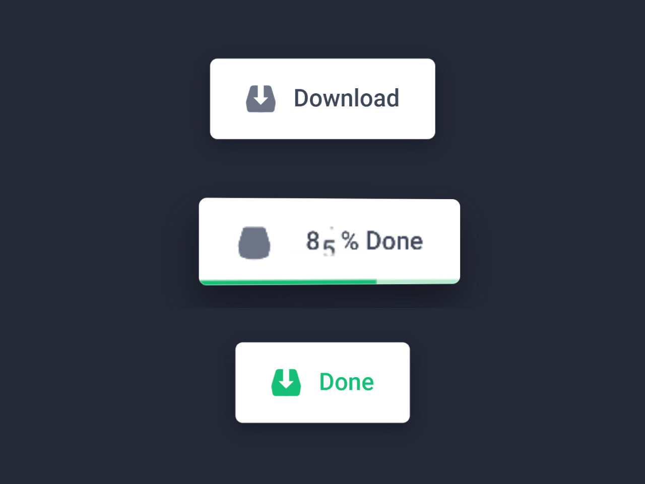

This code creates a button with a progress bar that visually represents the download process. When clicked, it transforms into a progress bar and displays the download progress as a percentage. It’s helpful for enhancing user experience during downloads.
You can use this code on your website’s download buttons to provide a user-friendly download experience. It enhances user engagement by showing real-time progress, improving user satisfaction. Additionally, it’s easy to implement and adds a modern touch to your web design.
How to Create Animated Download Button With Progress Bar
1. First of all, load the Reset CSS, Google Fonts, and jQuery by adding the following CDN links into the head tag of your webpage.
<link rel="stylesheet" href="https://cdnjs.cloudflare.com/ajax/libs/meyer-reset/2.0/reset.min.css"> <link rel='stylesheet' href='https://fonts.googleapis.com/css?family=Roboto:400,500,700&display=swap'> <script src='https://cdnjs.cloudflare.com/ajax/libs/jquery/3.3.1/jquery.min.js'></script>
2. Add the following HTML structure to your webpage where you want the download button to appear. Within the <a> tag, you can customize the button content to fit your needs. You can change the text and icons as desired.
<a class="dl-button" href="">
<div>
<div class="icon">
<div>
<svg class="arrow" viewBox="0 0 20 18" fill="currentColor">
<polygon points="8 0 12 0 12 9 15 9 10 14 5 9 8 9"></polygon>
</svg>
<svg class="shape" viewBox="0 0 20 18" fill="currentColor">
<path d="M4.82668561,0 L15.1733144,0 C16.0590479,0 16.8392841,0.582583769 17.0909106,1.43182334 L19.7391982,10.369794 C19.9108349,10.9490677 19.9490212,11.5596963 19.8508905,12.1558403 L19.1646343,16.3248465 C19.0055906,17.2910371 18.1703851,18 17.191192,18 L2.80880804,18 C1.82961488,18 0.994409401,17.2910371 0.835365676,16.3248465 L0.149109507,12.1558403 C0.0509788145,11.5596963 0.0891651114,10.9490677 0.260801785,10.369794 L2.90908938,1.43182334 C3.16071592,0.582583769 3.94095214,0 4.82668561,0 Z"></path>
</svg>
</div><span></span>
</div>
<div class="label">
<div class="show default">Download</div>
<div class="state">
<div class="counter">
<ul>
<li></li>
<li>1</li>
</ul>
<ul>
<li>0</li>
<li>1</li>
<li>2</li>
<li>3</li>
<li>4</li>
<li>5</li>
<li>6</li>
<li>7</li>
<li>8</li>
<li>9</li>
<li>0</li>
</ul>
<ul>
<li>0</li>
<li>1</li>
<li>2</li>
<li>3</li>
<li>4</li>
<li>5</li>
<li>6</li>
<li>7</li>
<li>8</li>
<li>9</li>
<li>0</li>
<li>1</li>
<li>2</li>
<li>3</li>
<li>4</li>
<li>5</li>
<li>6</li>
<li>7</li>
<li>8</li>
<li>9</li>
<li>0</li>
<li>1</li>
<li>2</li>
<li>3</li>
<li>4</li>
<li>5</li>
<li>6</li>
<li>7</li>
<li>8</li>
<li>9</li>
<li>0</li>
</ul><span>%</span>
</div><span>Done</span>
</div>
</div>
<div class="progress"></div>
</div></a><a class="restart" href="">
<svg viewBox="0 0 16 16" fill="currentColor">
<path d="M4.5,4.5c1.9-1.9,5.1-1.9,7,0c0.7,0.7,1.2,1.7,1.4,2.7l2-0.3C14.7,5.4,14,4.1,13,3.1c-2.7-2.7-7.1-2.7-9.9,0 L0.9,0.9L0.2,7.3l6.4-0.7L4.5,4.5z"></path>
<path d="M15.8,8.7L9.4,9.4l2.1,2.1c-1.9,1.9-5.1,1.9-7,0c-0.7-0.7-1.2-1.7-1.4-2.7l-2,0.3 C1.3,10.6,2,11.9,3,12.9c1.4,1.4,3.1,2,4.9,2c1.8,0,3.6-0.7,4.9-2l2.2,2.2L15.8,8.7z"></path>
</svg>Restart</a>
3. Apply the following CSS styles to your page. You can either include them directly in your HTML file or link to an external CSS file. These styles are responsible for the button’s appearance and animations.
.dl-button {
  --duration: 4000;
  --success: #16BF78;
  --grey-light: #99A3BA;
  --grey: #6C7486;
  --grey-dark: #3F4656;
  --light: #CDD9ED;
  --shadow: rgba(18, 22, 33, .6);
  --shadow-dark: rgba(18, 22, 33, .85);
  display: block;
  text-decoration: none;
  perspective: 500px;
}
.dl-button > div {
  position: relative;
  background: #fff;
  border-radius: 5px;
  overflow: hidden;
  display: flex;
  padding: 16px 24px;
  box-shadow: 0 4px 12px var(--shadow);
}
.dl-button > div .icon {
  --color: var(--grey);
  margin-right: 12px;
  position: relative;
  transform: translateZ(8px);
}
.dl-button > div .icon div {
  overflow: hidden;
  position: relative;
  width: 20px;
  height: 22px;
}
.dl-button > div .icon div:before, .dl-button > div .icon div:after {
  content: "";
  position: absolute;
  width: 2px;
  height: 2px;
  top: 2px;
  transition: opacity 0.3s ease;
}
.dl-button > div .icon div:before {
  left: 6px;
  background-image: radial-gradient(circle at 0 100%, var(--color) 2px, #fff 0px);
}
.dl-button > div .icon div:after {
  right: 6px;
  background-image: radial-gradient(circle at 100% 100%, var(--color) 2px, #fff 0px);
}
.dl-button > div .icon div svg {
  width: 20px;
  height: 18px;
  display: block;
  margin-top: 2px;
  position: relative;
  z-index: 1;
}
.dl-button > div .icon div svg.arrow {
  color: #fff;
  position: absolute;
  left: 0;
  top: 0;
  z-index: 2;
  transform: translateY(-1px);
}
.dl-button > div .icon div svg.shape {
  color: var(--color);
  transition: color 0.4s ease;
}
.dl-button > div .icon span {
  --s: 1;
  position: absolute;
  left: 1px;
  right: 1px;
  bottom: 2px;
  background: var(--color);
  height: 6px;
  border-radius: 50%;
  display: block;
  transform: translateY(0) scale(var(--s));
}
.dl-button > div .label {
  --color: var(--grey-dark);
  line-height: 22px;
  font-size: 16px;
  font-weight: 500;
  color: var(--color);
  position: relative;
  transition: color 0.4s ease;
  transform: translateZ(8px);
}
.dl-button > div .label > div {
  display: flex;
  transition: opacity 0.25s ease;
}
.dl-button > div .label > div:not(.show) {
  position: absolute;
  left: 0;
  top: 0;
  opacity: 0;
}
.dl-button > div .label > div.hide {
  opacity: 0;
}
.dl-button > div .label > div .counter {
  overflow: hidden;
  display: flex;
  height: 18px;
  line-height: 18px;
  margin: 2px 0;
  position: relative;
  transition: opacity 0.3s ease;
}
.dl-button > div .label > div .counter:before, .dl-button > div .label > div .counter:after {
  content: "";
  display: block;
  position: absolute;
  left: 0;
  right: 0;
  height: 3px;
  z-index: 1;
}
.dl-button > div .label > div .counter:before {
  top: 0;
  background: linear-gradient(to bottom, white 0%, rgba(255, 255, 255, 0) 100%);
}
.dl-button > div .label > div .counter:after {
  bottom: 0;
  background: linear-gradient(to top, white 0%, rgba(255, 255, 255, 0) 100%);
}
.dl-button > div .label > div .counter span {
  display: inline-block;
  margin: 0 4px 0 2px;
}
.dl-button > div .label > div .counter ul {
  --y: 0;
  margin: 0;
  padding: 0;
  list-style: none;
  width: 10px;
  height: 18px;
  -webkit-backface-visibility: hidden;
  transform: translateY(var(--y)) translateZ(0);
}
.dl-button > div .label > div .counter ul:nth-child(1) {
  transition: transform calc(var(--duration) * .2ms) ease-in-out;
}
.dl-button > div .label > div .counter ul:nth-child(2) {
  transition: transform calc(var(--duration) * .8ms) ease-in-out;
}
.dl-button > div .label > div .counter ul:nth-child(3) {
  transition: transform calc(var(--duration) * .8ms) ease-in-out;
}
.dl-button > div .label > div .counter ul li {
  width: 10px;
  height: 18px;
}
.dl-button > div .label > div .counter.hide {
  opacity: 0;
}
.dl-button > div .progress {
  --s: 0;
  position: absolute;
  left: 0;
  right: 0;
  bottom: 0;
  height: 3px;
  transform-origin: 50% 100%;
  transform: scaleY(var(--s));
  transition: transform 0.4s ease;
}
.dl-button > div .progress:before, .dl-button > div .progress:after {
  --s: 1;
  content: "";
  background: var(--success);
  position: absolute;
  left: 0;
  top: 0;
  bottom: 0;
  right: 0;
  transform-origin: 0 50%;
  transform: scaleX(var(--s));
}
.dl-button > div .progress:before {
  opacity: 0.35;
}
.dl-button > div .progress:after {
  --s: 0;
  transition: transform calc(var(--duration) * .9ms) ease-in-out;
}
.dl-button.active > div {
  -webkit-animation: button calc(var(--duration) * 1ms) linear forwards;
          animation: button calc(var(--duration) * 1ms) linear forwards;
}
.dl-button.active > div .icon div:before, .dl-button.active > div .icon div:after {
  opacity: 0;
  transition-delay: 0.4s;
}
.dl-button.active > div .icon svg.arrow {
  -webkit-animation: arrow calc(var(--duration) * .18ms) linear 4 calc(var(--duration) * .2ms);
          animation: arrow calc(var(--duration) * .18ms) linear 4 calc(var(--duration) * .2ms);
}
.dl-button.active > div .icon span {
  -webkit-animation: span calc(var(--duration) * .18ms) linear 4 calc(var(--duration) * .2ms);
          animation: span calc(var(--duration) * .18ms) linear 4 calc(var(--duration) * .2ms);
}
.dl-button.active > div .label > div .counter ul:nth-child(1) {
  --y: -18px;
  transition-delay: calc(var(--duration) * .72ms);
}
.dl-button.active > div .label > div .counter ul:nth-child(2) {
  --y: -180px;
  transition-delay: calc(var(--duration) * .09ms);
  -webkit-animation: motion calc(var(--duration) * .5ms) linear forwards calc(var(--duration) * .19ms);
          animation: motion calc(var(--duration) * .5ms) linear forwards calc(var(--duration) * .19ms);
}
.dl-button.active > div .label > div .counter ul:nth-child(3) {
  --y: -540px;
  transition-delay: calc(var(--duration) * .075ms);
  -webkit-animation: motion calc(var(--duration) * .8ms) linear forwards calc(var(--duration) * .075ms);
          animation: motion calc(var(--duration) * .8ms) linear forwards calc(var(--duration) * .075ms);
}
.dl-button.active > div .progress {
  --s: 1;
  transition-delay: 0.4s;
}
.dl-button.active > div .progress:after {
  --s: 1;
  transition-delay: 0.4s;
}
.dl-button.done > div .icon {
  --color: var(--success);
}
.dl-button.done .label {
  --color: var(--success);
}
.dl-button.done .label .counter {
  width: 0;
}

@-webkit-keyframes arrow {
  38% {
    transform: translateY(100%);
    opacity: 1;
  }
  39% {
    transform: translateY(100%);
    opacity: 0;
  }
  40% {
    transform: translateY(-100%);
    opacity: 0;
  }
  41% {
    transform: translateY(-100%);
    opacity: 1;
  }
  100% {
    transform: translateY(-1px);
    opacity: 1;
  }
}

@keyframes arrow {
  38% {
    transform: translateY(100%);
    opacity: 1;
  }
  39% {
    transform: translateY(100%);
    opacity: 0;
  }
  40% {
    transform: translateY(-100%);
    opacity: 0;
  }
  41% {
    transform: translateY(-100%);
    opacity: 1;
  }
  100% {
    transform: translateY(-1px);
    opacity: 1;
  }
}
@-webkit-keyframes span {
  25% {
    transform: translateY(2px) scale(var(--s));
  }
  55% {
    transform: translateY(2px) scale(var(--s));
  }
  80%, 100% {
    transform: translateY(0) scale(var(--s));
  }
}
@keyframes span {
  25% {
    transform: translateY(2px) scale(var(--s));
  }
  55% {
    transform: translateY(2px) scale(var(--s));
  }
  80%, 100% {
    transform: translateY(0) scale(var(--s));
  }
}
@-webkit-keyframes motion {
  20%, 70% {
    filter: blur(0.4px);
  }
}
@keyframes motion {
  20%, 70% {
    filter: blur(0.4px);
  }
}
@-webkit-keyframes button {
  0% {
    transform: translateX(0) translateZ(0) scale(1) rotateY(0deg);
  }
  10% {
    transform: translateX(0) translateZ(0) scale(0.96) rotateY(0deg);
    box-shadow: 0 4px 8px var(--shadow-dark);
  }
  20% {
    transform: translateX(-16px) translateZ(32px) scale(1) rotateY(-16deg);
    box-shadow: 4px 12px 20px var(--shadow-dark);
  }
  85% {
    transform: translateX(16px) translateZ(32px) scale(1) rotateY(16deg);
    box-shadow: -4px 12px 20px var(--shadow-dark);
  }
  95% {
    transform: translateX(0) translateZ(0) scale(1.12) rotateY(0deg);
    box-shadow: 0 8px 24px var(--shadow-dark);
  }
  100% {
    transform: translateX(0) translateZ(0) scale(1) rotateY(0deg);
  }
}
@keyframes button {
  0% {
    transform: translateX(0) translateZ(0) scale(1) rotateY(0deg);
  }
  10% {
    transform: translateX(0) translateZ(0) scale(0.96) rotateY(0deg);
    box-shadow: 0 4px 8px var(--shadow-dark);
  }
  20% {
    transform: translateX(-16px) translateZ(32px) scale(1) rotateY(-16deg);
    box-shadow: 4px 12px 20px var(--shadow-dark);
  }
  85% {
    transform: translateX(16px) translateZ(32px) scale(1) rotateY(16deg);
    box-shadow: -4px 12px 20px var(--shadow-dark);
  }
  95% {
    transform: translateX(0) translateZ(0) scale(1.12) rotateY(0deg);
    box-shadow: 0 8px 24px var(--shadow-dark);
  }
  100% {
    transform: translateX(0) translateZ(0) scale(1) rotateY(0deg);
  }
}
.dl-button.done + .restart {
  opacity: 1;
  visibility: visible;
}

.restart {
  --grey-dark: #3F4656;
  position: absolute;
  bottom: 20%;
  left: 50%;
  transform: translateX(-50%);
  color: var(--grey-dark);
  font-size: 14px;
  line-height: 16px;
  text-decoration: none;
  opacity: 0;
  visibility: hidden;
  transition: opacity 0.4s ease;
}
.restart svg {
  width: 16px;
  height: 16px;
  margin-right: 4px;
  display: inline-block;
  vertical-align: top;
}

html {
  box-sizing: border-box;
  -webkit-font-smoothing: antialiased;
}

* {
  box-sizing: inherit;
}
*:before, *:after {
  box-sizing: inherit;
}

.cd__main{
  min-height: 720px;
  font-family: Roboto, Arial;
  display: flex;
  justify-content: center;
  align-items: center;
  background: #242836 !important;
  padding: 20px;
}
4. Add the following JavaScript code to enable the button’s functionality. This code manages the download progress and animations. Place it just before the closing </body> tag or within a script tag in your HTML file.
$('.dl-button').on('click', e => {

    let btn = $(e.currentTarget),
        label = btn.find('.label'),
        counter = label.find('.counter');

    if(!btn.hasClass('active') && !btn.hasClass('done')) {

        btn.addClass('active');

        setLabel(label, label.find('.default'), label.find('.state'));

        setTimeout(() => {
            counter.addClass('hide');
            counter.animate({
                width: 0
            }, 400, function() {
                label.width(label.find('.state > span').width());
                counter.removeAttr('style');
            });
            btn.removeClass('active').addClass('done');
        }, getComputedStyle(btn[0]).getPropertyValue('--duration'));

    }

    return false;

});

$('.restart').on('click', e => {

    let btn = $('.dl-button'),
        label = btn.find('.label'),
        counter = label.find('.counter');

    setLabel(label, label.find('.state'), label.find('.default'), function() {
        counter.removeClass('hide');
        btn.removeClass('done');
    });

    return false;

});

function setLabel(div, oldD, newD, callback) {
    oldD.addClass('hide');
    div.animate({
        width: newD.outerWidth()
    }, 200, function() {
        oldD.removeClass('show hide');
        newD.addClass('show');
        div.removeAttr('style');
        if(typeof callback === 'function') {
            callback();
        }
    });
}
That’s all! hopefully, you have successfully created an Animated Download Button with a Progress Bar. If you have any questions or suggestions, feel free to comment below.
Similar Code Snippets:

- HTML Visitor Counter Source Code
- Internet Speed Test Using JavaScript


I code and create web elements for amazing people around the world. I like work with new people. New people new Experiences.
I truly enjoy what I’m doing, which makes me more passionate about web development and coding. I am always ready to do challenging tasks whether it is about creating a custom CMS from scratch or customizing an existing system.