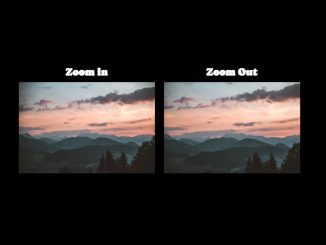
This code enables smooth image zoom transition in CSS. It works by using the CSS transform property to smoothly zoom in on images when they are hovered over. It’s particularly useful for portfolio websites, product showcases, image galleries, and any other web pages where you want to add an engaging hover effect to images.
How to Create Smooth Image Zoom Transition In CSS
1. First, let’s set up the HTML structure for your images. You can place the following code inside the <body> tag of your HTML document. Replace the URL of the img tags with your own images on which you want to apply a smooth zoom transition.
<div class="display-flex">
 <div>
 <h2>Zoom in</h2>
<div class="zoom-in">
<img width="300" src="https://images.pexels.com/photos/1261728/pexels-photo-1261728.jpeg?auto=compress&cs=tinysrgb&w=600"/>
</div>
  </div>
  <div>
  <h2>Zoom Out</h2>
<div class="zoom-out">
<img width="300" src="https://images.pexels.com/photos/1261728/pexels-photo-1261728.jpeg?auto=compress&cs=tinysrgb&w=600"/>
</div>
    </div>
</div>
2. Next, let’s add the necessary CSS styles to create the zoom effect on hover. You can include the following CSS code in your <style> tag or an external CSS file.
@import url('https://fonts.googleapis.com/css2?family=Caprasimo&display=swap');
*{
  box-sizing:border-box;
  margin:0;
  padding:0;
}
body{
  height:100vh;
  align-items:center;
  justify-content:center;
  background:black !important;
  font-family: 'Caprasimo', cursive;
  color:white;
}
h2{
  text-align: center;
}
.display-flex{
  display:flex;
}
.zoom-in,
.zoom-out {
  overflow: hidden;
  padding: 0;
  width: 300px;
  margin: 10px;
}
.zoom-in img,
.zoom-out img {
  transition-duration: 2s;
  margin: 0 auto;
  display: block;
}
.zoom-in img:hover {
  transform: scale(1.1);
}
.zoom-out img {
  transform: scale(1.1);
}
.zoom-out img:hover {
  transform: scale(1);
}
You can customize this code by changing the image URLs, adjusting the image dimensions, or modifying the CSS styles to match your website’s design.
That’s it! You’ve successfully added smooth image zoom transitions to your website using CSS. Feel free to use this technique to make your web content more engaging. If you have any questions or suggestions, don’t hesitate to comment below.
Similar Code Snippets:

I code and create web elements for amazing people around the world. I like work with new people. New people new Experiences.
I truly enjoy what I’m doing, which makes me more passionate about web development and coding. I am always ready to do challenging tasks whether it is about creating a custom CMS from scratch or customizing an existing system.


