
This code creates a custom select dropdown without a wrapper in CSS. It styles the dropdown using CSS variables, removes default styles, and adds a gradient background with a right-aligned arrow icon. The design is clean, featuring a glass-style effect with no need for JavaScript. It enhances the user interface, providing a sleek appearance and improved user experience.
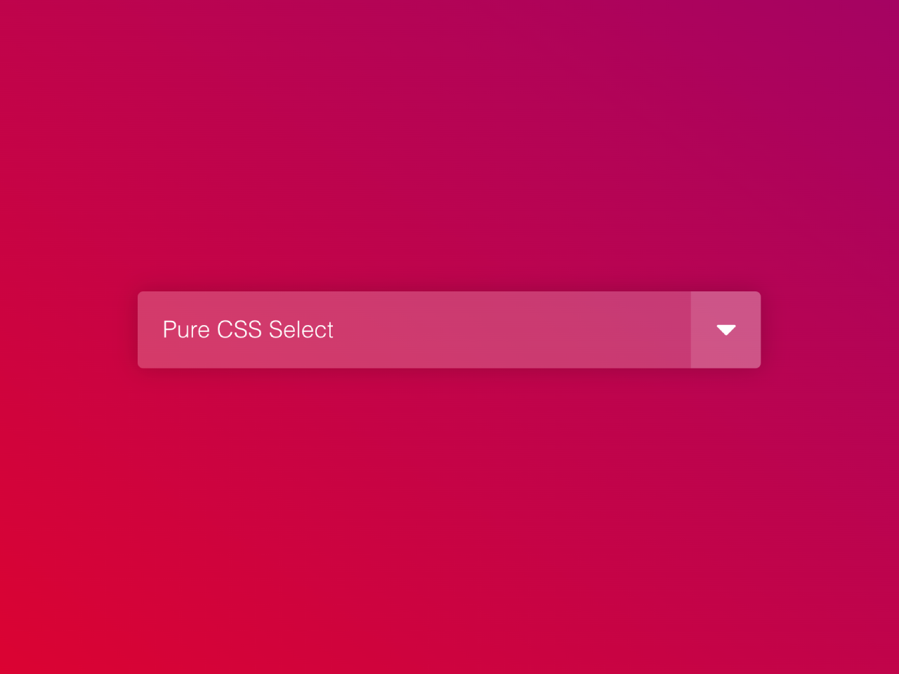
How to Create Custom Select Dropdown Without Wrapper in CSS
1. First of all, load the Normalize CSS by adding the following CDN link into the head tag of your HTML document.
<link rel="stylesheet" href="https://cdnjs.cloudflare.com/ajax/libs/normalize/5.0.0/normalize.min.css">
2. Create a <select> element in your HTML file. Customize the <option> elements with your desired values.
<select>
  <option selected value="0">Pure CSS Select</option>
  <option value="1">No Wrapper</option>
  <option value="2">No JS</option>
  <option value="3">Nice!</option>
</select>
3. Copy and paste the following CSS code into your stylesheet. This CSS code employs variables for easy customization. Feel free to modify the colors and styles to match your website’s theme.
:root {
  --arrow-bg: rgba(255, 255, 255, 0.3);
  --arrow-icon: url(https://upload.wikimedia.org/wikipedia/commons/9/9d/Caret_down_font_awesome_whitevariation.svg);
  --option-bg: white;
  --select-bg: rgba(255, 255, 255, 0.2);
}

* {
  box-sizing: border-box;
}

body {
  display: grid;
  place-items: center;
  min-height: 100vh;
  background: linear-gradient(35deg, red, purple) !important;
}

/* <select> styles */
select {
  /* Reset */
  -webkit-appearance: none;
     -moz-appearance: none;
          appearance: none;
  border: 0;
  outline: 0;
  font: inherit;
  /* Personalize */
  width: 20rem;
  padding: 1rem 4rem 1rem 1rem;
  background: var(--arrow-icon) no-repeat right 0.8em center/1.4em, linear-gradient(to left, var(--arrow-bg) 3em, var(--select-bg) 3em);
  color: white;
  border-radius: 0.25em;
  box-shadow: 0 0 1em 0 rgba(0, 0, 0, 0.2);
  cursor: pointer;
  /* Remove IE arrow */
  /* Remove focus outline */
  /* <option> colors */
}
select::-ms-expand {
  display: none;
}
select:focus {
  outline: none;
}
select option {
  color: inherit;
  background-color: var(--option-bg);
}
This pure CSS solution enhances the visual appeal of your dropdowns. Adjust the CSS variables in the :root selector to personalize the dropdown’s appearance further. The provided styles are responsive, ensuring a consistent and pleasant user experience across devices.
That’s it! Your custom select dropdown is ready to use. The design includes a gradient background, a right-aligned arrow icon, and a clean glass-style appearance. The dropdown is responsive, adapting to various screen sizes.

I code and create web elements for amazing people around the world. I like work with new people. New people new Experiences.
I truly enjoy what I’m doing, which makes me more passionate about web development and coding. I am always ready to do challenging tasks whether it is about creating a custom CMS from scratch or customizing an existing system.