
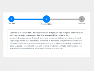
This code snippet is helpful to create a horizontal stepper for Bootstrap 5. It uses the Bootstrap 5 accordion component to navigate the next/prev steps. You can place anything inside the accordion element to show a specific step’s content.
You can use this stepper for various purposes like creating a multi-step signup form, or it can be used for step-by-step user guidelines. Moreover, you can add multiple steps according to your needs. Similarly, you can easily customize it by changing a few CSS values or defining additional styles.
How to Create Horizontal Stepper for Bootstrap 5
1. In order to create a stepper, load the Bootstrap 5 CSS into your project by adding the following CDN link into the head tag.
<!-- Bootstrap 5.1 CSS -->
<link href="https://cdn.jsdelivr.net/npm/bootstrap@5.1.0/dist/css/bootstrap.min.css" rel="stylesheet" integrity="sha384-KyZXEAg3QhqLMpG8r+8fhAXLRk2vvoC2f3B09zVXn8CA5QIVfZOJ3BCsw2P0p/We" crossorigin="anonymous">
2. After that, create the HTML structure for process steps as follows:
<div class="container">
<div class="accordion" id="accordionExample">
<div class="steps">
    <progress id="progress" value=0 max=100 ></progress>
    <div class="step-item">
        <button class="step-button text-center" type="button" data-bs-toggle="collapse"
            data-bs-target="#collapseOne" aria-expanded="true" aria-controls="collapseOne">
            1
        </button>
        <div class="step-title">
            First Step
        </div>
    </div>
    <div class="step-item">
        <button class="step-button text-center collapsed" type="button" data-bs-toggle="collapse"
            data-bs-target="#collapseTwo" aria-expanded="false" aria-controls="collapseTwo">
            2
        </button>
        <div class="step-title">
            Second Step
        </div>
    </div>
    <div class="step-item">
        <button class="step-button text-center collapsed" type="button" data-bs-toggle="collapse"
            data-bs-target="#collapseThree" aria-expanded="false" aria-controls="collapseThree">
            3
        </button>
        <div class="step-title">
            Third Step
        </div>
    </div>
</div>

<div class="card">
    <div  id="headingOne">
    </div>

    <div id="collapseOne" class="collapse show" aria-labelledby="headingOne"
        data-bs-parent="#accordionExample">
        <div class="card-body">
           your content goes here...
        </div>
    </div>
</div>
<div class="card">
    <div  id="headingTwo">

    </div>
    <div id="collapseTwo" class="collapse" aria-labelledby="headingTwo" data-bs-parent="#accordionExample">
        <div class="card-body">
            your content goes here...
        </div>
    </div>
</div>
<div class="card">
    <div  id="headingThree">

    </div>
    <div id="collapseThree" class="collapse" aria-labelledby="headingThree"
        data-bs-parent="#accordionExample">
        <div class="card-body">
            your content goes here...
        </div>
    </div>
</div>
</div>
</div>
3. Now, style the process step bar using the following CSS. You can customize the color and size of steps as you need.
.steps {
    display: flex;
    justify-content: space-between;
    align-items: center;
    margin-bottom: 2rem;
    position: relative;
}
.step-button {
    width: 50px;
    height: 50px;
    border-radius: 50%;
    border: none;
    background-color: var(--prm-gray);
    transition: .4s;
}
.step-button[aria-expanded="true"] {
    width: 60px;
    height: 60px;
    background-color: var(--prm-color);
    color: #fff;
}
.done {
    background-color: var(--prm-color);
    color: #fff;
}
.step-item {
    z-index: 10;
    text-align: center;
}
#progress {
  -webkit-appearance:none;
    position: absolute;
    width: 95%;
    z-index: 5;
    height: 10px;
    margin-left: 18px;
    margin-bottom: 18px;
}
/* to customize progress bar */
#progress::-webkit-progress-value {
    background-color: var(--prm-color);
    transition: .5s ease;
}
#progress::-webkit-progress-bar {
    background-color: var(--prm-gray);

}
4. Finally, Load the Bootstrap 5 JS and the following stepper JavaScript function before closing the body tag and done.
<!-- Bootstrap 5 JavaScript Bundle with Popper -->
<script src="https://cdn.jsdelivr.net/npm/bootstrap@5.1.0/dist/js/bootstrap.bundle.min.js" integrity="sha384-U1DAWAznBHeqEIlVSCgzq+c9gqGAJn5c/t99JyeKa9xxaYpSvHU5awsuZVVFIhvj" crossorigin="anonymous"></script>
<!-- Stepper JavaScript -->
<script>
const stepButtons = document.querySelectorAll('.step-button');
const progress = document.querySelector('#progress');

Array.from(stepButtons).forEach((button,index) => {
    button.addEventListener('click', () => {
        progress.setAttribute('value', index * 100 /(stepButtons.length - 1) );//there are 3 buttons. 2 spaces.

        stepButtons.forEach((item, secindex)=>{
            if(index > secindex){
                item.classList.add('done');
            }
            if(index < secindex){
                item.classList.remove('done');
            }
        })
    })
})
</script>
That’s all! Hopefully, you have successfully integrated this Bootstrap 5 stepper into your project. If you have any questions or suggestions, let me know by comment below.
Connect with us on social media:
- https://www.pinterest.com/codehim/
- https://medium.com/@codehim
- https://issuu.com/codehim
- https://www.youtube.com/@codehim
Similar Code Snippets:

I code and create web elements for amazing people around the world. I like work with new people. New people new Experiences.
I truly enjoy what I’m doing, which makes me more passionate about web development and coding. I am always ready to do challenging tasks whether it is about creating a custom CMS from scratch or customizing an existing system.





I real appreciate your work. I stumbled across your site while trying to find a stepper and i was very grateful because I end up getting a nice date picker too.
Do you having any code for search bar? I want to implement one in my asp.net core razor page project.