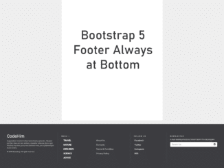
This lightweight Bootstrap 5 code snippet helps you you to create a footer element that always at bottom. It comes with 4 columns responsive layout to place navigation links.
It uses CSS absolute property to set the footer position always at bottom. You can easily integrate this code into your project to make your site’s footer always at bottom.
How to Create Bootstrap 5 Footer Always at Bottom
1. First of all, load the Bootstrap 5 framework by adding the following CDN link into the head tag of your HTML page.
<!-- Bootstrap 5 CSS -->
<link href="https://cdn.jsdelivr.net/npm/bootstrap@5.1.0/dist/css/bootstrap.min.css" rel="stylesheet" integrity="sha384-KyZXEAg3QhqLMpG8r+8fhAXLRk2vvoC2f3B09zVXn8CA5QIVfZOJ3BCsw2P0p/We" crossorigin="anonymous">
<!-- Bootstrap 3 (for Glyphicons) -->
<link rel='stylesheet' href='https://maxcdn.bootstrapcdn.com/bootstrap/3.3.6/css/bootstrap.min.css'>
<!-- Bootstrap 5 JavaScript Bundle with Popper -->
<script src="https://cdn.jsdelivr.net/npm/bootstrap@5.1.0/dist/js/bootstrap.bundle.min.js" integrity="sha384-U1DAWAznBHeqEIlVSCgzq+c9gqGAJn5c/t99JyeKa9xxaYpSvHU5awsuZVVFIhvj" crossorigin="anonymous"></script>
2. After that, create the HTML structure for the footer as follows:
    <footer class="footer-bs">
        <div class="row">
        	<div class="col-md-3 footer-brand animated fadeInLeft">
            	<h2>Logo</h2>
                <p>Suspendisse hendrerit tellus laoreet luctus pharetra. Aliquam porttitor vitae orci nec ultricies. Curabitur vehicula, libero eget faucibus faucibus, purus erat eleifend enim, porta pellentesque ex mi ut sem.</p>
                <p>© 2045 Bootstrap, All rights reserved</p>
            </div>
        	<div class="col-md-4 footer-nav animated fadeInUp">
            	<h4>Menu —</h4>
            	<div class="col-md-6">
                    <ul class="pages">
                        <li><a href="#">Travel</a></li>
                        <li><a href="#">Nature</a></li>
                        <li><a href="#">Explores</a></li>
                        <li><a href="#">Science</a></li>
                        <li><a href="#">Advice</a></li>
                    </ul>
                </div>
            	<div class="col-md-6">
                    <ul class="list">
                        <li><a href="#">About Us</a></li>
                        <li><a href="#">Contacts</a></li>
                        <li><a href="#">Terms & Condition</a></li>
                        <li><a href="#">Privacy Policy</a></li>
                    </ul>
                </div>
            </div>
        	<div class="col-md-2 footer-social animated fadeInDown">
            	<h4>Follow Us</h4>
            	<ul>
                	<li><a href="#">Facebook</a></li>
                	<li><a href="#">Twitter</a></li>
                	<li><a href="#">Instagram</a></li>
                	<li><a href="#">RSS</a></li>
                </ul>
            </div>
        	<div class="col-md-3 footer-ns animated fadeInRight">
            	<h4>Newsletter</h4>
                <p>A rover wearing a fuzzy suit doesn’t alarm the real penguins</p>
                <p>
                    <div class="input-group">
                      <input type="text" class="form-control" placeholder="Search for...">
                      <span class="input-group-btn">
                        <button class="btn btn-default" type="button"><span class="glyphicon glyphicon-envelope"></span></button>
                      </span>
                    </div><!-- /input-group -->
                 </p>
            </div>
        </div>
    </footer>
3. Finally, define the absolute position for the footer element to set the footer always at the bottom.
      body{
          position: relative;
      }
      main{
          margin-bottom: 220px;
      }
      .footer-bs{
          position: absolute;
          width: 100%;
          min-height: 320px;
          bottom: 40px;
          left: 0;
      }
That’s all! hopefully, you have successfully integrated this Bootstrap 5 footer into your project. If you have any questions or suggestions, let me know by comment below.
Connect with us on social media:
- https://codehimcom.blogspot.com/
- https://www.blogger.com/profile/07569490548898588763
- https://codehimcom.wordpress.com/
- https://en.gravatar.com/codehimcom
Similar Code Snippets:

I code and create web elements for amazing people around the world. I like work with new people. New people new Experiences.
I truly enjoy what I’m doing, which makes me more passionate about web development and coding. I am always ready to do challenging tasks whether it is about creating a custom CMS from scratch or customizing an existing system.

